OVERVIEW
WaBee is an app that lets people earn cashback rewards for shopping at local businesses. Users can search for participating merchants and view cashback details, then upload their receipts and watch as percentages of their purchases are deposited into their account balance. They have the option of either withdrawing their balance to their PayPal account, or using WaBee's "Cashback for Causes" network to donate the money to a charitable organization of their choice.
My Role: Lead UX Designer; UI Designer
Tools: Sketch, After Effects, InDesign
Platforms: iOS, Android
Deliverables: Medium and High Fidelity Wireframes, Animations, Design Specs
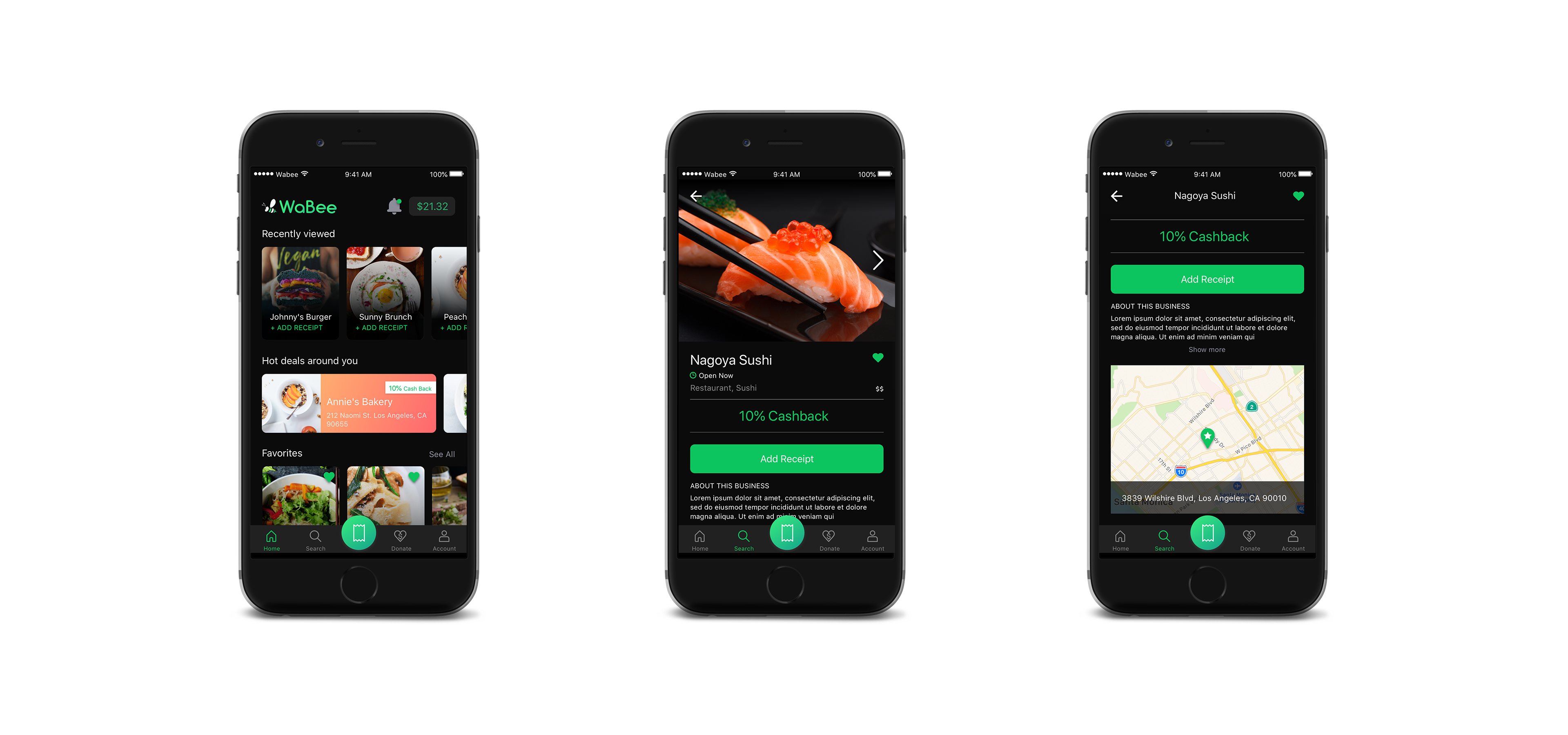
HIGH FIDELITY SCREENSHOTS
THE CHALLENGE
WaBee was an app in trouble, suffering from a lackluster, non-intuitive design and antiquated bug-filled code. They made the wise decision to redesign and redevelop the app from scratch, and hired the firm Swenson He to get the job done. I collaborated on the project with Ying Chen, my fellow designer at Swenson He.
To make things easier Ying and I decided to split the work with me leading the UX design and her the UI design. I provided her with medium fidelity wireframes, with all the UX interactions and layouts figured out, and she would then turn them into completed hifi comps with a sleek, modern visual design. We collaborated closely on both sides of this effort, bouncing ideas off each other and helping each other as needed.
UX DESIGN

NAVIGATION AND STRUCTURE
WaBee's old app consisted of a single main screen (search) plus a hamburger menu containing all the other features. We wanted to make the new app more organized for ease of use as well as to accommodate some new features the client wanted to add. We created a bottom nav bar with four sections:
- Home: all the features the user would need quick access to, like rewards balance and local deals
- Search: where the user can search for participating merchants
- Donate: a new feature where users can find and set up donations to charitable organizations
- Account: settings and profile information
In addition, we created a big round button in the center of the nav bar that would be a shortcut to the most important feature of the whole app: uploading receipts. Previously this feature was hidden inside each individual merchant screen - meaning the user would have to go through the whole search process to perform this simple, vital task. Not anymore!
HOME
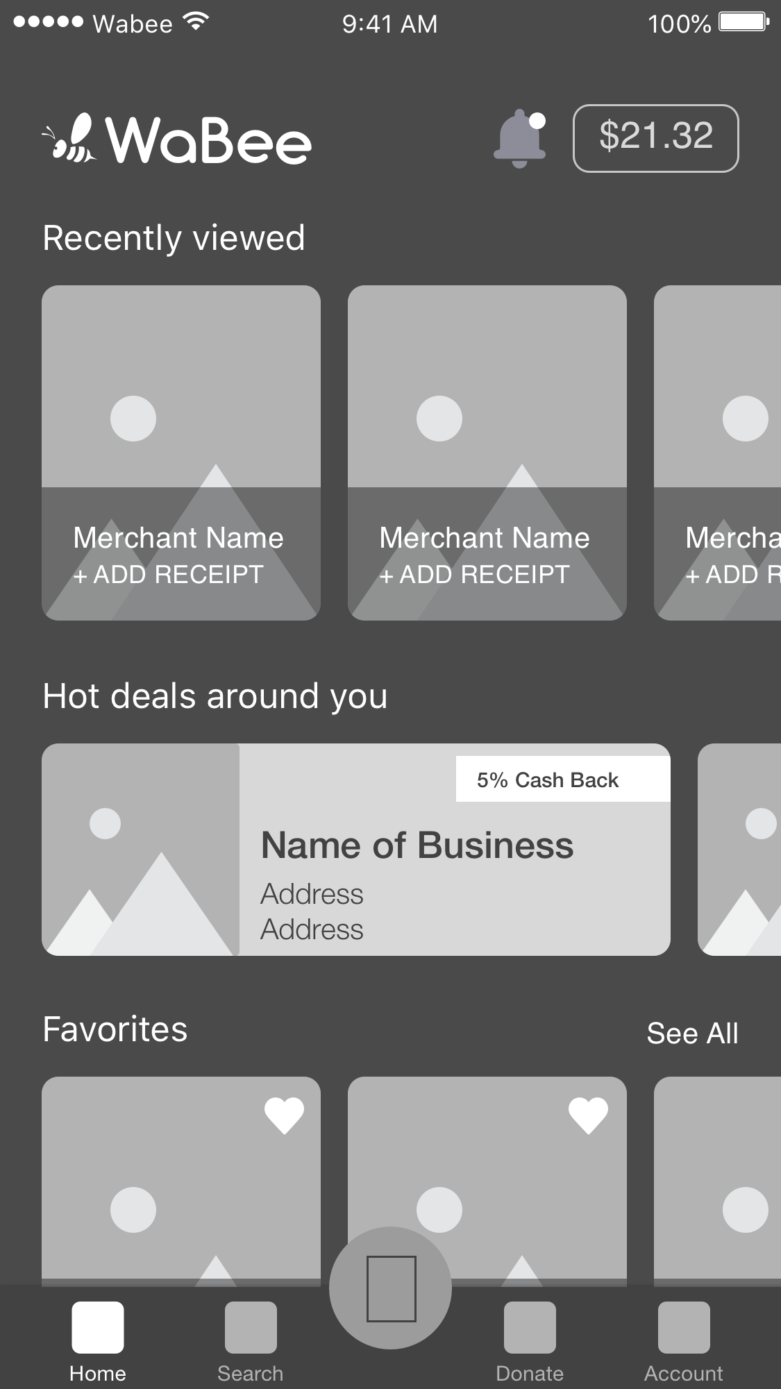
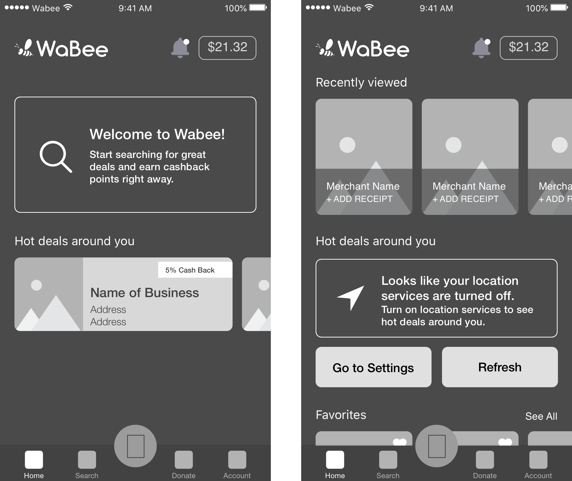
The Home section contains everything the user might need "at a glance". Recent activity, favorites, local deals, as well as features like notifications and rewards balance information can all be accessed from this section.
This screen required several different designs depending on the following factors:
- Is the user logged in?
- Are location services enabled?
- Has the user viewed any merchants yet?
- Has the user added any favorites?

UPLOADING RECEIPTS
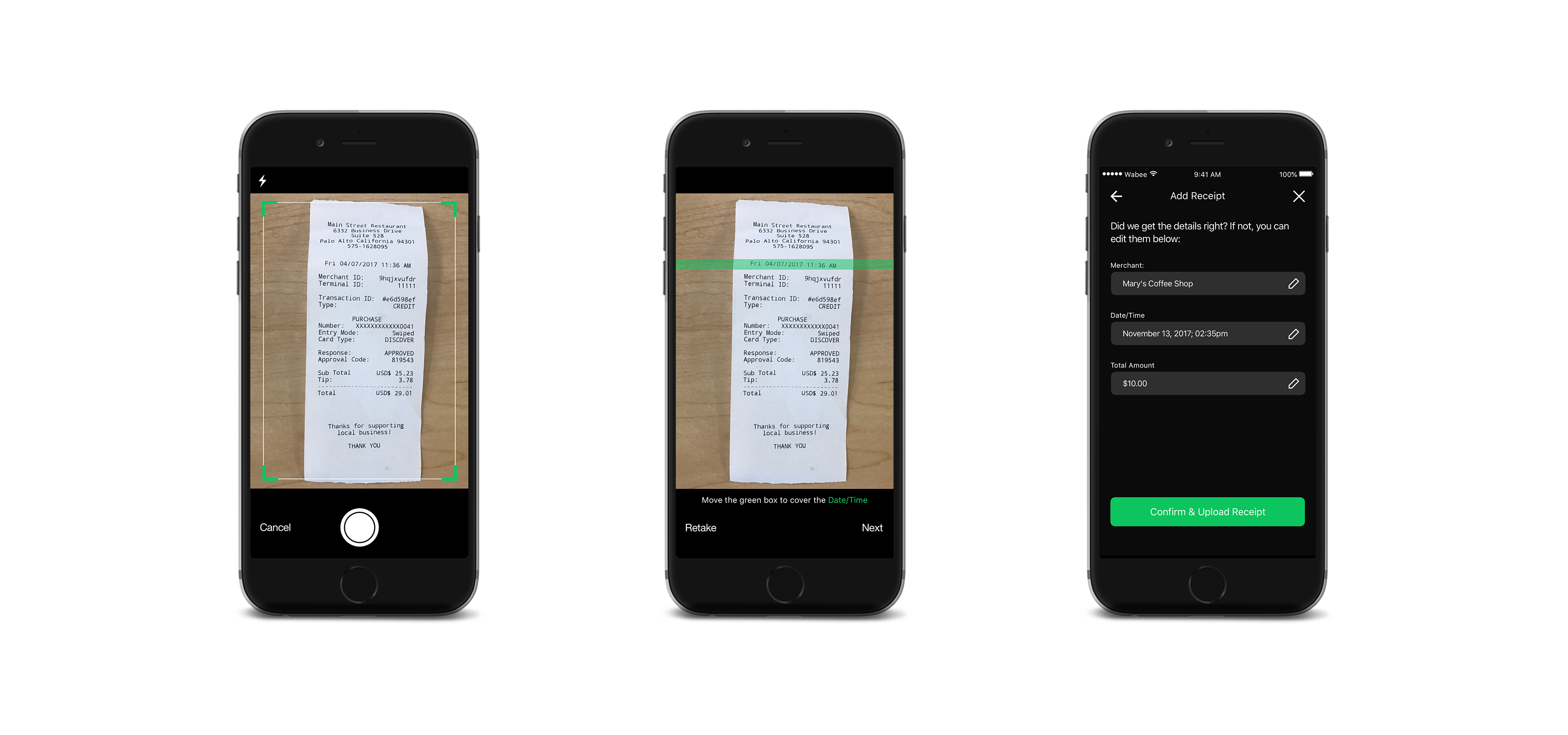
WaBee does all of their receipt verification manually, so the new app incorporates OCR technology to make this task easier for them. This presented a technical challenge for design, as OCR is not sophisticated enough to recognize which numbers on the receipt are needed. Our solution was to prompt the user to move a selection bar over both the total amount and the date/time of purchase. (We studied lots of different receipts to determine the optimal size for the bar.) After the user is done, they can review the information that was scanned and edit it if necessary before uploading the receipt.


SEARCH / MERCHANT DETAIL
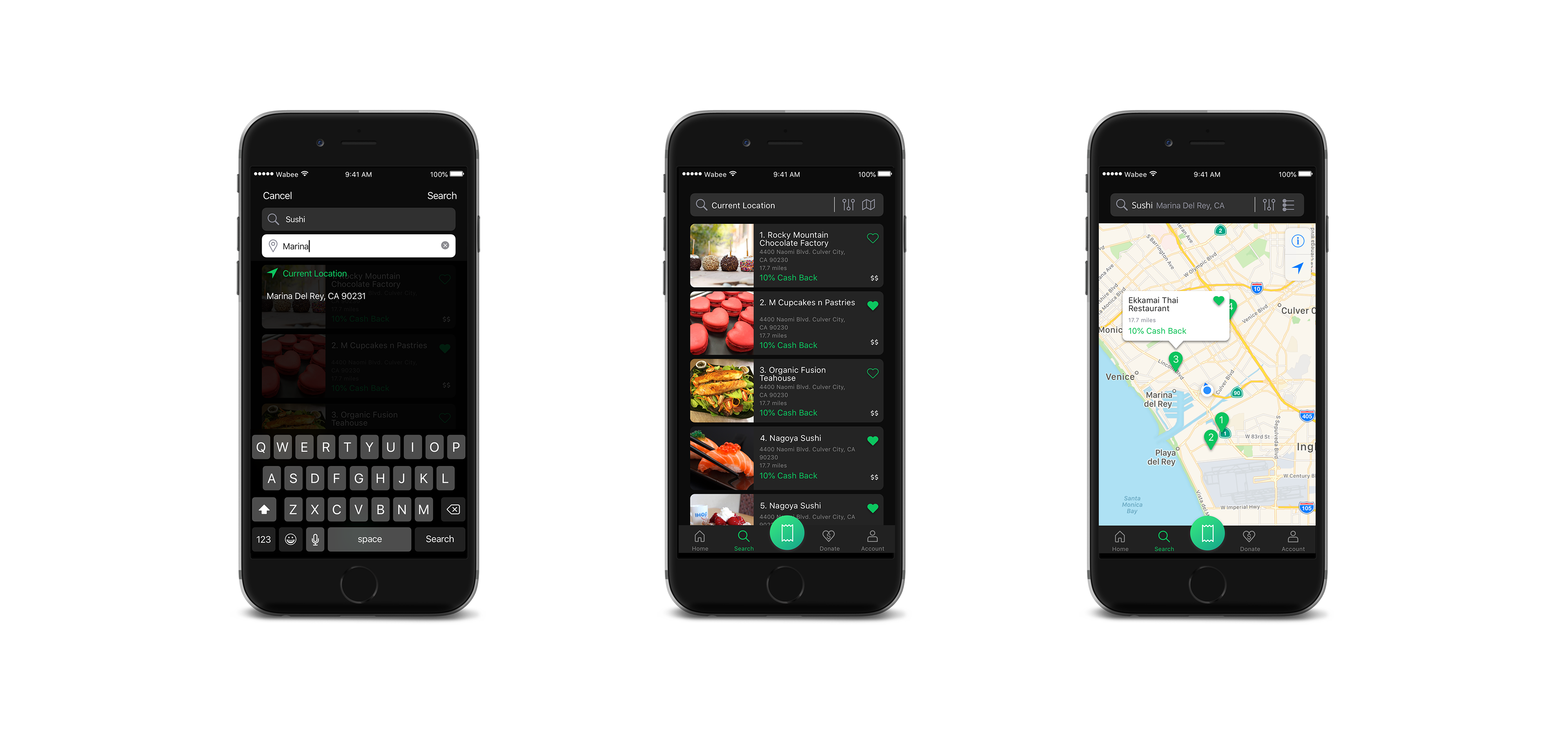
The user can search by location, keyword, or both. The results screen can be toggled between map view and list view, and can be sorted by distance, name, cashback %, or price. We had to create a separate design for the search flow to account for a user whose location services are turned off - this flow gives them an error message prompting them to turn location services on before they can search.
The user can click on any of the results to see the detail page for that merchant, which includes information like directions, hours, offer exclusions, and more. The user can also begin the "upload receipt" flow from the detail page - if they do, the merchant name is automatically filled in for them, saving them a step.


DONATE
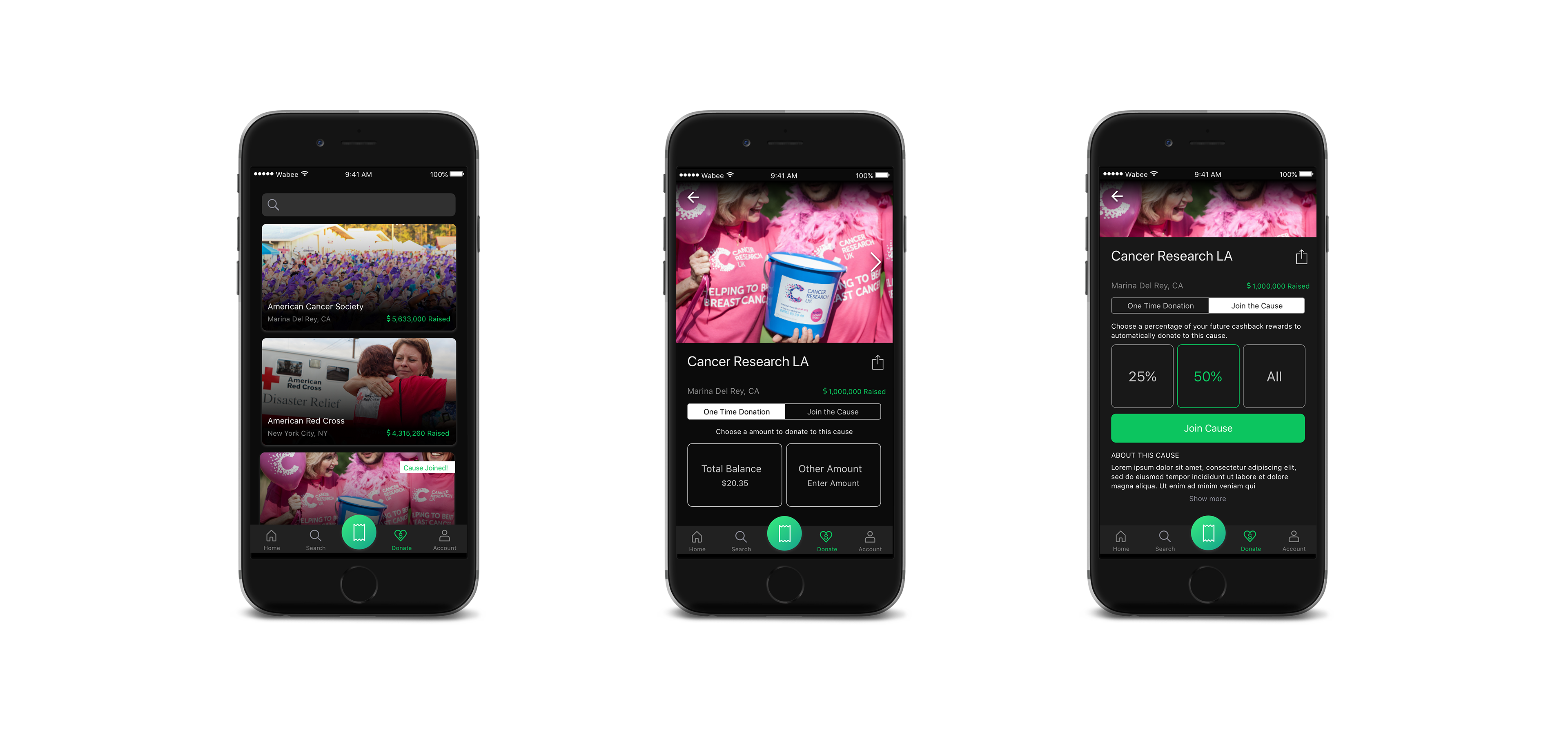
Similar in some ways to the merchant search, the user can go to this section to search for organizations to donate their rewards to. Once they find one, the user has the option of making a one-time donation, or they can "join the cause" and select a percentage of their rewards to be automatically donated. If they join a cause, they can edit or cancel their donation by going back to the organization detail page, or through a shortcut in the Account section (see "Account" below).
The donate search results list is visually distinctive from the merchant search results, both for the user's sake and also to accomodate larger photos in the Donate section, where emotional imagery is more important.


ACCOUNT
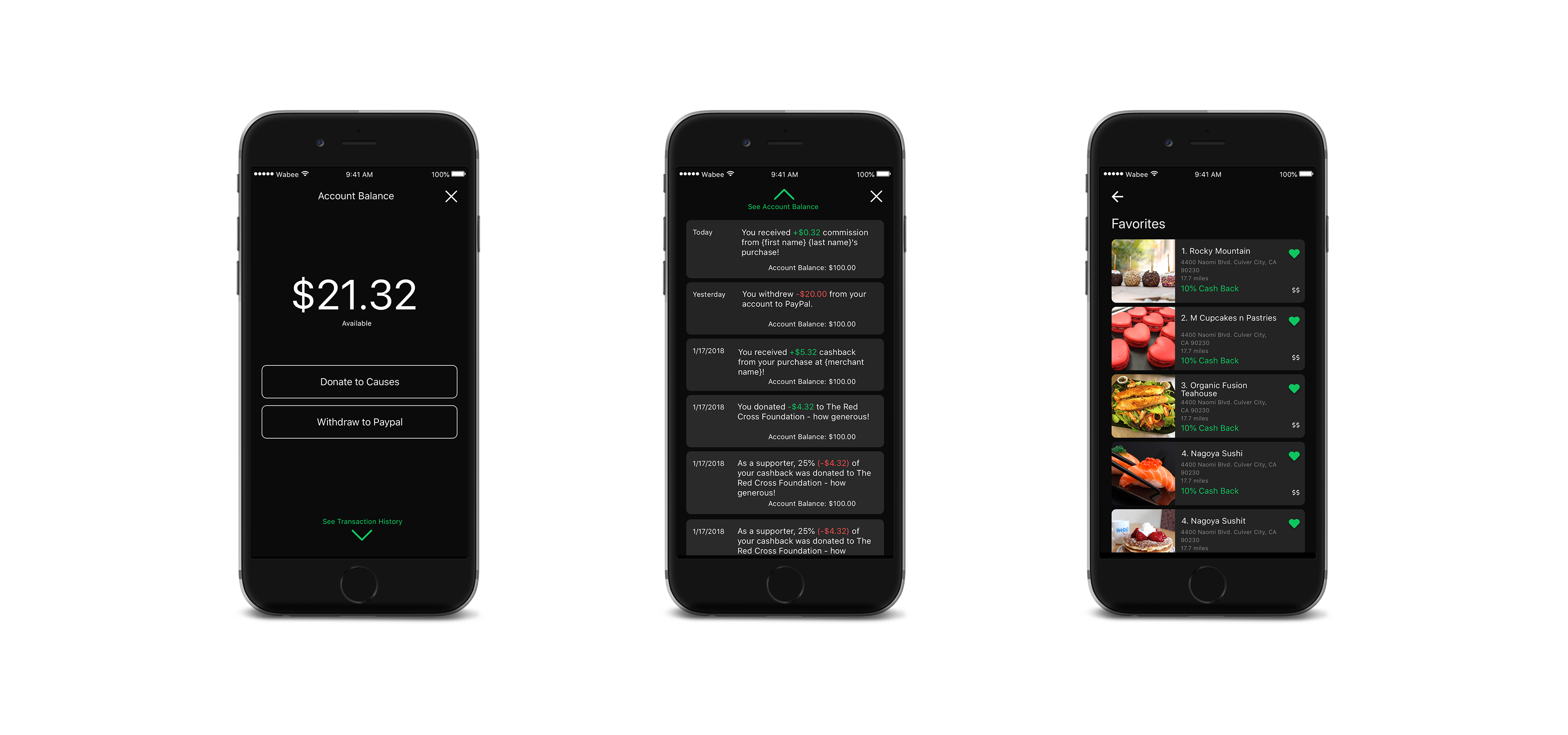
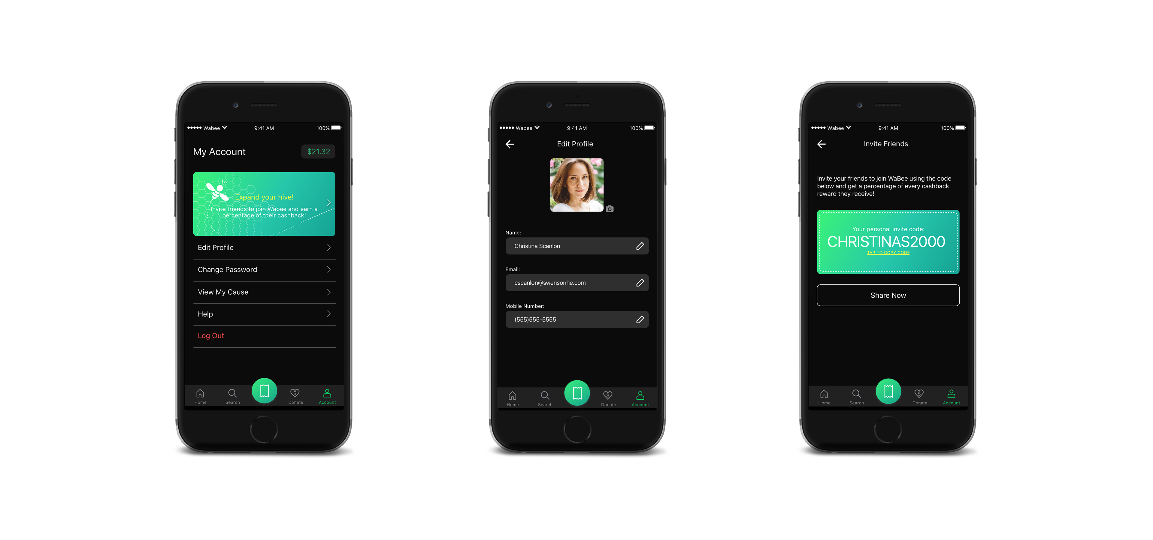
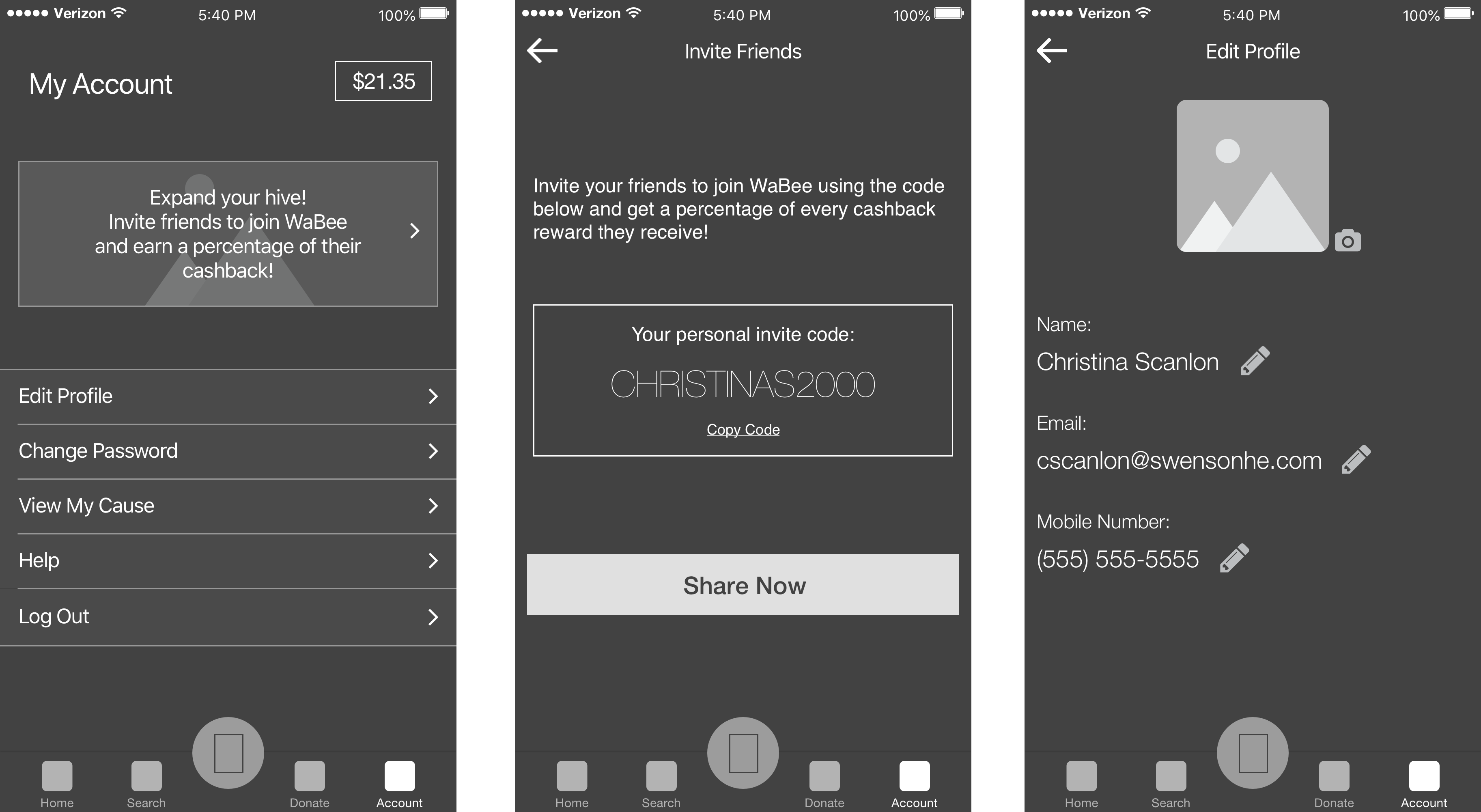
The account section is where many of the miscellaneous items from the original app's hamburger menu now live, in a more organized fashion. The user's rewards balance can also be accessed easily from here. Features of this section include:
- Invite Friends: the user can tap this button to get an invite code to send to their friends (and receive a percentage of their rewards)
- Edit Profile: The user can edit their photo, name, email, and phone number
- Change password
- View My Cause: an easy way for the user to go straight to the organization detail page of the cause they joined (disabled if they have not joined a cause)
- Help: a static page with information about the app, plus a link to email WaBee support
- Log Out: users who are logged out can still use the app but anything that requires an account will trigger an error prompting the user to log in

BALANCE / WITHDRAW TO PAYPAL
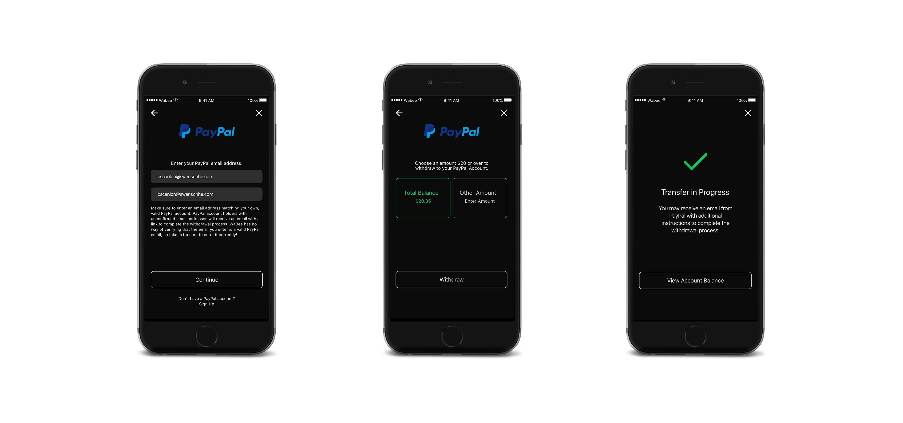
The PayPal withdrawal flow presented another big UX challenge as there were a lot of technical limitations from PayPal's side. We would have no way of confirming whether the user was entering a valid PayPal email address or not. If the email they entered did not have a PayPal account, PayPal would send them an email with instructions to sign up and receive the funds. If the email they entered didn't exist, the money would be stuck in limbo. We tried to prevent this situation as best we could by: 1) asking the user to enter their email twice and verifying the two emails matched, and 2) writing plenty of copy explaining the user's responsibilities.


SIGN UP / LOG IN
We originally intended for the user's email address to be their unique identifier, however as we began designing we realized that since it was a mobile-only app their phone number would be easier and more secure. With the mobile number as a unique identifier, technically they wouldn't even need to remember their password to log in - they could simply send a verification code to their phone if they forgot the password. Emails would still be collected but would only be used for account-related messages.
We also gave the user options to log in with Facebook or Google, as our research showed that the majority of users do opt for social login if given the choice.


ANIMATIONS
A LITTLE SOMETHING EXTRA
Though the client agreement did not call for it, we loved the WaBee logo so much that we couldn't resist doing some animations with it to give the app a little something extra. Here is an animation that I created to serve as the app's loading spinner (the animation that appears when a screen needs time to load). Much cuter than a boring circle, don't you think?

RESULTS


"We walked in with wireframes that lacked personality and brand identity. They took those basic concepts we provided and turned it into an amazing design that is user-friendly and has its own brand identity. Since the launch of this version of the app, we have gotten so much positive feedback. Not only are users loving the app design but we are seeing that it is helping drive very high user retention."
- Brandon Castaneda, WaBee CEO
NEXT STEPS
When WaBee is ready for another round of design, there are several things I'd like to add that were not possible the first time around due to time and budget limitations, including:
- Type ahead search suggestions for merchant search and donate search
- Pagination or lazy loading for search results (the current version caps searches at 20 results)
- A carousel display of search results at the bottom of the map view screen, making it easier for users to scroll through the results
- If the user has not joined a cause, instead of having “View My Cause” disabled on the account page, it could open up a page explaining WaBee's "Cashback for Causes" feature and directing them to the Donate section
- An expanded gallery view of the photos on the merchant detail and organization detail screens
- Interactive (instead of static) maps on the merchant detail screen
- Organization of the notifications screen into "read" and "unread" sections, with date headers
- The abiity to join more than one cause at a time
- Modular push notification controls - the ability to turn specific notifications on or off, instead of all or nothing
- iPad version of the app

© 2019 Christina Scanlon. All Rights Reserved.
