
OVERVIEW
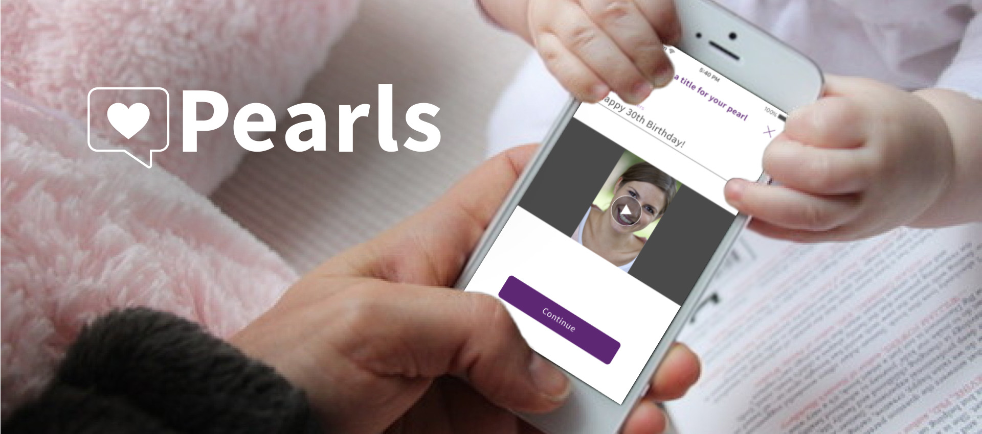
When entrepreneur Chris Dyson’s sister-in-law lost her battle to cancer at the young age of 23, he wished more than anything that her spirit could have been captured, both for his own memory and for that of future generations. Everyone has unique life experiences to share, and Chris wanted to give people a chance to record those “pearls of wisdom” for their loved ones and for the world. Pearls (formerly My Little Pearls) is an app that lets you share your memories and experiences, so that the best parts of you can live on forever.
My Role: Lead UX/UI Designer
Tools: Sketch, Illustrator, Proto.io
Platforms: iOS, Android
Deliverables: Medium and High Fidelity Wireframes, Interactive Prototype
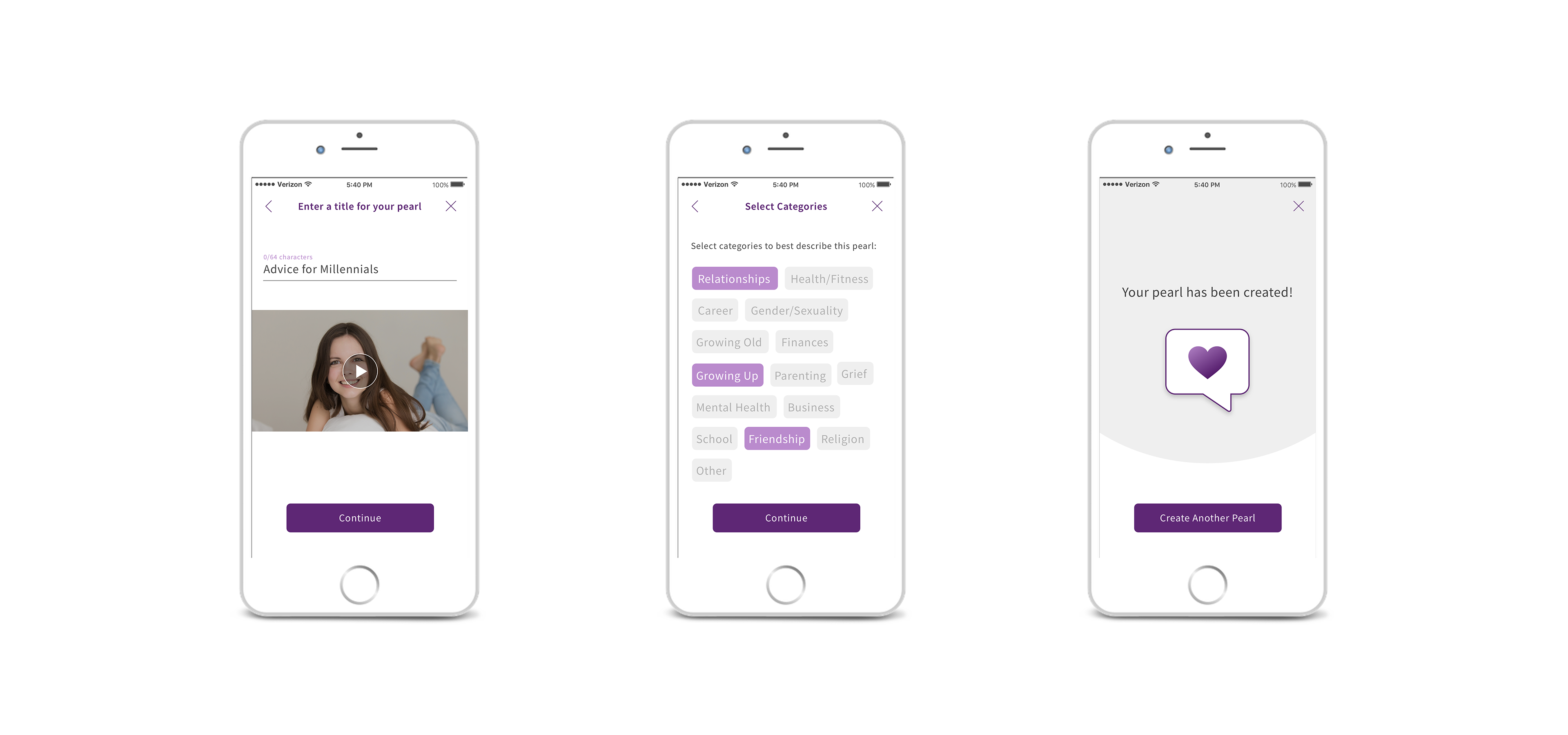
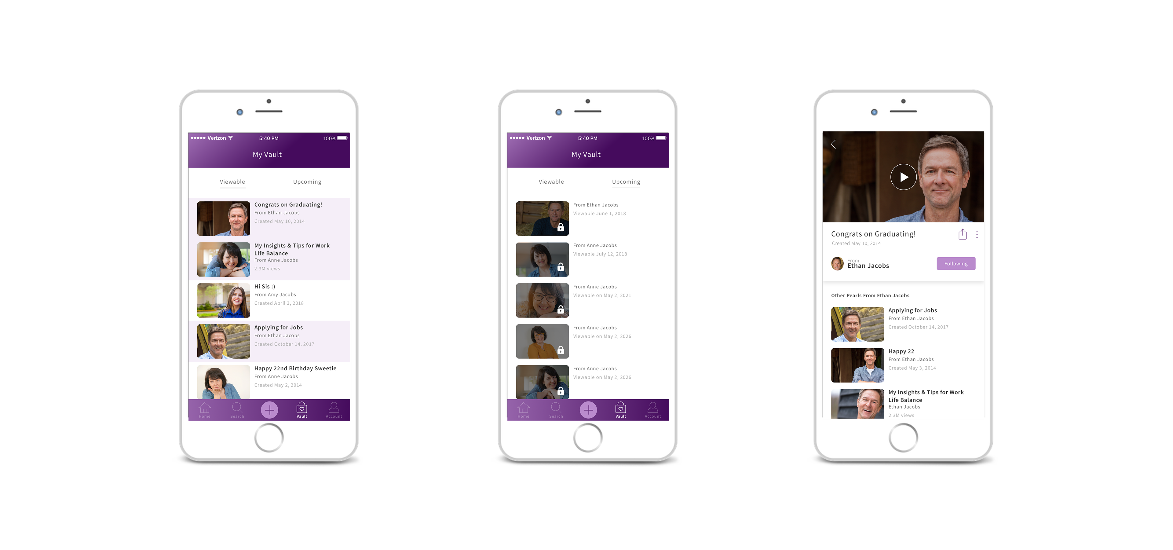
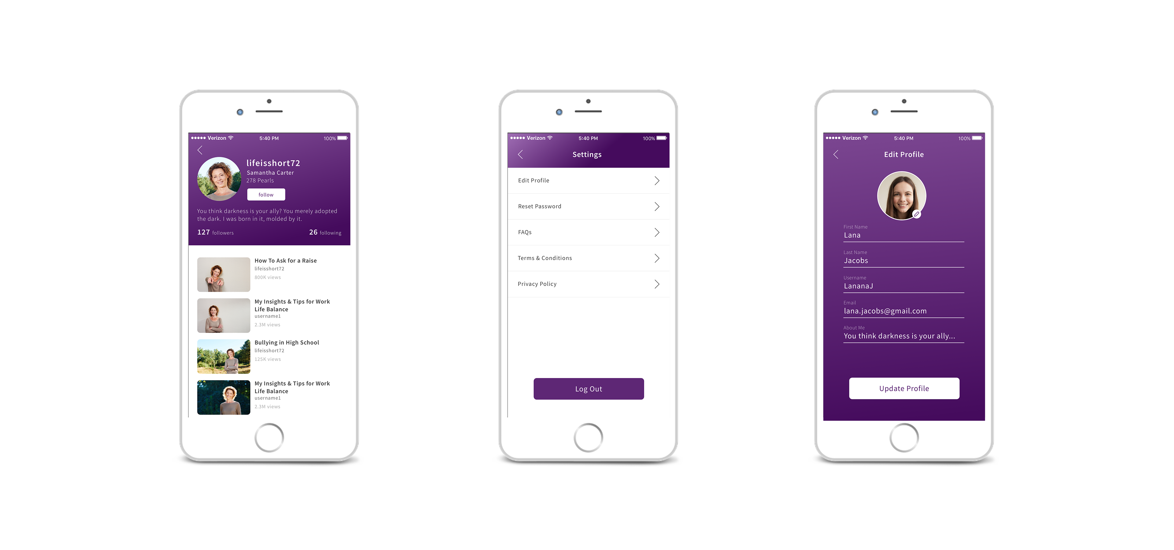
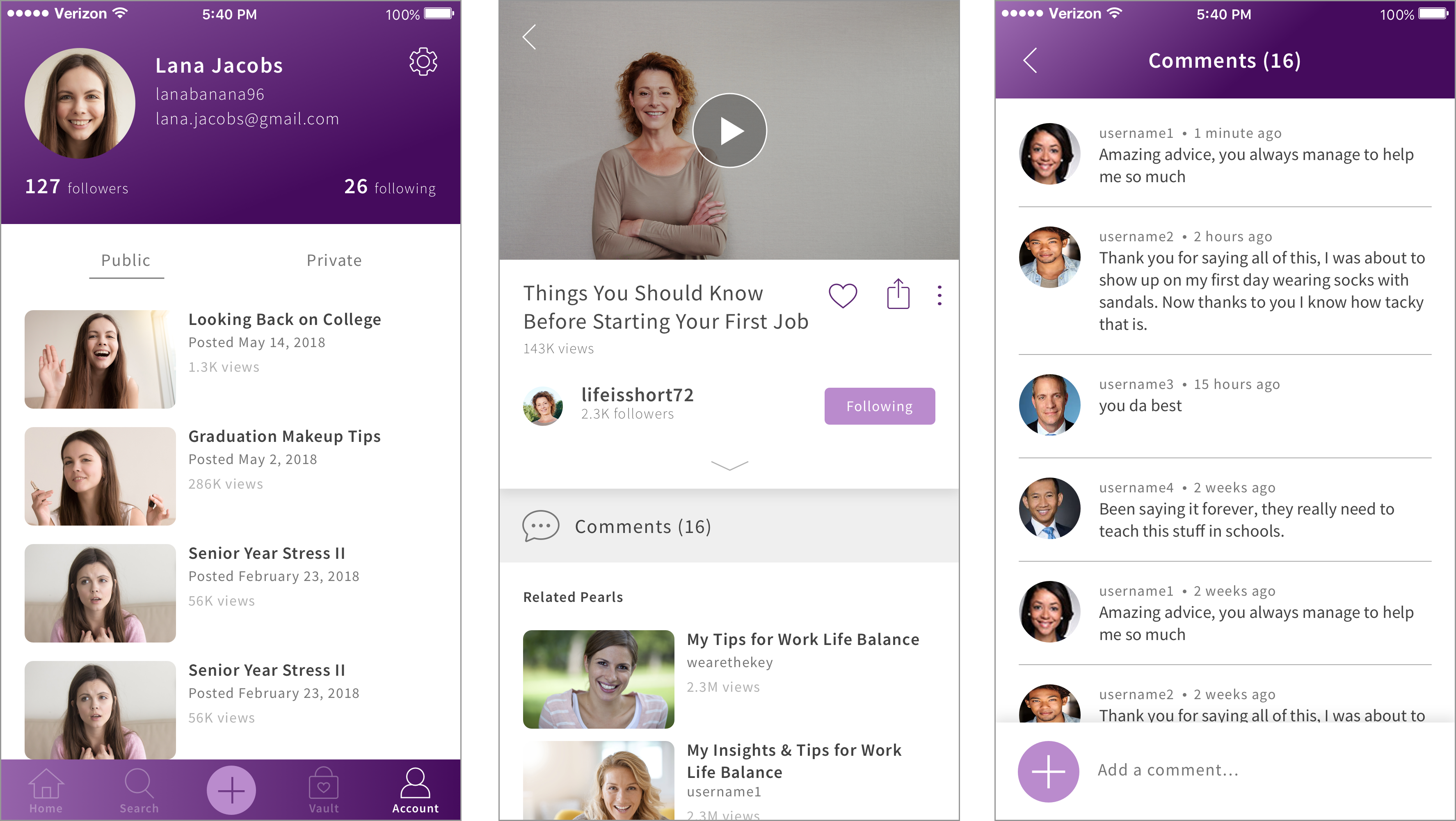
HIGH FIDELITY SCREENSHOTS
IDEATION
Chris came to the firm Swenson He with a dream and a concept: he wanted to create an app that would let people record videos (“pearls”) of their advice and experiences, and send them to their loved ones to have for all time. Together with Ying Chen (my fellow designer at Swenson He), we brainstormed with Chris to develop his concept further.
BRAINSTORMING TAKEAWAYS
We came up with some great ideas to flesh out the app, including:
- “Locked” pearls: videos sent to loved ones that can’t be opened until a future date. Imagine being able to send your child advice that they can open on the day they graduate college, or sing them Happy Birthday far into the future?
- Public pearls: videos meant to be shared with the world. General life advice, memories, and experiences stored in a searchable database, that might be just what someone you’ve never met needs to hear.
PROJECT PLANNING: PROTOTYPE FIRST
We decided that we would start by creating an interactive prototype to serve as proof of concept for investors. A prototype would also give us a chance to do some great user research in the meantime. Then after funding was secured, we would turn the prototype into a full app.
LOGO & BRANDING


Original Logo
Ying spent several days with Chris designing a logo for Pearls and working on branding colors. Purple was chosen as the main color for the brand due to the strong emotions it conveys, which fit well with the nature of the app.
UX DESIGN
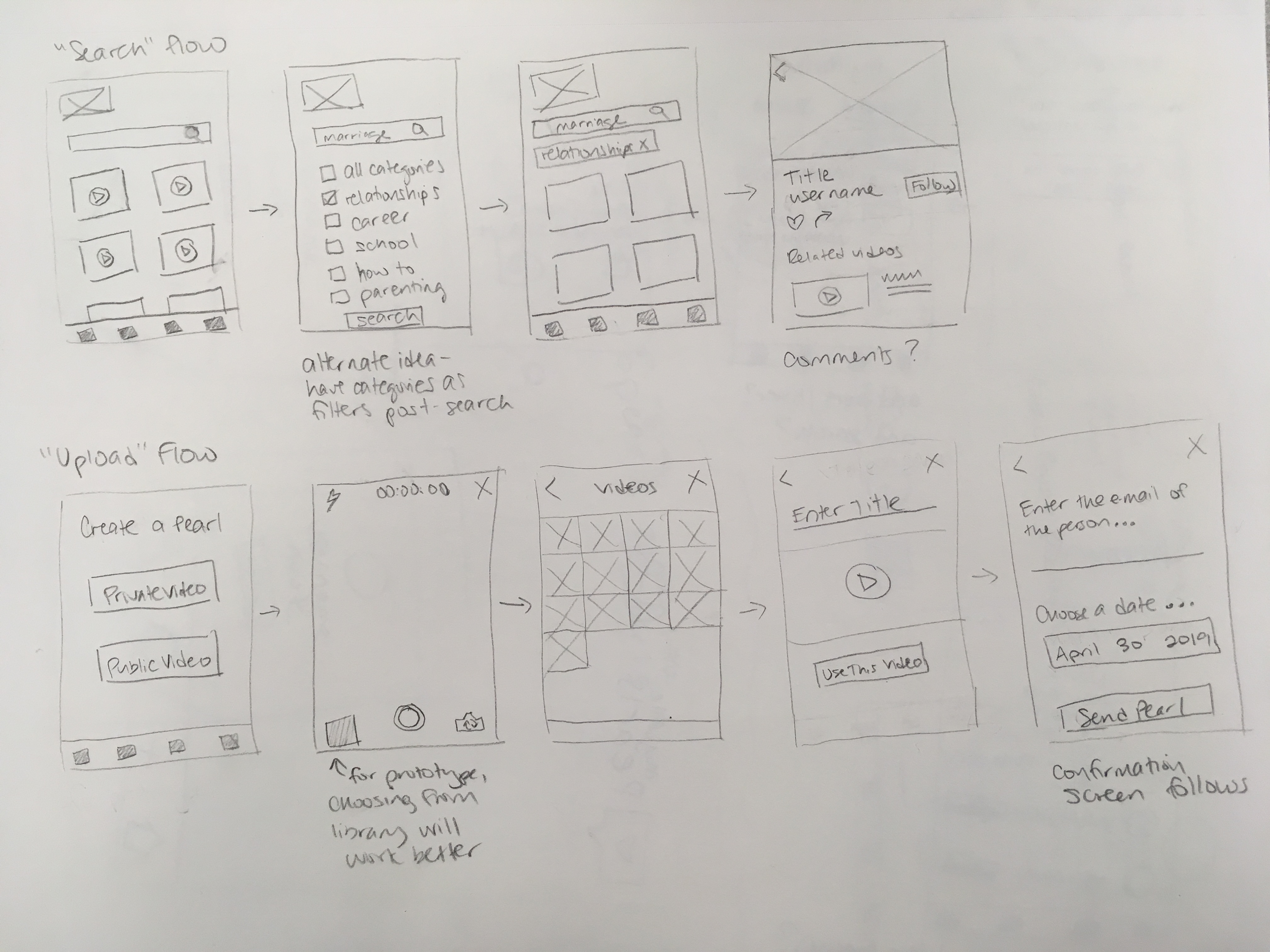
The project transitioned back to me to do the UX and UI, and create the interactive prototype. I started by creating wireframes in order to perfect the structure and flows of the app before exploring the visual design.
NAVIGATION
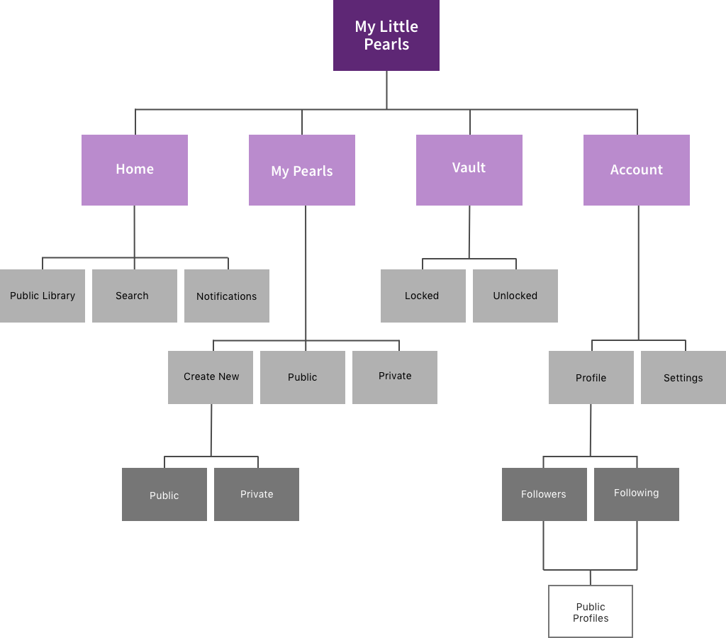
The heart of the app would consist of four primary functions: creating a private pearl, creating a public pearl, viewing a private pearl, and viewing a public pearl. The app would also need to include some secondary functions, such as account, search, and notifications.
I decided to organize the app into four sections within a bottom nav bar:
- Home: an instagram-style feed of public pearls
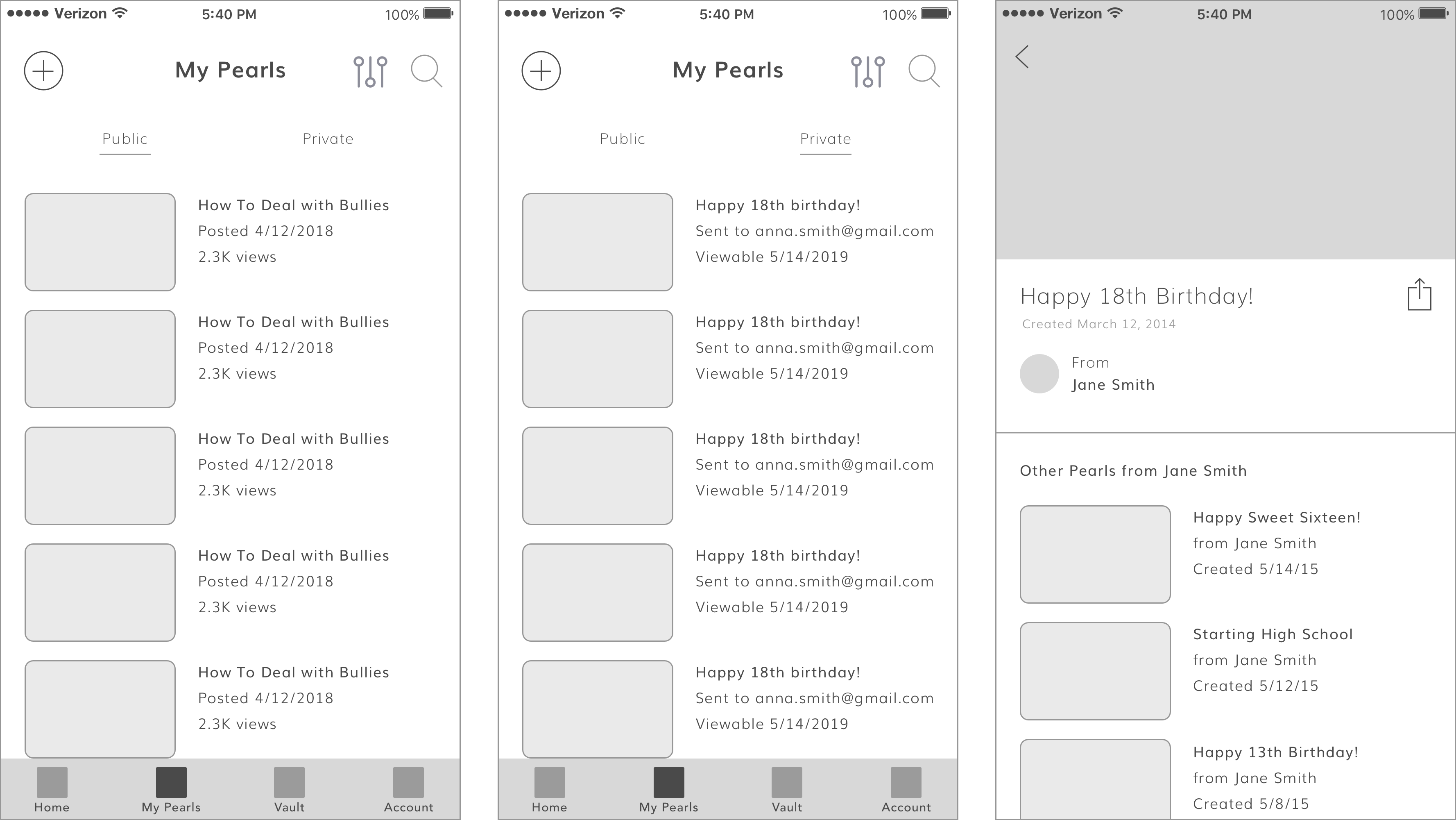
- My Pearls: all the public and private pearls created by the user
- Vault: private pearls received by the user
- Account: profile and settings
HOME
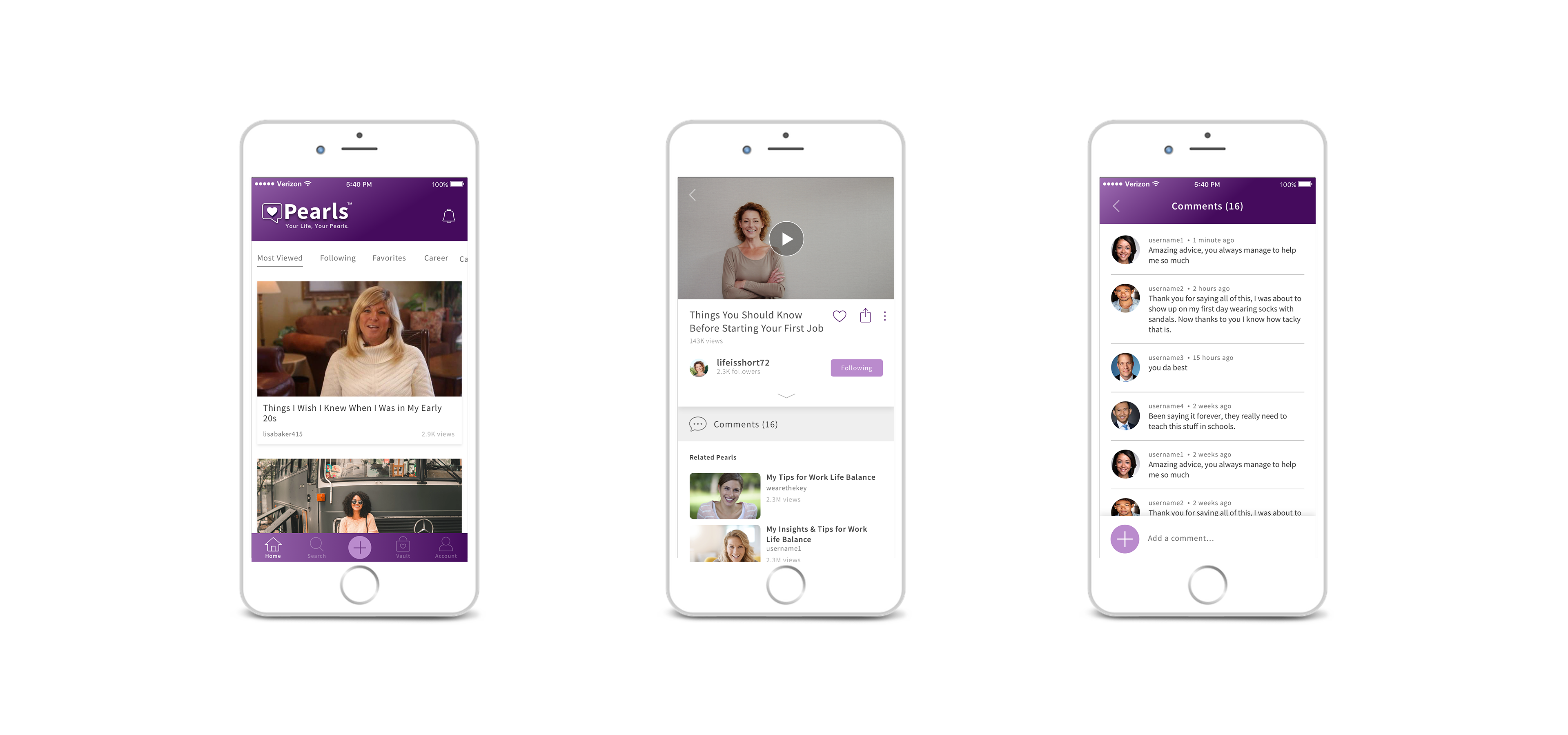
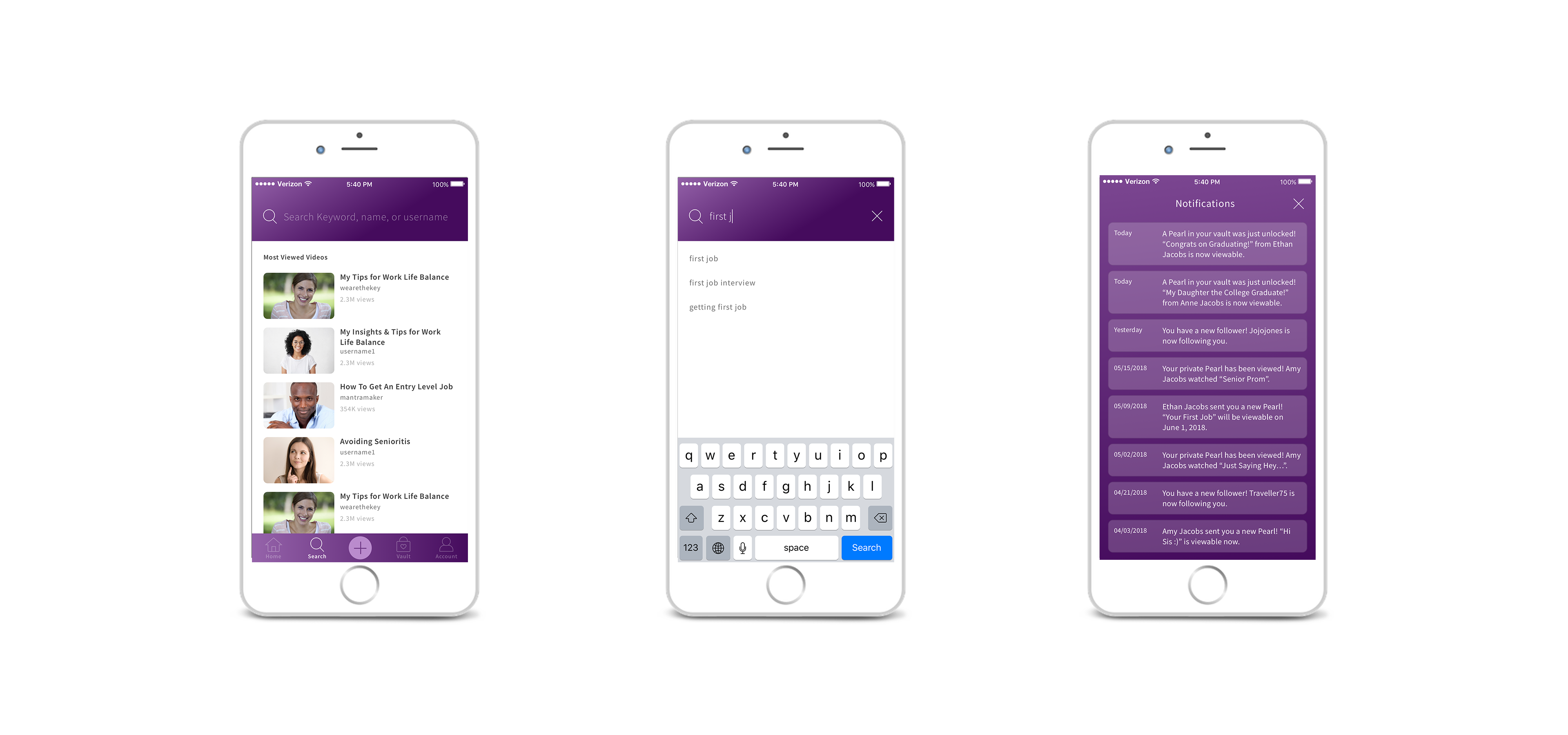
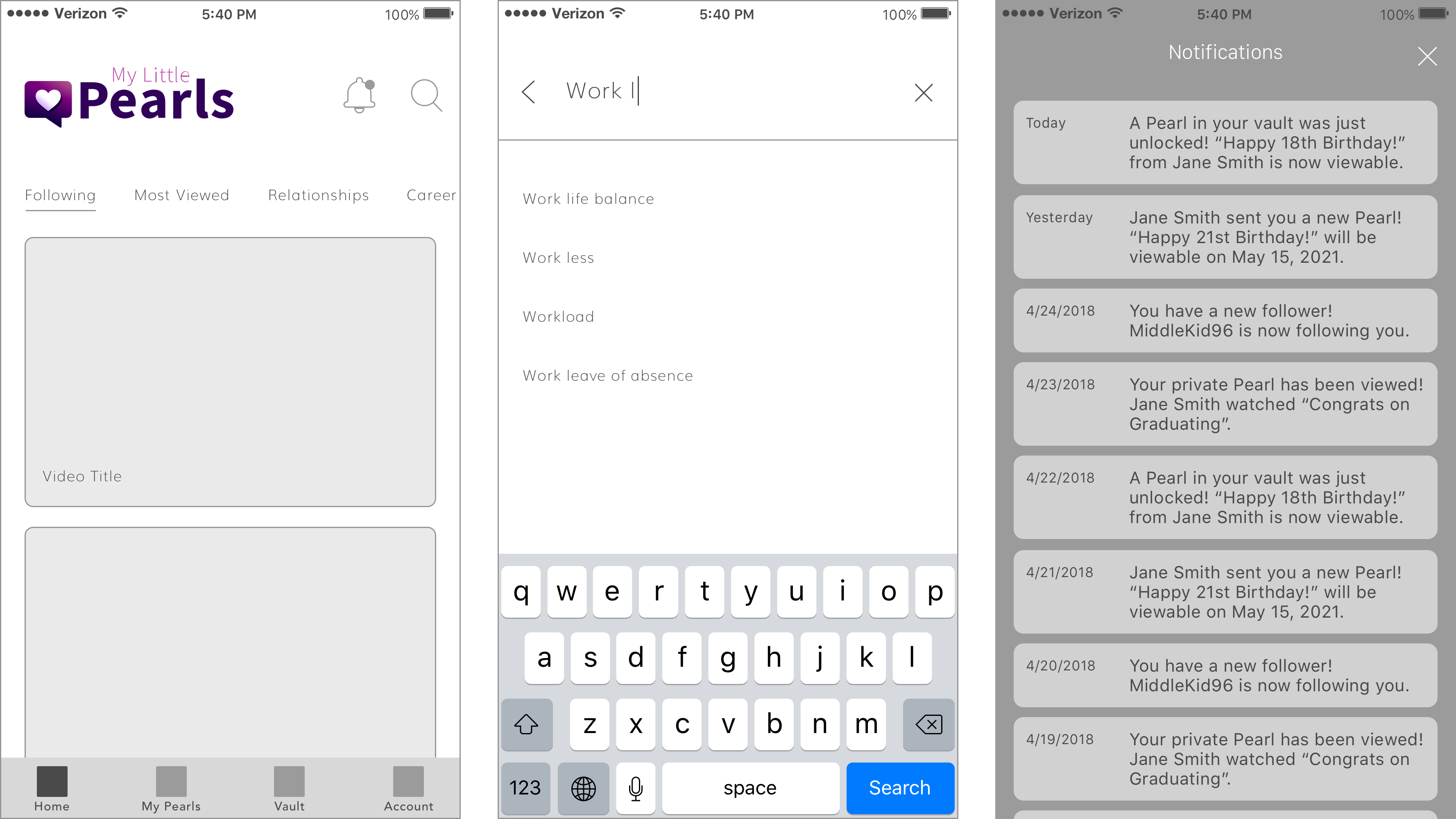
The home screen is where the user can easily access the entire library of public Pearls. Tabs at the top of the screen separate the library into categories that the user can browse by, or they can hit the search icon at the top to search for keywords or users.
The notifications screen can also be accessed from the home screen. Users are notified when someone sends them a Pearl, when a Pearl becomes available for viewing, when someone starts following them, and other events.
CREATE A PEARL
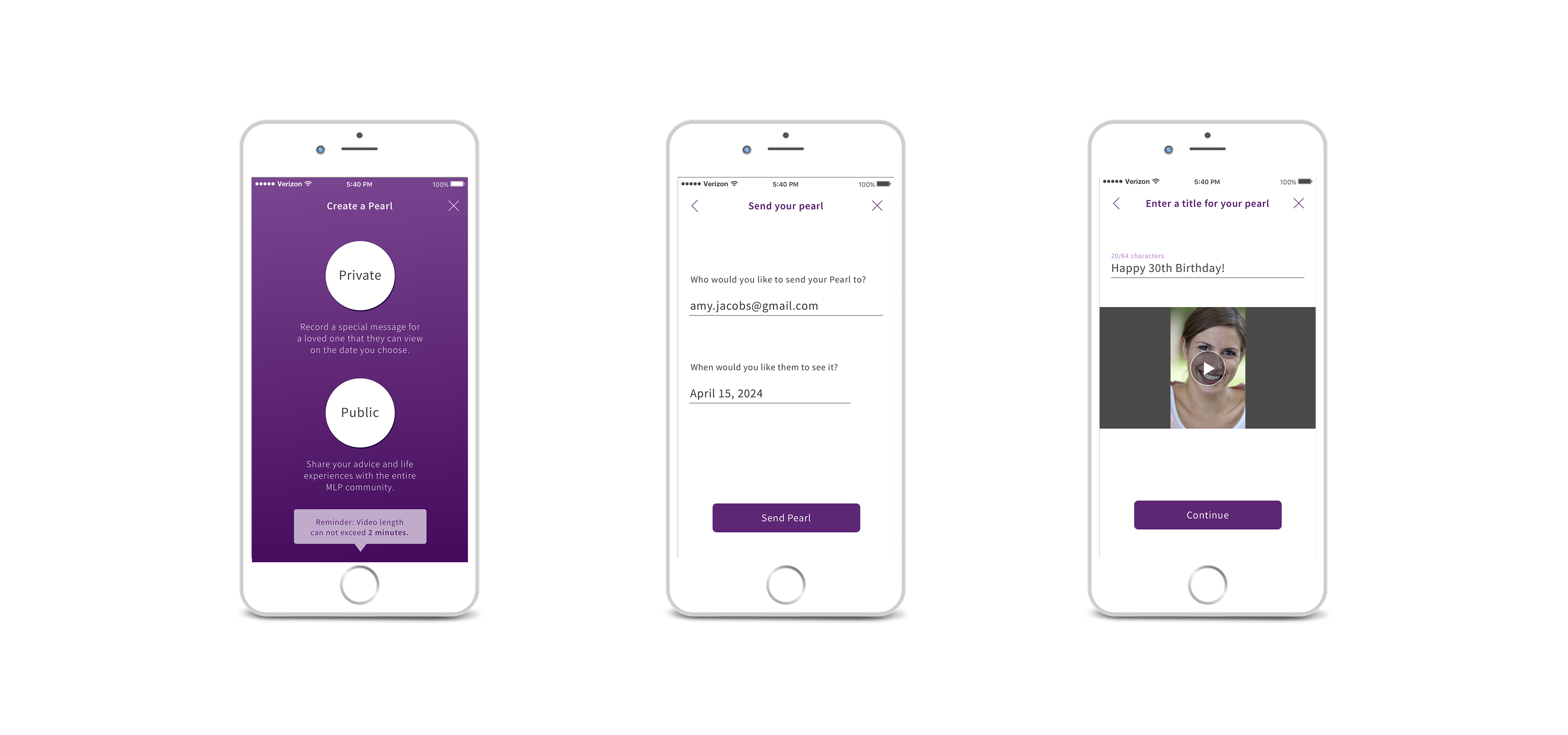
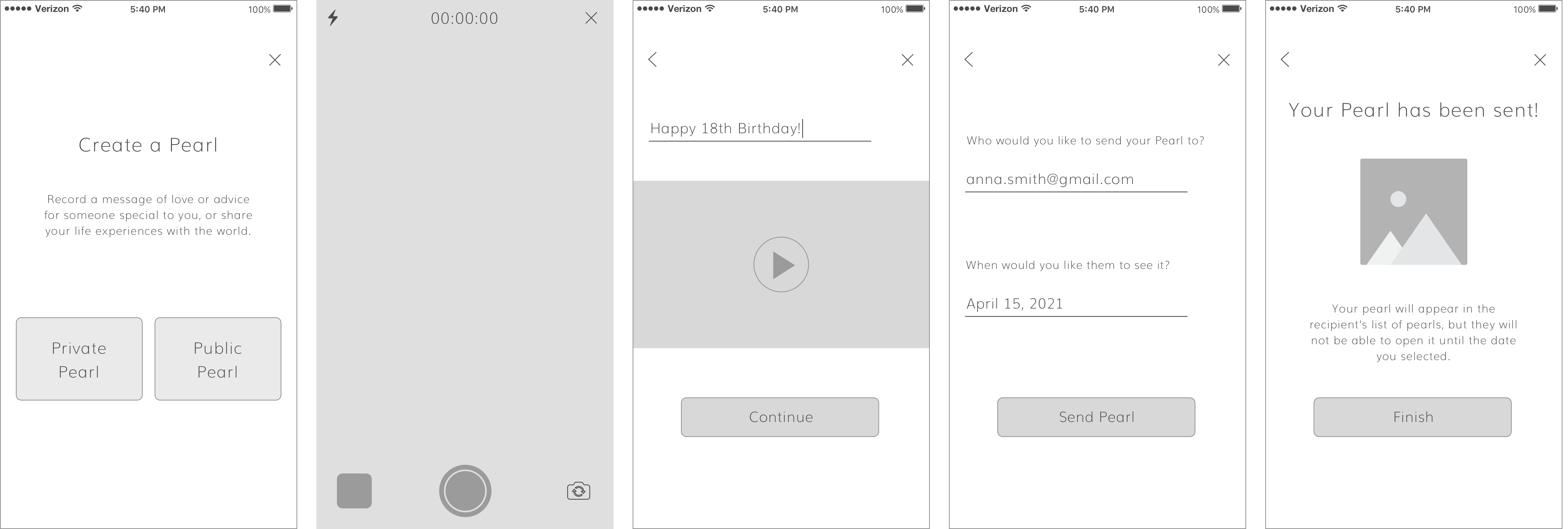
For the purposes of the prototype, I focused on the flow for creating a private Pearl as I felt it would be a better way to showcase the app’s uniqueness. I started the flow by having the user choose upfront which type of Pearl they wanted to create, as public and private Pearls would require different steps. For a private Pearl they would need to enter the email address of the person they were sending it to, as well as the date that it would be unlocked.
VAULT
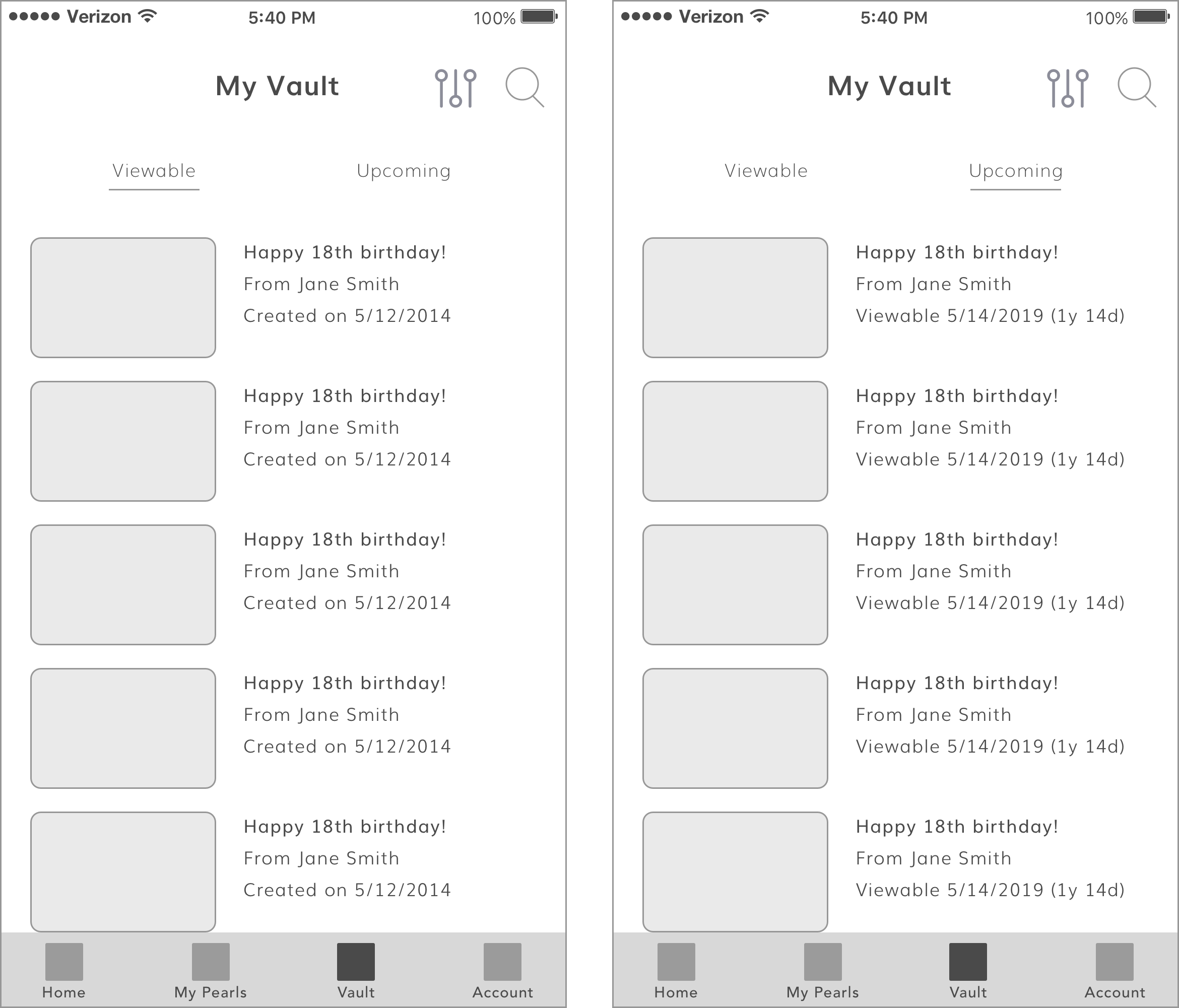
The "Vault" houses all of the private Pearls that the user has received from someone else. The Pearls are separated into "viewable" (Pearls that can already be opened) and "upcoming" (Pearls that cannot be opened until a future date). The Pearls in the "upcoming" section list the date that they can be opened.
ACCOUNT
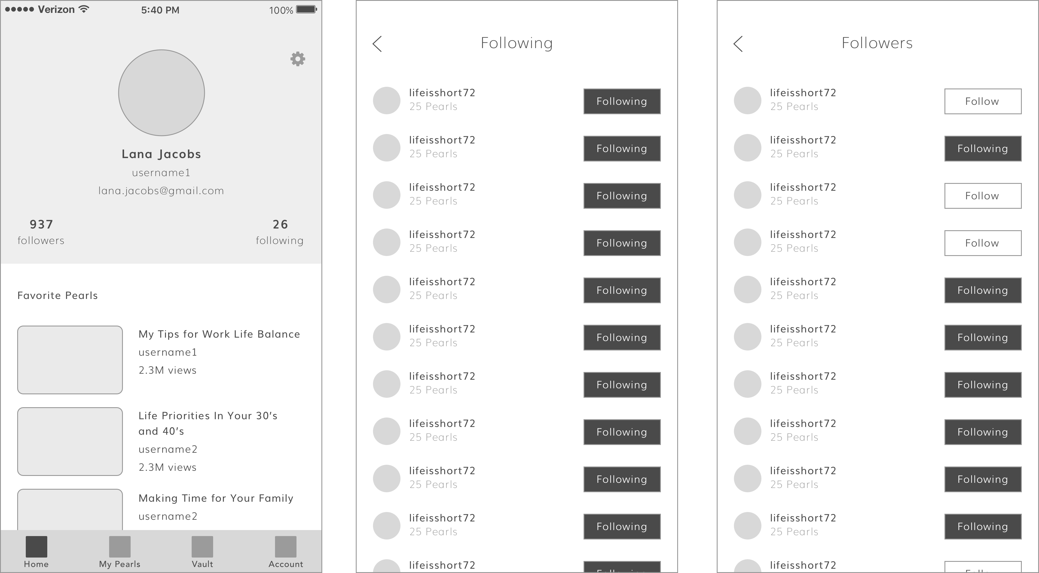
Finally, the Account section contains the user's profile and settings. The user can see how many followers they have, and how many people they are following. I incorporated a system similar to that of Instagram for ease of use.
All of the Pearls the user has marked as "favorites" can also be accessed from the Account screen..
UI DESIGN
With the UX interactions figured out, it was time to move on to visual design. While purple was the main background color, I wanted to contrast it against a white background as I felt the app should also have a clean aesthetic to symbolize the purity of its purpose.
COLORS
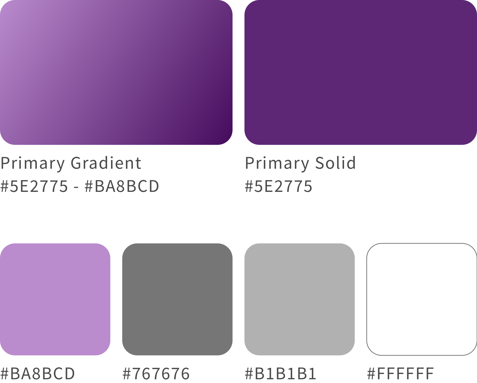
The purple gradient ended up changing slightly from the original branding design. I did keep it as a gradient, though, to give some depth to the design. Flat colors would have been a little too harsh for such an emotional app.
TYPOGRAPHY
Source Sans Pro is a sans serif font which gives the app a modern feel. It is not entirely rounded however, as I didn’t want the app to go too far to the “quirky” side. It strikes a good balance between approachable and trustworthy, as the app needs to convey both sensibilities.
PROTOTYPE
With the UX and UI now complete, it was time to turn everything into a functioning prototype! I used the tool Proto.io so that I could incorporate some heavy duty animations, to make it look as impressive as possible.
DESIGN PHASE II
With a solid prototype to show off, Chris had no problem getting the funding he needed to come back for a second round of design to complete the app. Ying and I both worked on the design during this phase.
ADJUSTMENTS
The prototype gave us a great tool to conduct some user research. For the most part the design held up very well, but we discovered a few changes were necessary, including:
- "My Pearls" moved to Account section
- Universal search added to bottom nav
- "Create Pearl" button moved to bottom nav
- Commenting feature added
LAUNCH
Pearls was officially launched for both iOS and Android in January 2019! Download it today and start recording your most treasured memories to share them with the people you love most.
© 2022 Christina Scanlon. All rights reserved.
