OVERVIEW
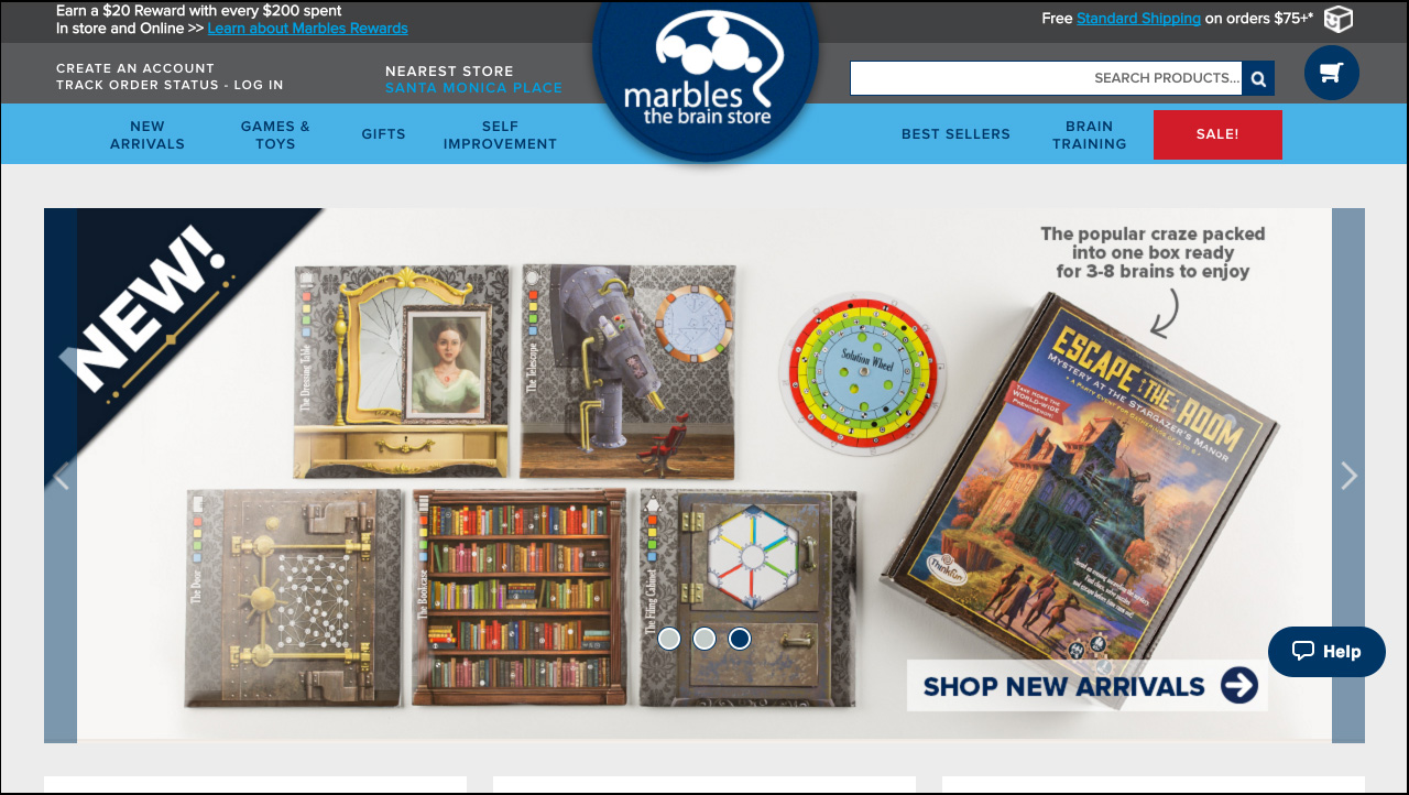
Gifts are a major source of revenue for Marbles, especially with their online customer base. Marbles website shoppers consist mainly of moms who are buying gifts for their children, but they are often intimidated by the website due to its messy layout and disorganized categories. They need the ability to search for and select an item quickly so they can move on with their busy schedules, but they have trouble navigating through the confusing menu system to do so.
My Role: Sole UX/UI Designer
Tools: Keynote, Invision, Photoshop
Platforms: Web
Deliverables: Interactive Prototype
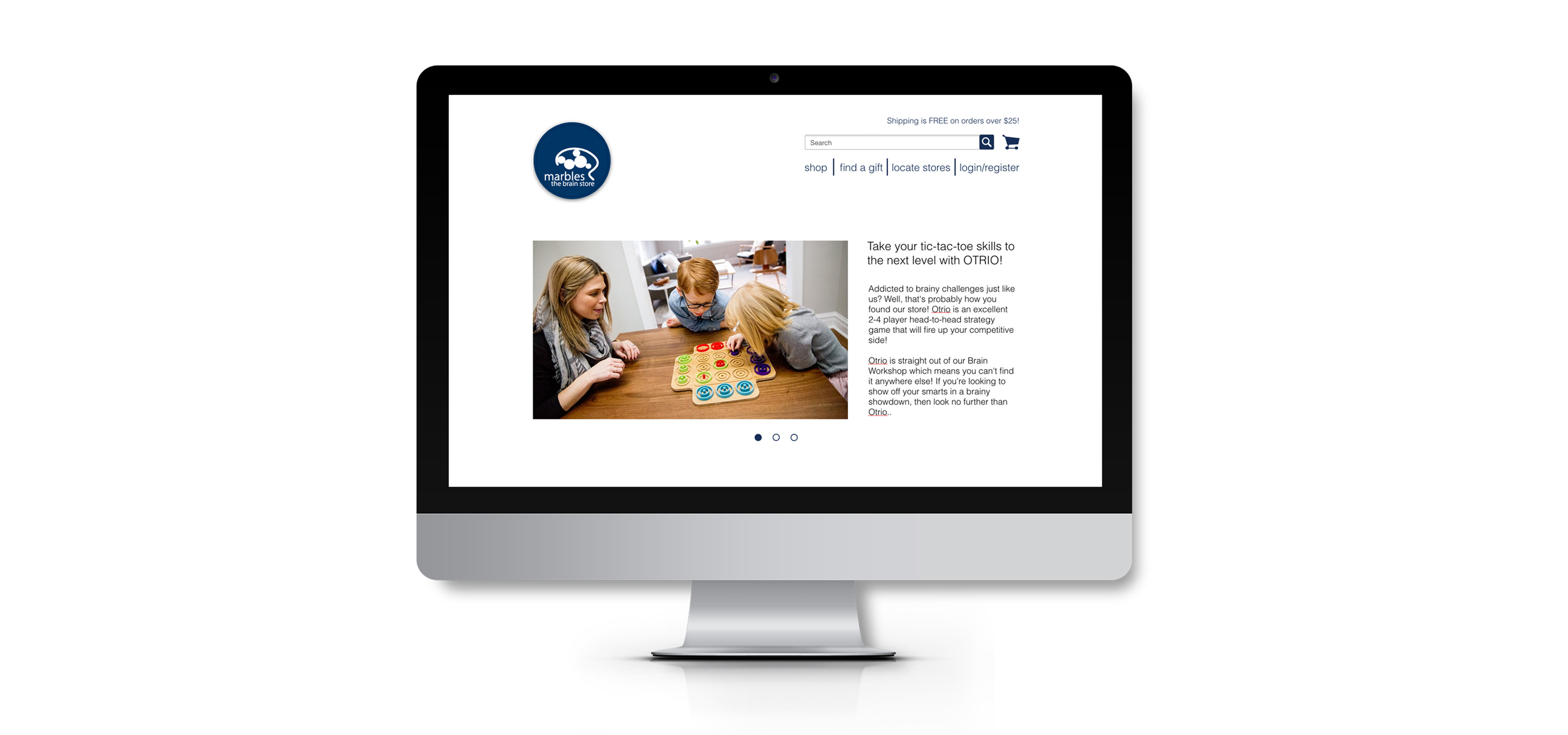
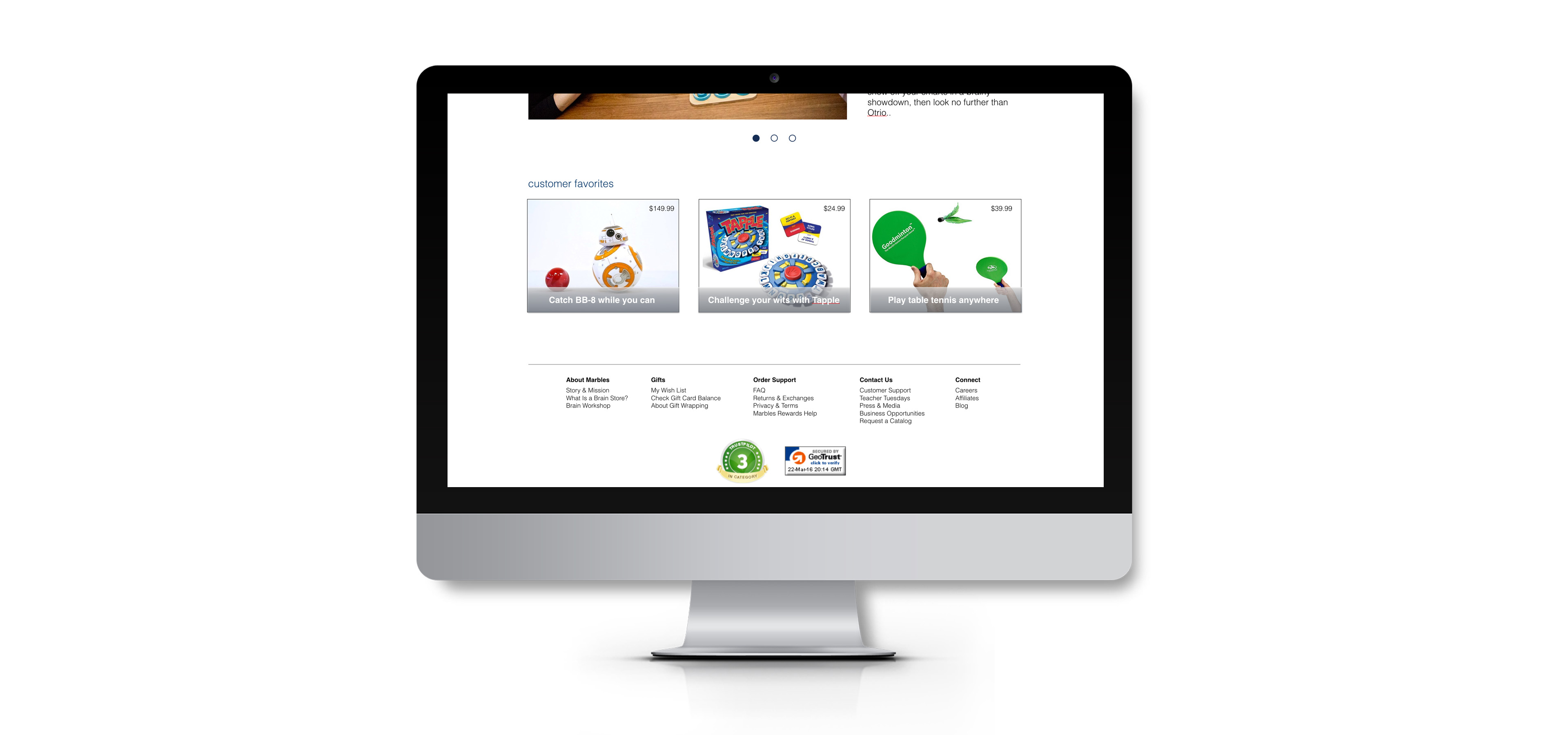
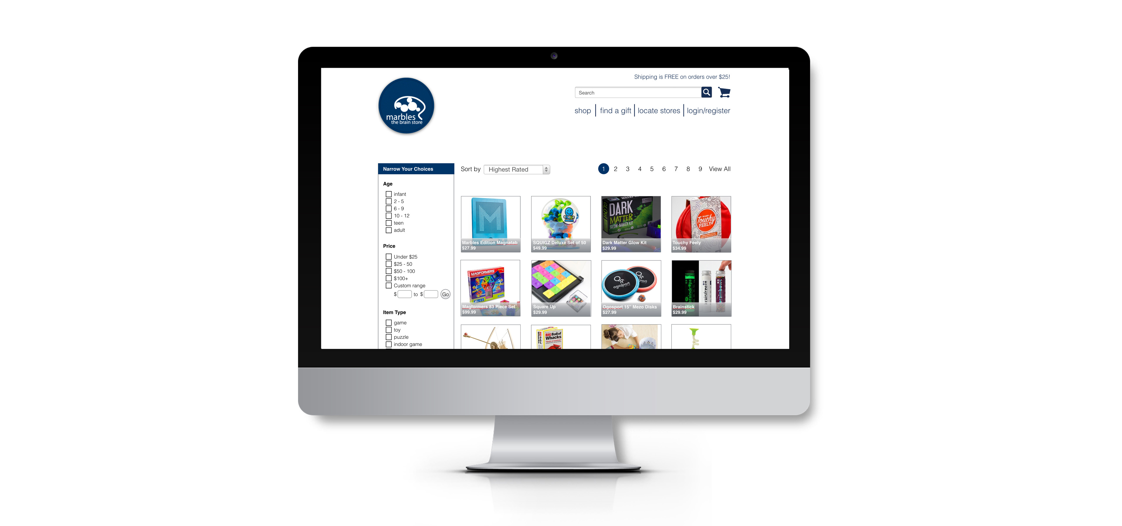
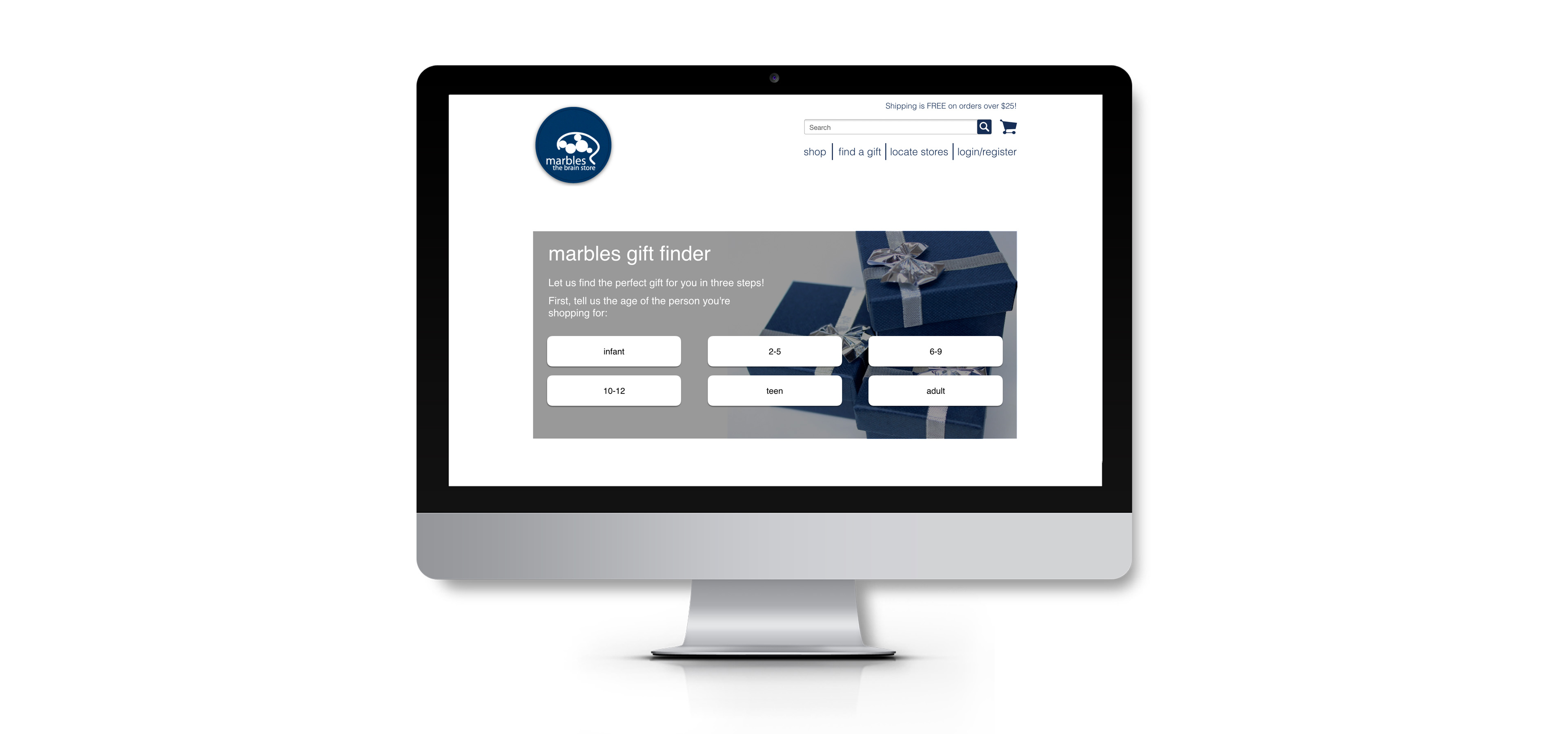
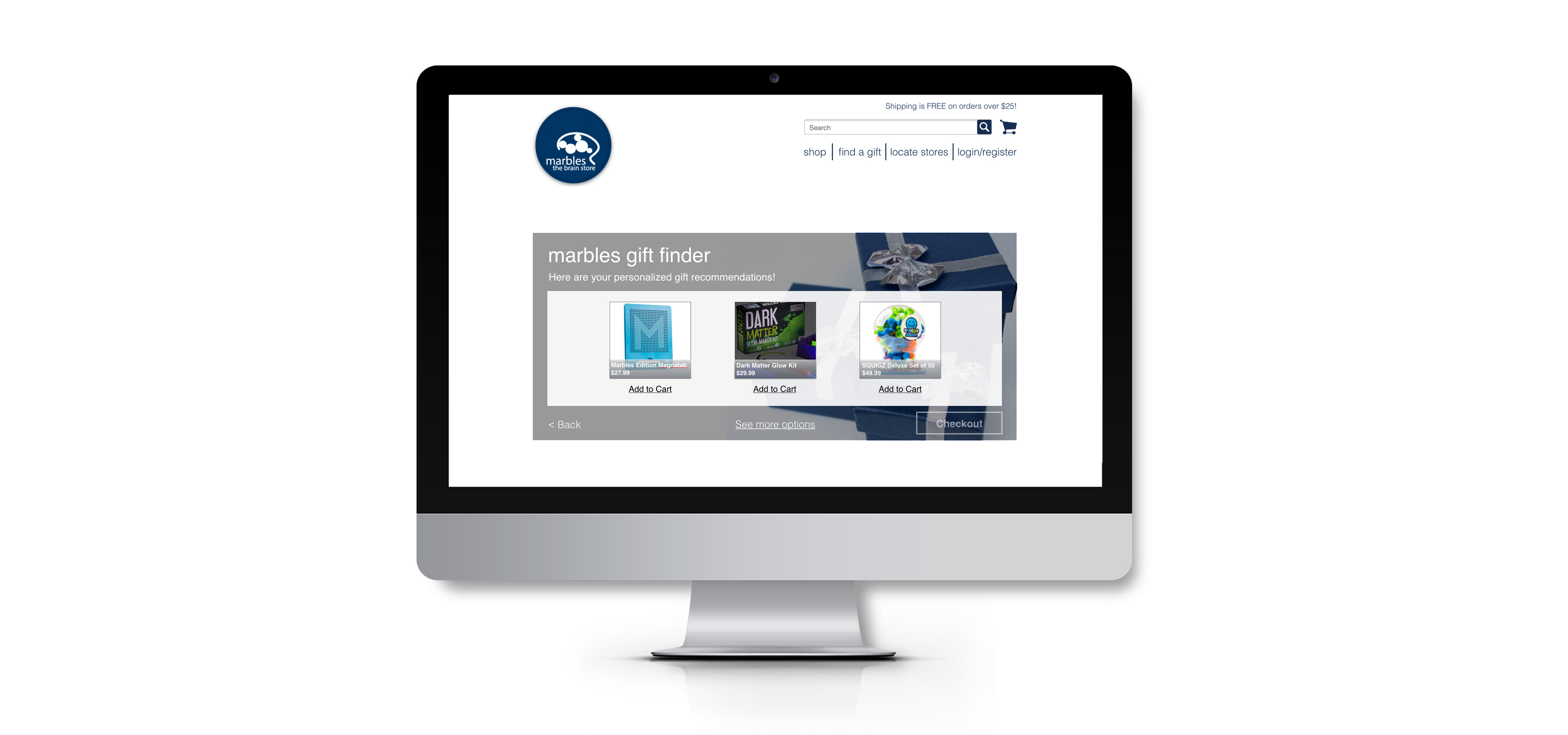
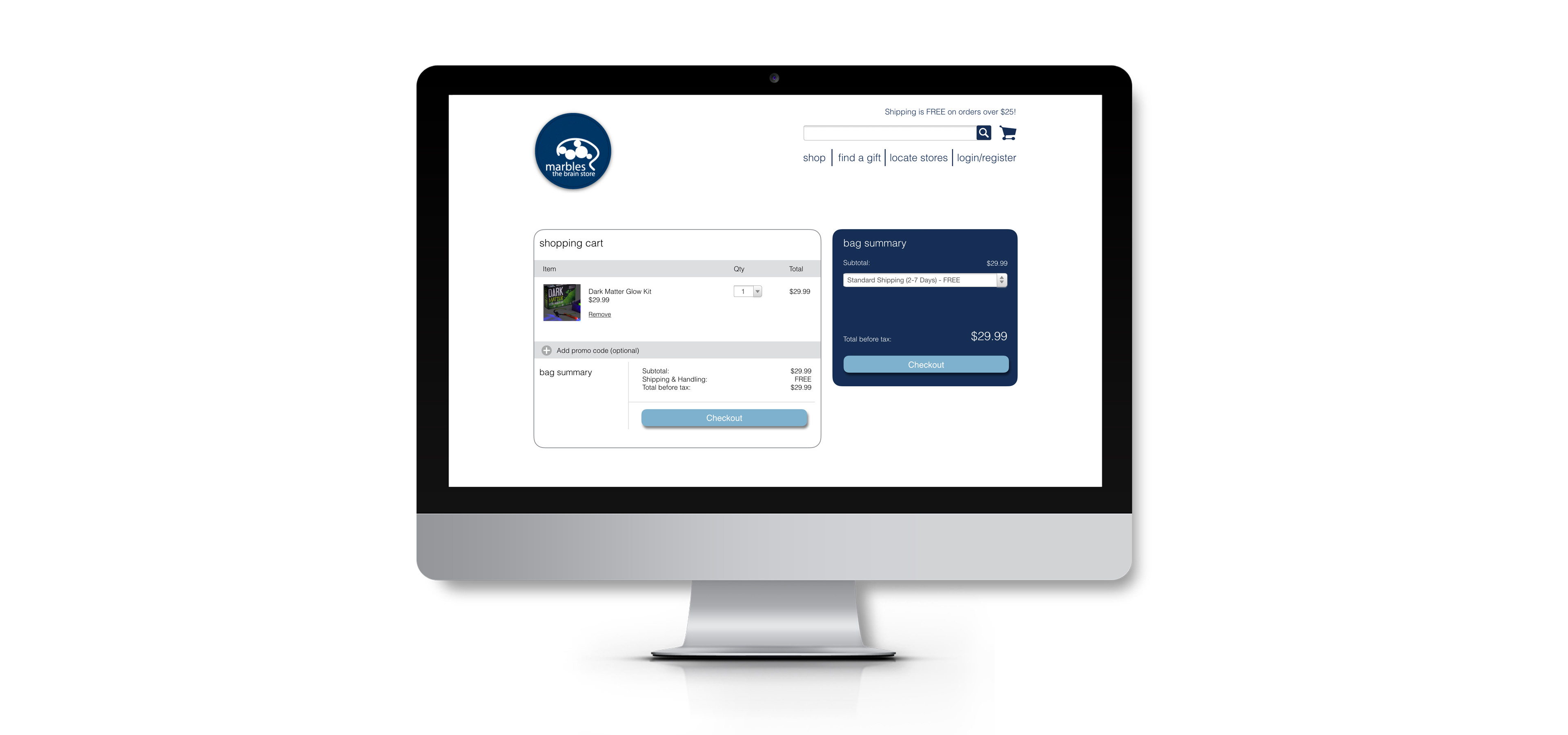
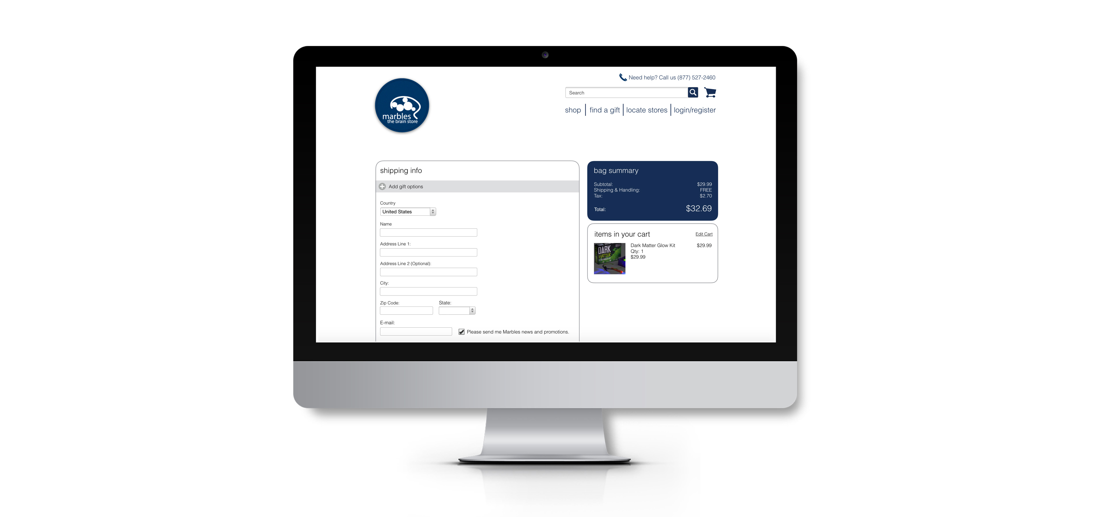
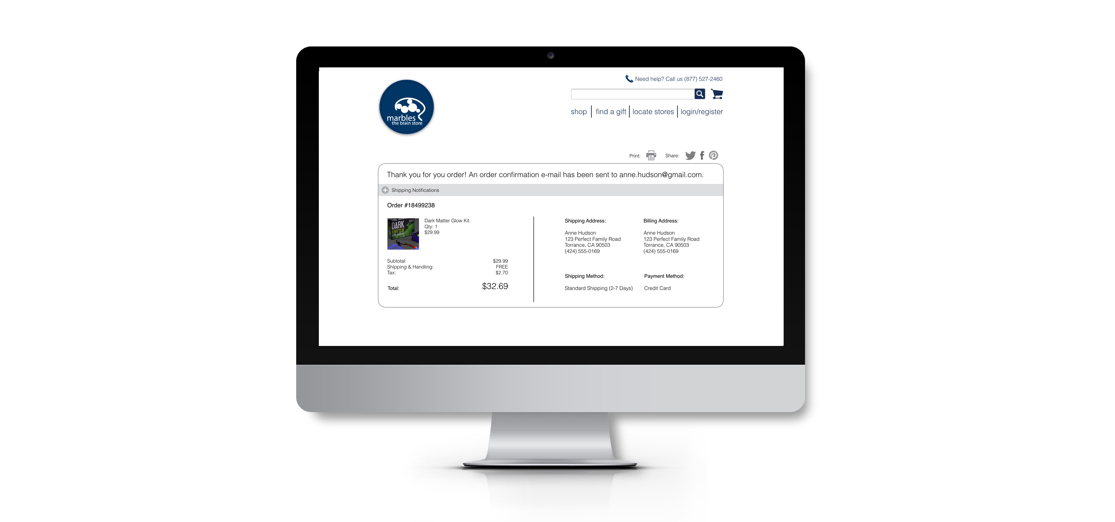
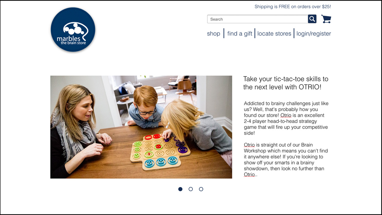
HIGH-FIDELITY SCREENSHOTS
RESEARCH
STORE MANAGER INTERVIEWS
I interviewed store managers at two different Marbles locations to get a sense of customer demographics.
Key Points:
- Gifts are a major source of revenue for the stores
- While in-store shoppers come from a wide range of demographics, website customers are mostly mothers shopping for their children.

USER PERSONA
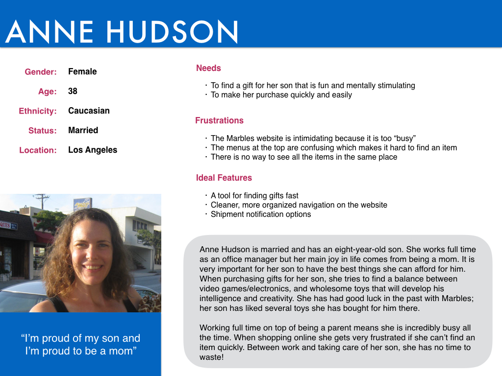
Based on my research so far I was able to create a user persona: Anne Hudson, a 38-year old married mother of an 8-year-old son.
Key Points:
- Anne works full-time on top of parenting, so she is extremely busy
- Anne is a loyal Marbles customer; she likes that their products are good for her son's brain development
CARD SORTING
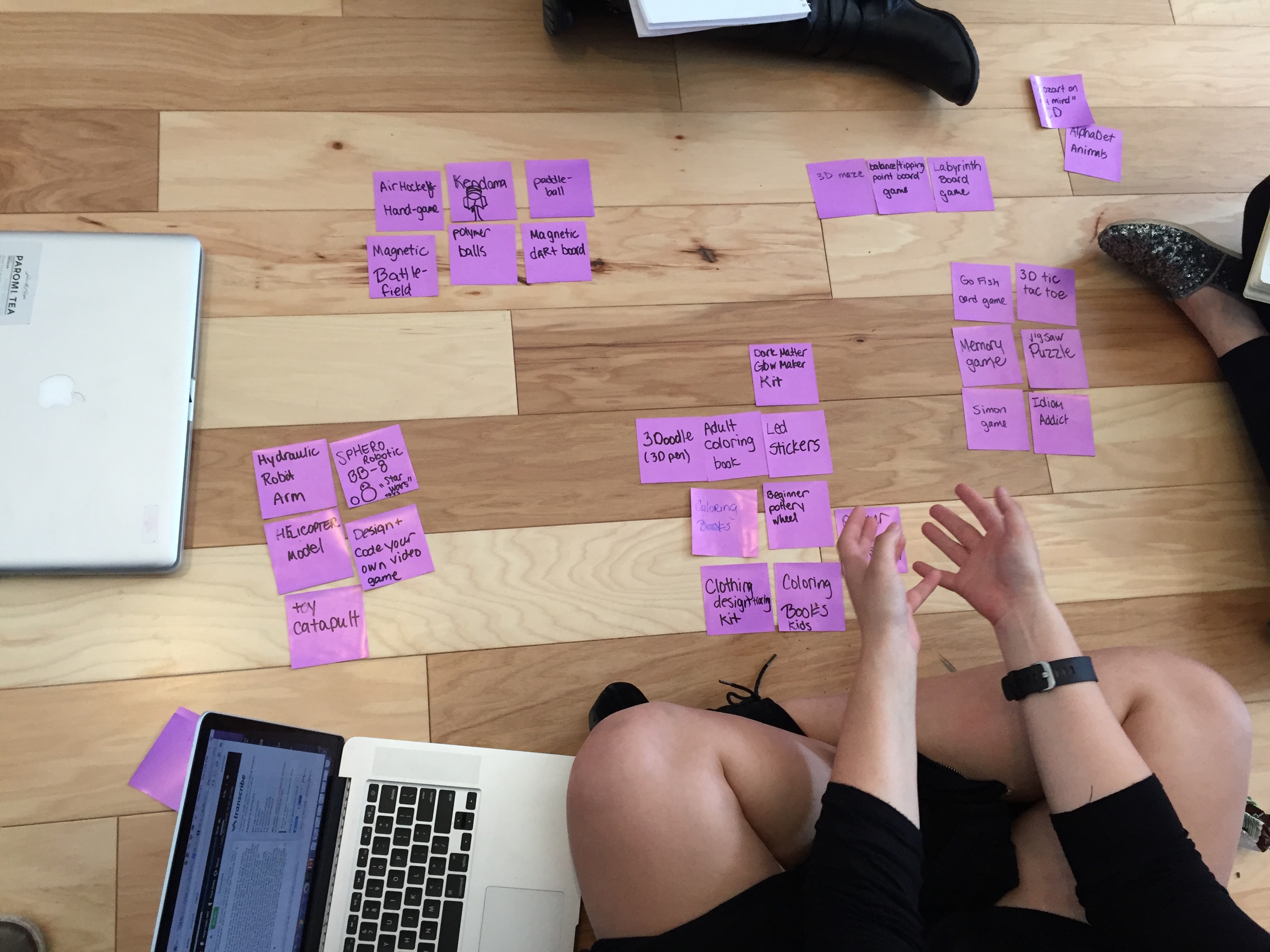
Now that I knew my target demographic I set out to learn their needs. I started with a card sort to find out how they divided Marbles items into categories.
Key Points:
All testers divided games into "indoor" and "outdoor" categories
All testers included an "arts & crafts" category


CONTEXTUAL INQUIRY
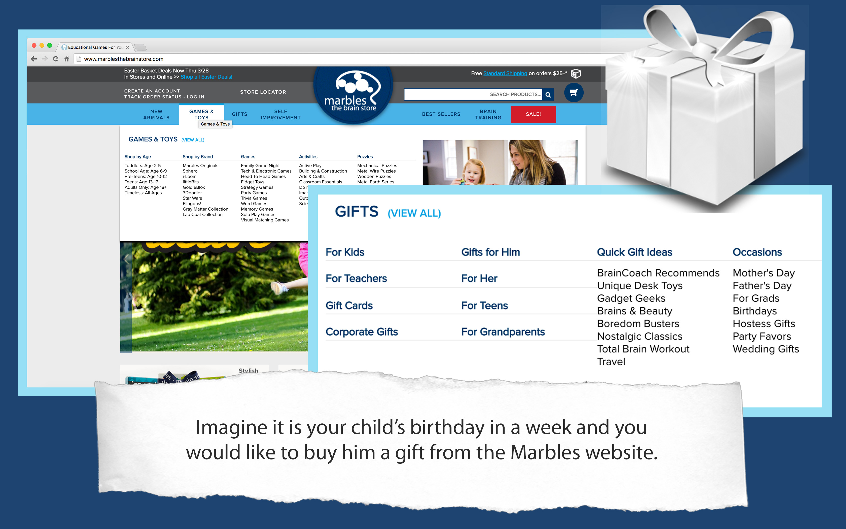
I also wanted to verify what was frustrating users about the website, so I had several testers use it to find a gift for their child, and observed the problems that they had during the process.
Key Points:
- Everyone went to the "gifts" menu first, but got quickly frustrated about what to do next - the sub-menus overwhelmed them
- They also tried to shop via the item listings, but they didn't like that there was no comprehensive page with all items
DESIGN
SKETCHES
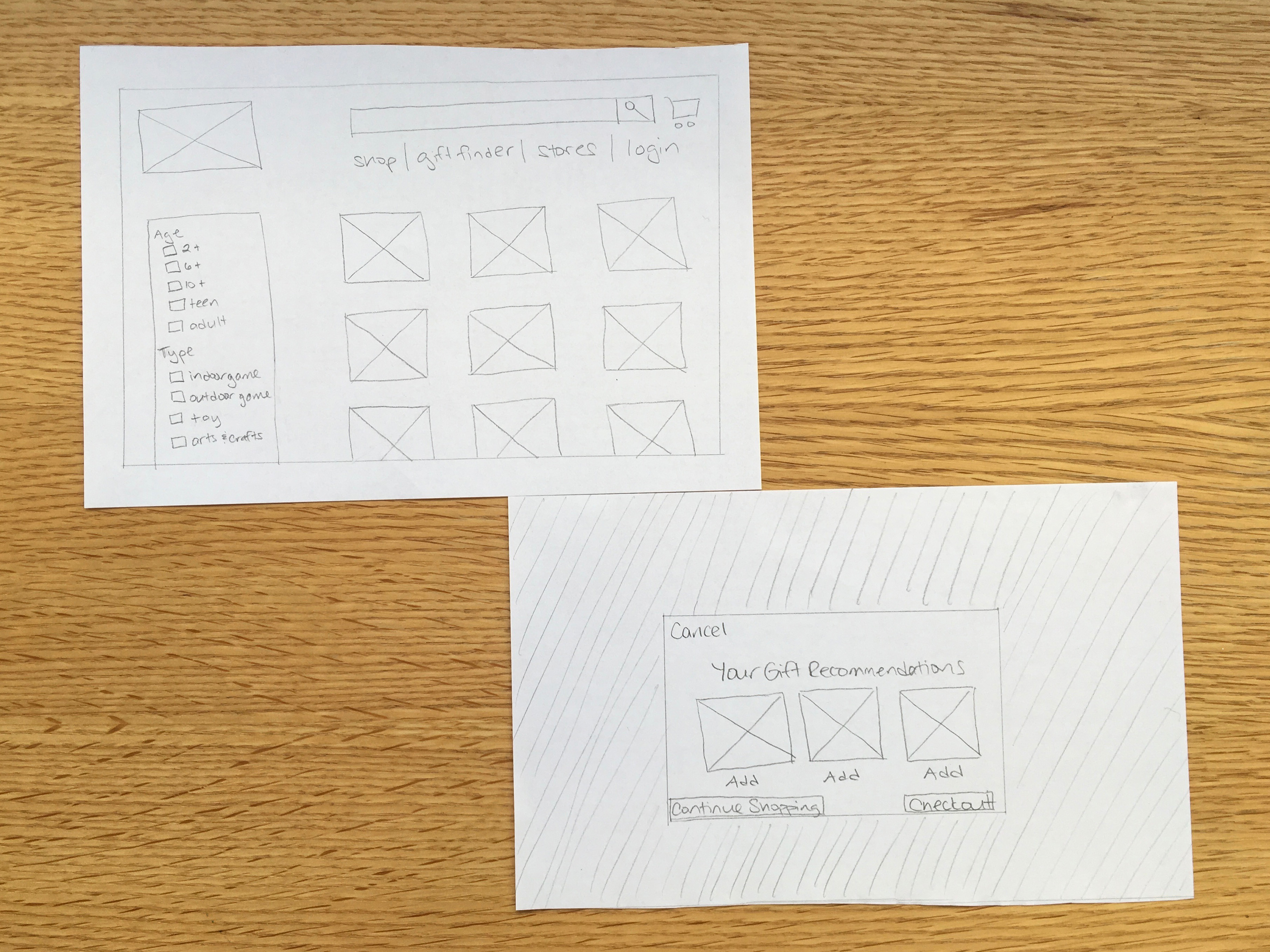
Now that I knew the thought process of my target users, and had determined what features were necessary, I started the design process by sketching out my ideas.
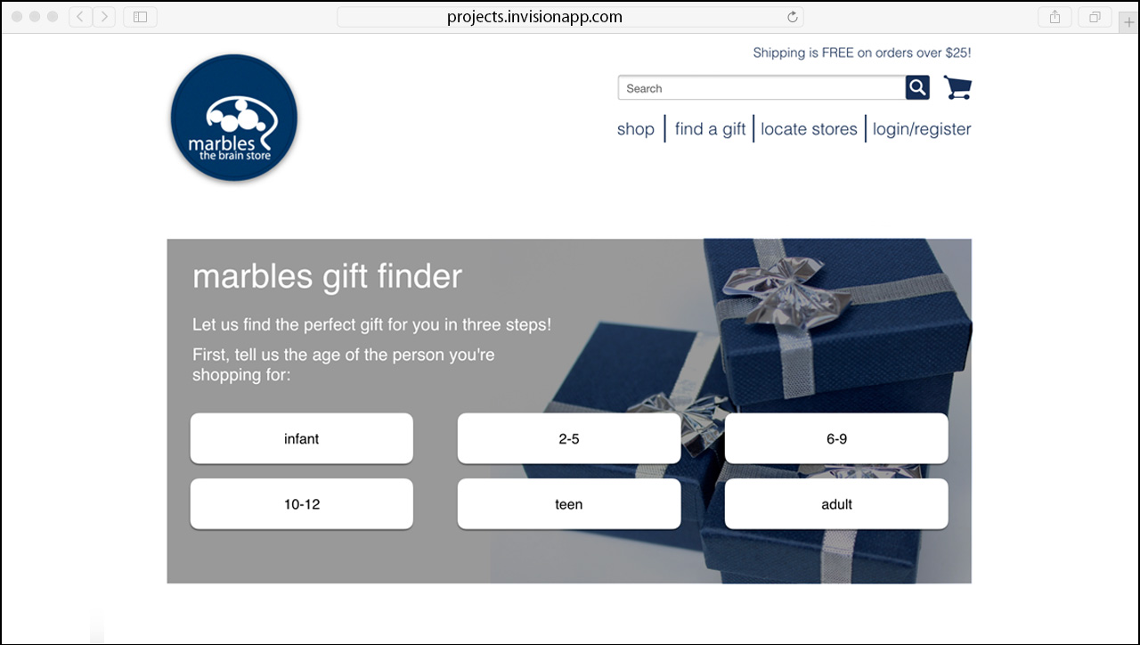
I wanted to make sure to include an easy way to shop for a gift, so I developed the "Find a Gift" section - an easy 3-step tool customers can use to get quick gift recommendations.
USER TESTING
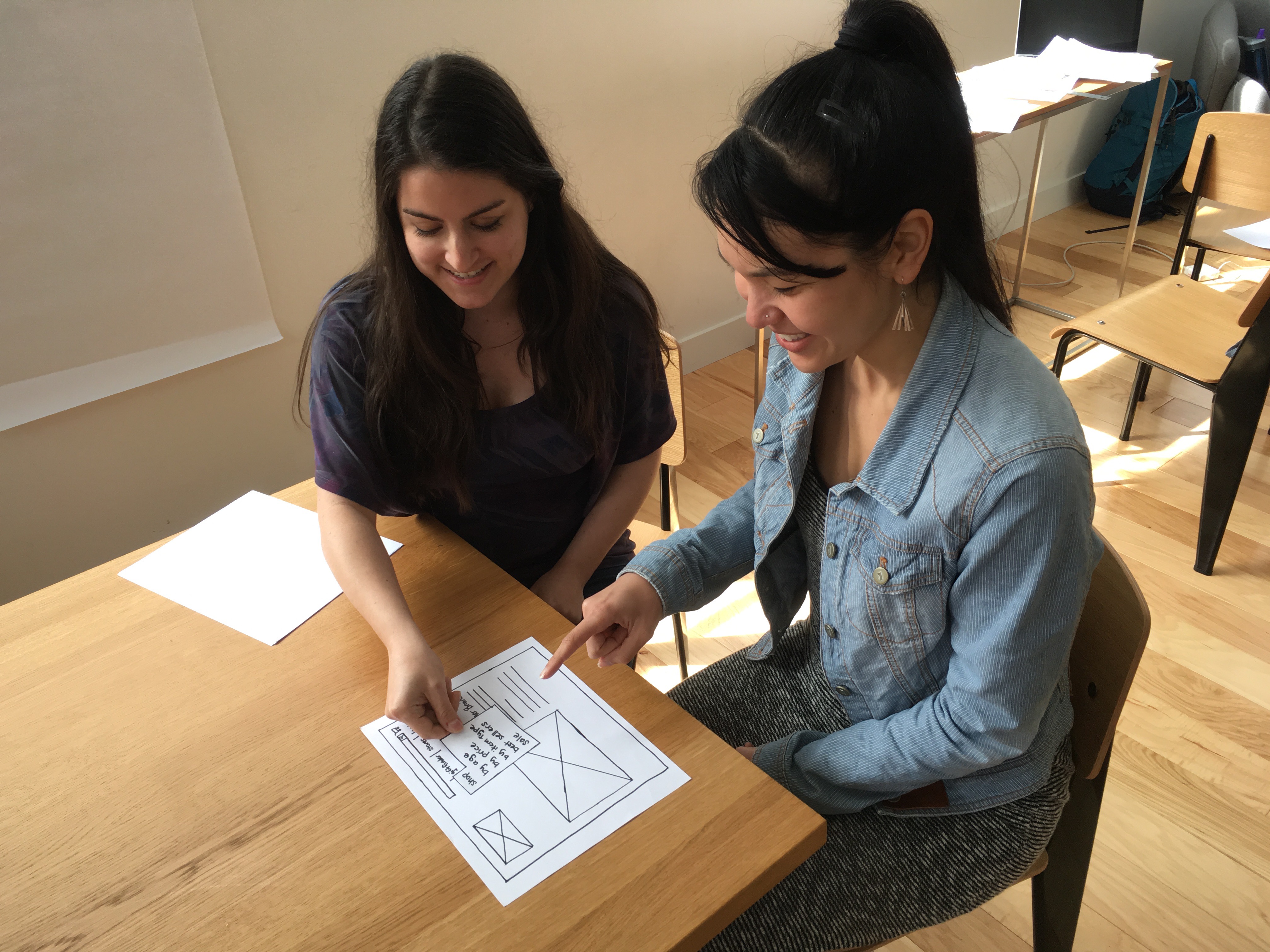
I tested the next iteration of my sketches using the Wizard of Oz method, acting as the "computer" while testers went through the sketched-out screens.
Key Points:
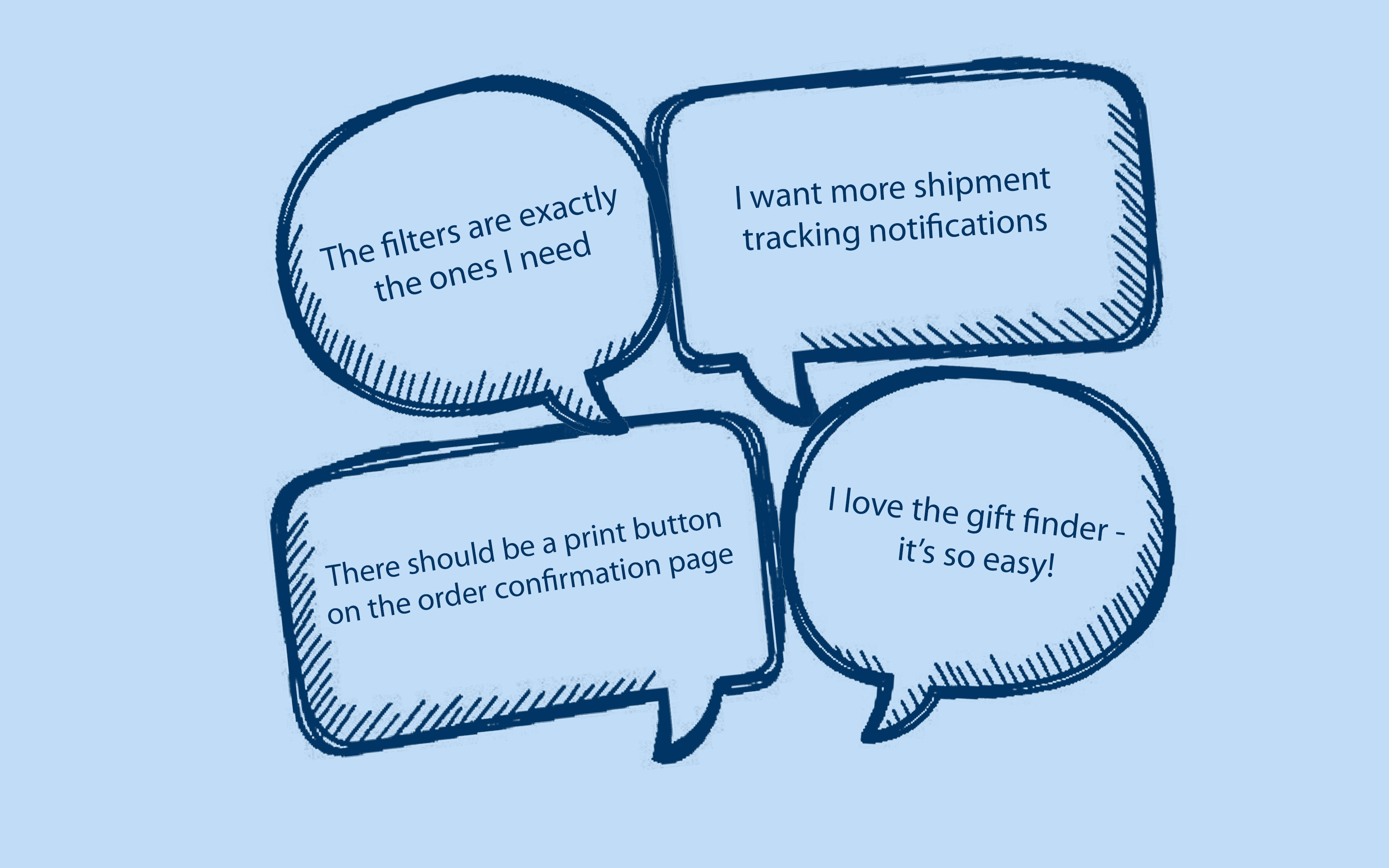
The gift finder tool got very positive responses
Testers weren't happy with the secondary navigation under the "shop" menu - I had included the categories "shop by age", "shop by price" and "shop by type", but they weren't sure how to see all the items at once

PROTOTYPE TESTING
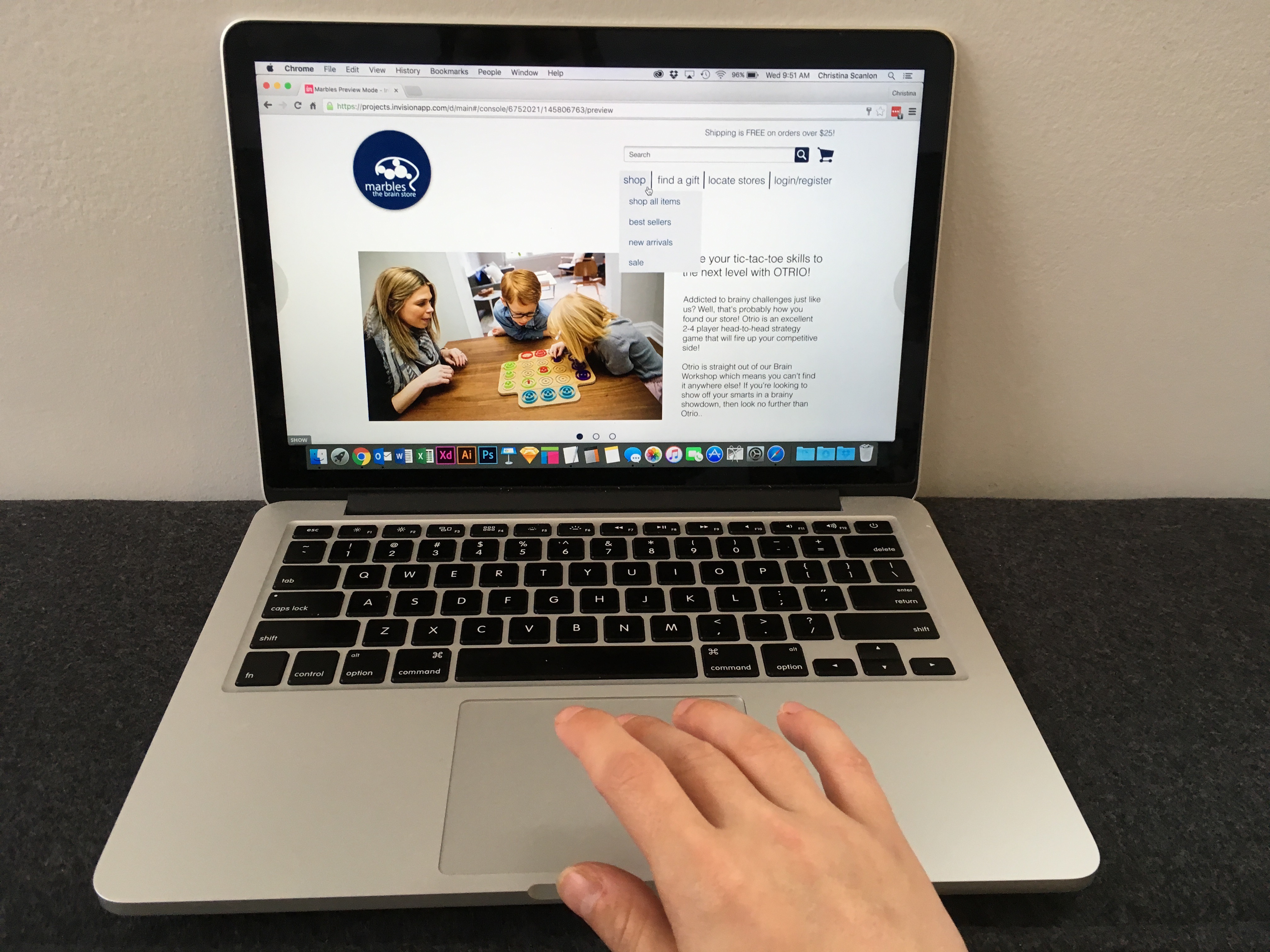
Now it was time for another round of user testing. The user feedback I got from the clickable prototype was mostly positive - they loved the gift finder as well as the comprehensive product listing page. They did have a few minor complaints though, such as wanting shipping notification options on the order confirmation page.
REVISED PROTOTYPE
I integrated the user feedback from the prototype testing into my design. I also redesigned the gift finder UI after consulting with developers about what was possible to build. My final prototype design is user-tested and much easier to navigate than the original site, meaning the busy moms of the world can go back to worrying about their kids instead of how to use the website.
BEFORE & AFTER
© 2018 Christina Scanlon. All Rights Reserved.


