
OVERVIEW
Noovie’s goal is to be a one-stop-shop website for all things movie related. Users can come to Noovie.com to see showtimes, trailers, movie news and even streaming information. There are also games that movie lovers can play to test their movie trivia knowledge and have AR experiences at their local theater.
My Role: Lead UX Designer; UI Designer
Tools: Sketch, UserTesting.com
Platforms: Responsive Web
Deliverables: Medium and High Fidelity Wireframes, Design Specs, Research Presentations

PROJECT CHALLENGES
Limited Engineering Resources
The engineering team at Noovie was under-resourced, so we didn’t have the ability to do major design changes. While we could change the style of the page and how users interacted with it, we were unable to add any new features.
Non-Holistic Design
Noovie’s key decision makers wanted to see big results quickly, so the decision was made to redesign just the homepage and ignore the other pages until later, as opposed to thinking more holistically about the site as a whole.
ORIGINAL DESIGN
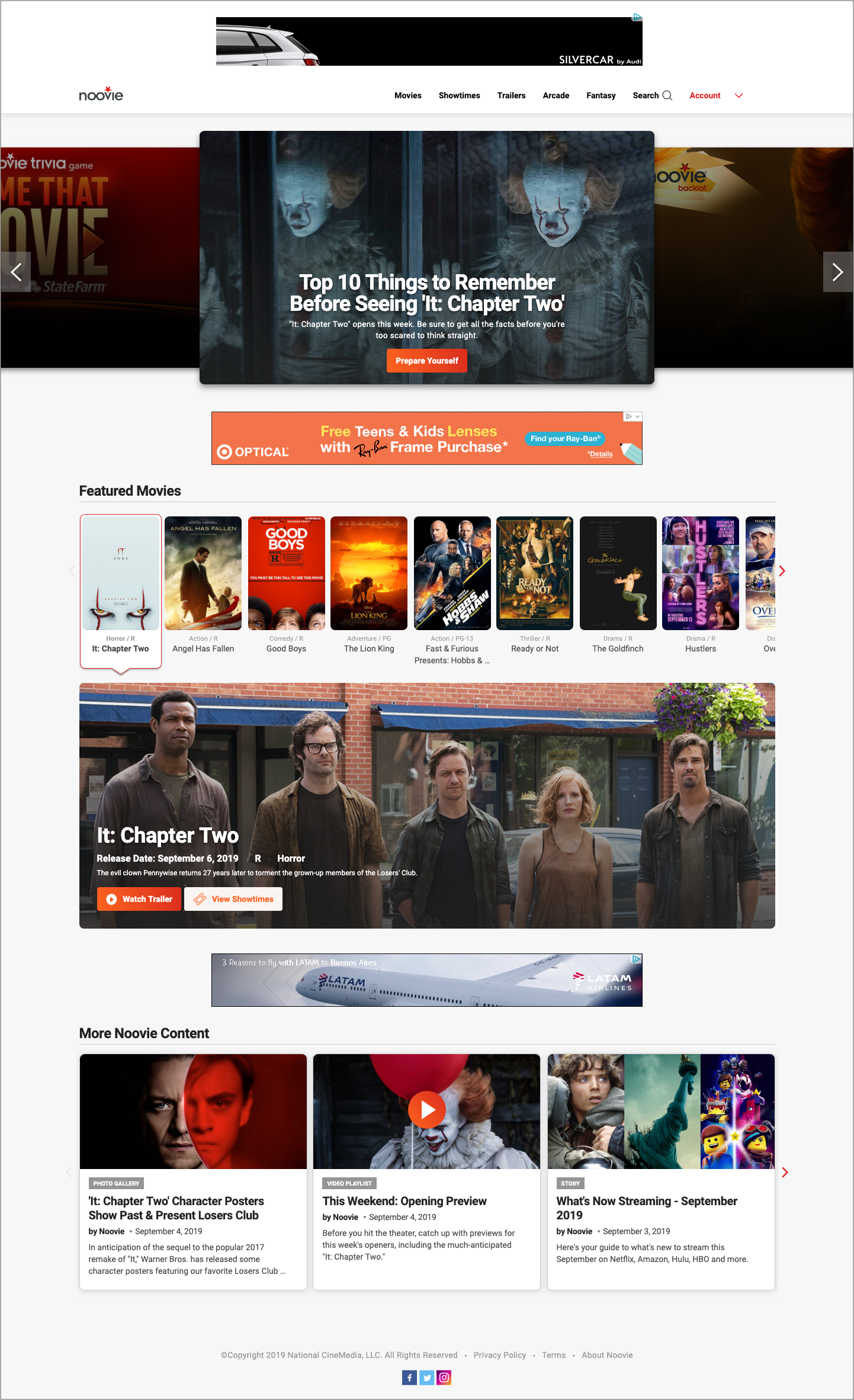

The original homepage consisted of:
- A carousel at the top that showcased new content
- A “Featured Movies” section highlighting movies in theaters
- Editorial content (original articles and other pieces) in a paginated section at the bottom
- Ad placement throughout the page
Problems Identified
In my preliminary analysis of the design, I noticed several areas I thought could be improved. I knew I would want to include these things in user testing.
- The top carousel was manual, and the preview of the next item was hard to see - would users take the step of clicking through the items?
- The “Featured Movies” section was unintuitive and took up a large section of the page with little information
- The editorial content feed was buried at the bottom of the page despite being Noovie's most unique feature
USER RESEARCH
Using the website UserTesting.com, I conducted 2 separate tests with 10 users each. In the first test, users looked at Noovie and two other movie websites to rate which features they liked most. In the second test, users were tested to see how easily they could perform certain tasks on Noovie (ex: “How would you find movies in your area”)
Key Takeaways:
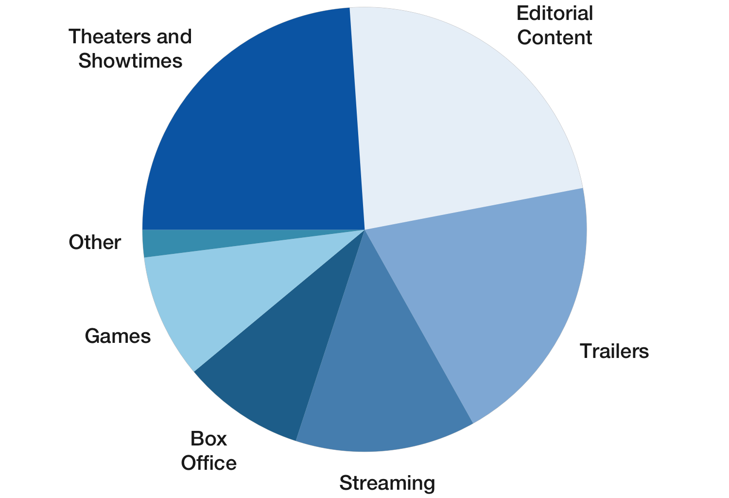
- Editorial content and theater showtimes were the two most popular features, followed by trailers
- None of the users clicked on the carousel to see the next item
- Users were confused about how to find movies in their area, and found the “Featured Movies” section difficult to navigate
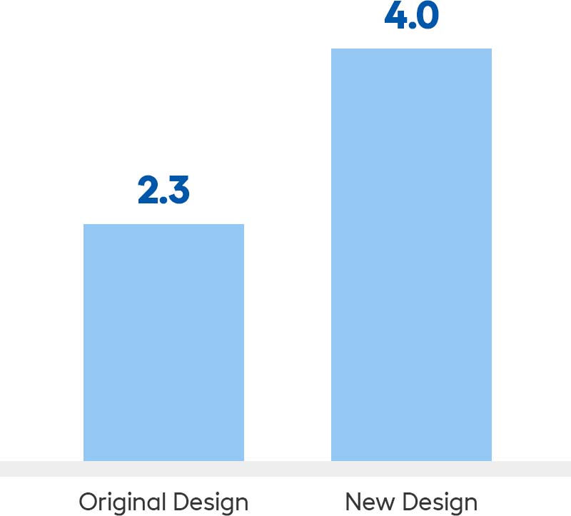
- Users gave Noovie a 2.3/5 rating when asked how likely they were to return

WIREFRAMES
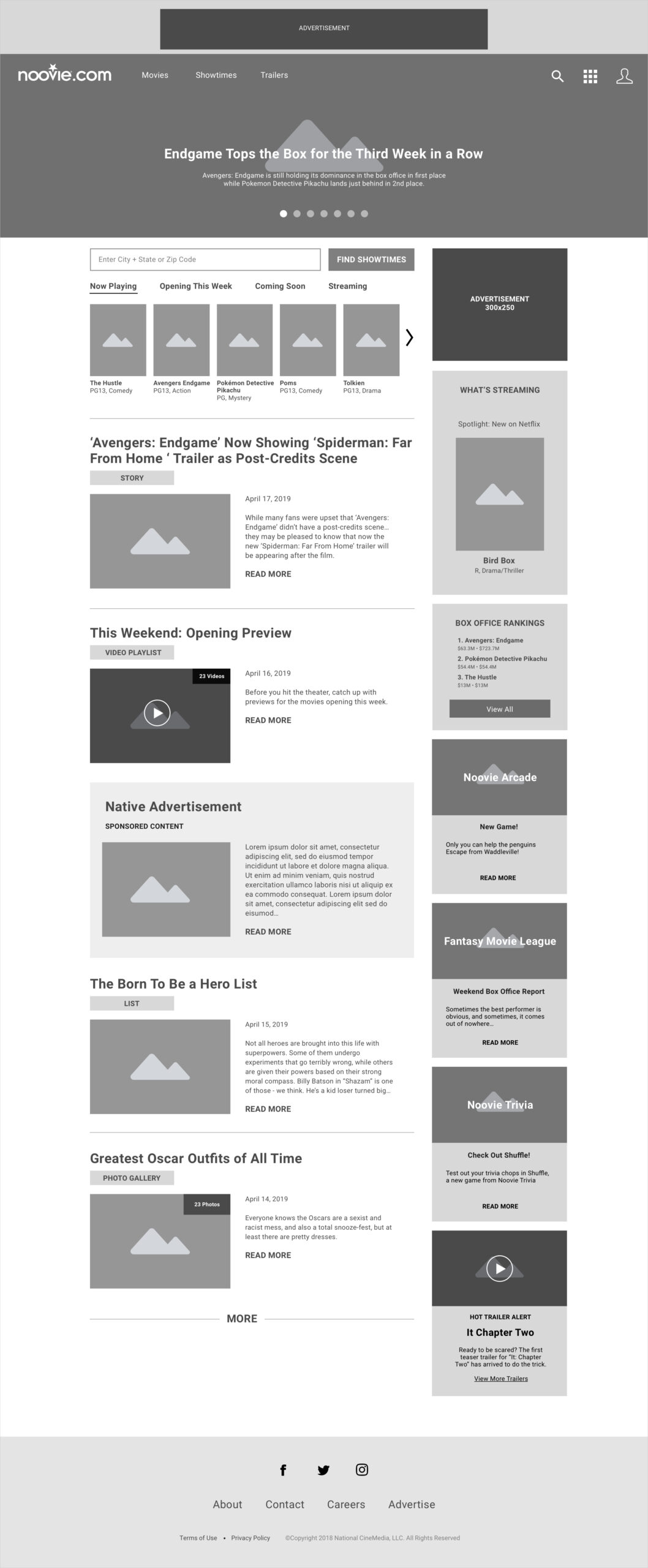

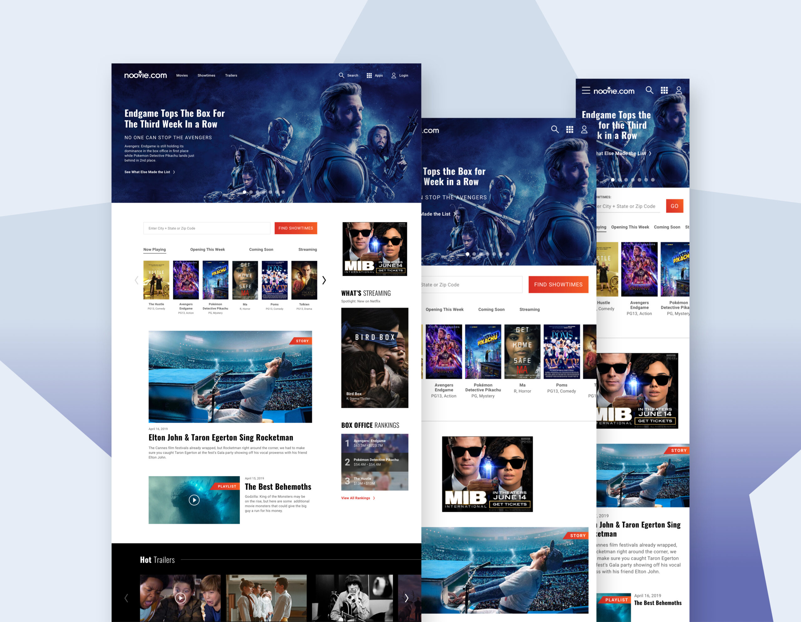
I did several iterations of wireframes for both the desktop and mobile breakpoints. Here you can see a sample of the desktop breakpoint.
Key Changes:
- Made the editorial content the main section of the page
- Added a "Find Showtimes" bar for easy access to theaters and showtimes
- Used a two-column layout for the larger breakpoints, so that less popular items could still be featured
- Automatic carousel rotation
After the wireframes were complete, I handed them off to my colleague for the visual design phase. While he was the one primarily responsible for the final look and feel, we collaborated multiple times a day, bouncing ideas off each other, to create a product we both felt proud of.
FOLLOW-UP RESEARCH
After the design was implemented I wanted to test its effectiveness. I conducted a new test on user testing.com, taking users through some of the same questions as before.
Key Takeaways
- Users loved the new design (especially the carousel) calling it “exciting” and “entertaining”
- Users found the layout simple to navigate, and took less time to complete the tasks
- Users gave the website a 4.0/5 rating when asked how likely they were to return

CAT (NOOVIE CMS)
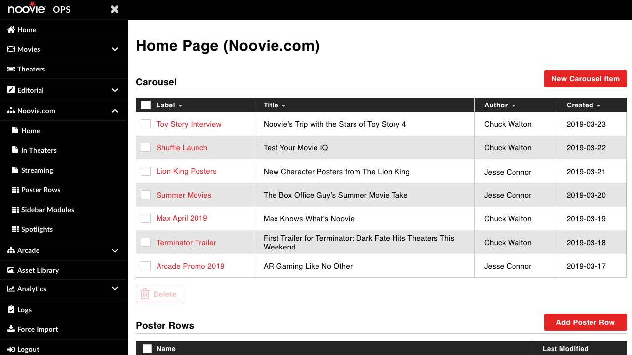
Noovie had a custom-built CMS called CAT (Content Administration Tool), used by the content team to manage the content of Noovie.com and other websites. For example, in order to create a carousel item on the Noovie homepage, the content team would have to upload an image and input a header, CTA text, etc.
REDESIGNING CAT
CAT was built without input from any designers, and very little input from the content team. Carousel management was one of many features I was able to redesign along with the new homepage.
I sat down with the content team and had them show me their process for creating a carousel item.
Pain Points:
- Carousel items were created directly in homepage management
- No way to save a carousel item and reuse it later
- Difficult to find specific carousel items at a glance (no images)
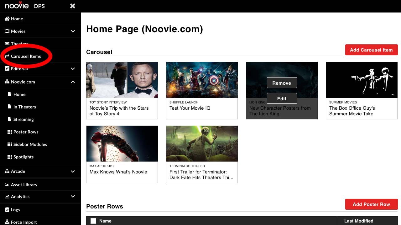
NEW CAROUSEL MANAGEMENT DESIGN
I built out a prototype and tested it with the content team. They loved it! The new design was implemented shortly thereafter.
Key Changes:
- Carousel items are created and managed in their own section, separate from the homepage
- Carousels can be stored for later use
- New grid view with images for easy searching
REFLECTIONS ON NOOVIE
There were many frustrating constraints around re-designing Noovie, and I sometimes think about what we could have done without those constraints. If I were still working on Noovie today, and had unlimited resources, some of the first things I would do are:
- Add personalization features to make the user experience more valuable
- Research the effectiveness of Noovie vs. Google or IMDB for quick movie info
- Continue to overhaul CAT with the goal of making it 100% user-friendly


© 2022 Christina Scanlon. All Rights Reserved.
