
OVERVIEW
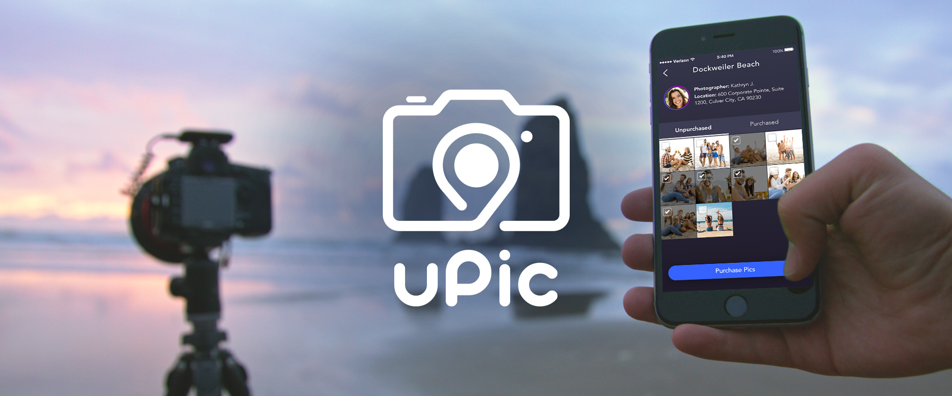
Have you ever found yourself in a scenic spot with your family or significant other, wanting something better than just a selfie? Or maybe you’re a photography hobbyist looking to make some extra money on the side? If so, uPic is the app for you, connecting people with photographers near their location for on-demand photo shoots to properly capture life’s memories.
My Role: Sole Designer - UX/UI, Branding
Tools: Sketch, Illustrator, InDesign
Platforms: iOS
Deliverables: Logo & Style Guide, Medium & High Fidelity Wireframes, Design Specs
HIGH FIDELITY SCREENSHOTS
PROJECT CHALLENGES
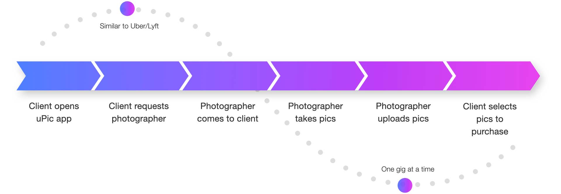
An app like uPic would normally be two separate apps, like Uber or Lyft: one app for the client, and one for the photographer. However, uPic was a start-up in its earliest stage and did not yet have the resources to develop two apps. Therefore both feature sets would have to be included in a single app, and yet also be clearly separated.
Also for budget reasons, the timeline of the project was very short: all design would have to be completed within 6 weeks.
INITIAL CONCEPT
RESEARCH
uPic elected to conduct discovery research on their own, however I did meet with them to help them strategize what research was needed and what questions to ask. When the results of the research were in, we met to discuss what was learned and what adjustments we should make to the requirements.


LOGO & BRANDING DESIGN
The project officially kicked off with the branding phase. I started by asking uPic a prepared list of questions (“If your brand was a person, what would that person be like?”) to get them to think about what type of brand they wanted to be. We decided that the uPic brand should primarily be modern and approachable, targeting a young upscale demographic, however it should still be trustworthy and authoritative underneath. With these characteristics in mind, I began designing the logo.
BLACK & WHITE CONCEPTS
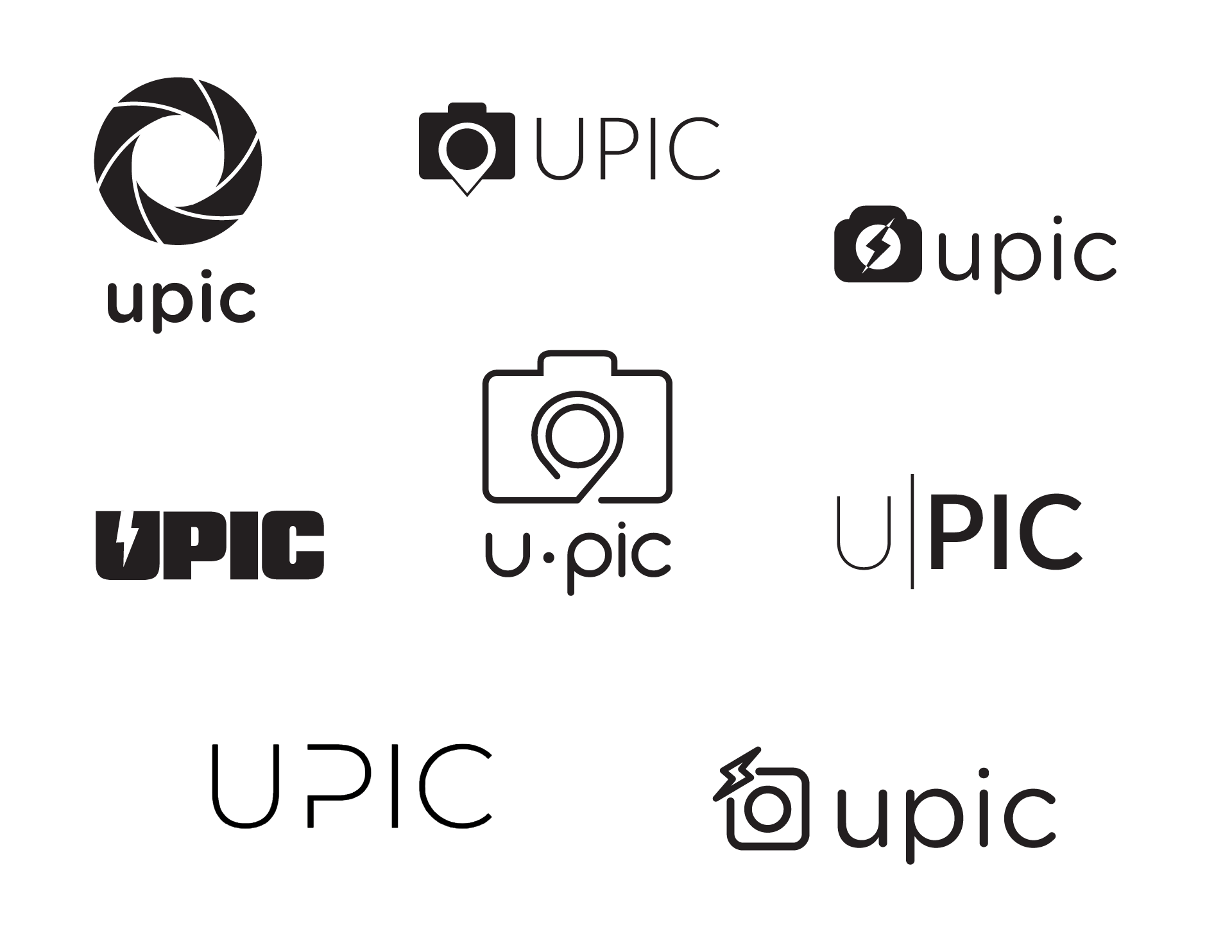
I began designing the logo in black and white only, as I wanted to make sure that it could stand on its own as a shape even without any color. I took heavy inspiration from photography-based imagery, such as cameras and lens shutters. I also played around with incorporating a location pin to emphasize the on-demand nature of the product. The client picked two directions they liked best, and I spent some time honing those further until a clear winner emerged.
Here are some concepts from the first round of logo design:
COLORS & FONTS
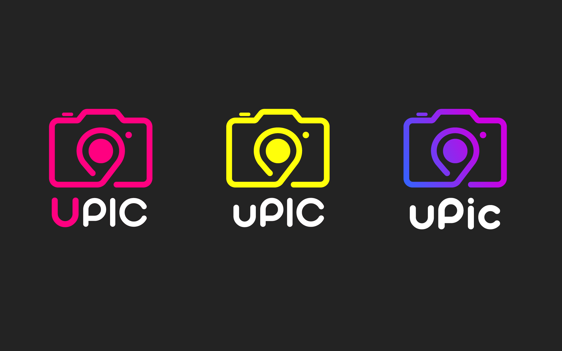
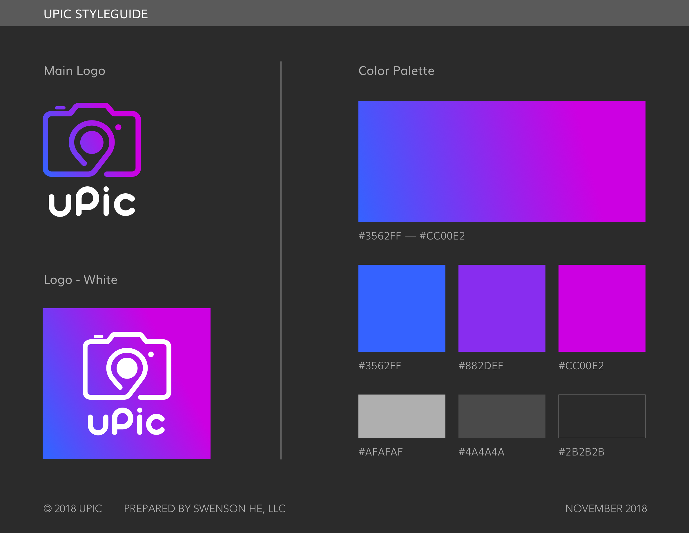
uPic wanted their logo to really “pop”. In order to achieve this, I chose to explore very bright colors against a dark background. The dark background also gives the brand some gravitas, balancing out the "modern" vibe with trustworthiness, like they wanted.
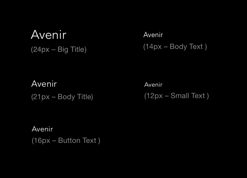
The chosen font is very rounded, giving it an approachable feeling. I adjusted the lettering to even out the letters and give it a heavier weight. After presenting uPic with various options on capitalization, they chose one with mostly lowercase letters to keep it friendly looking, but with an uppercase P to separate the syllables of the name.
UX DESIGN
With the branding design complete, it was time to move on to the app itself! I started with wireframes in order to solidify the UX of the app before exploring the visual design.
APP ARCHITECTURE
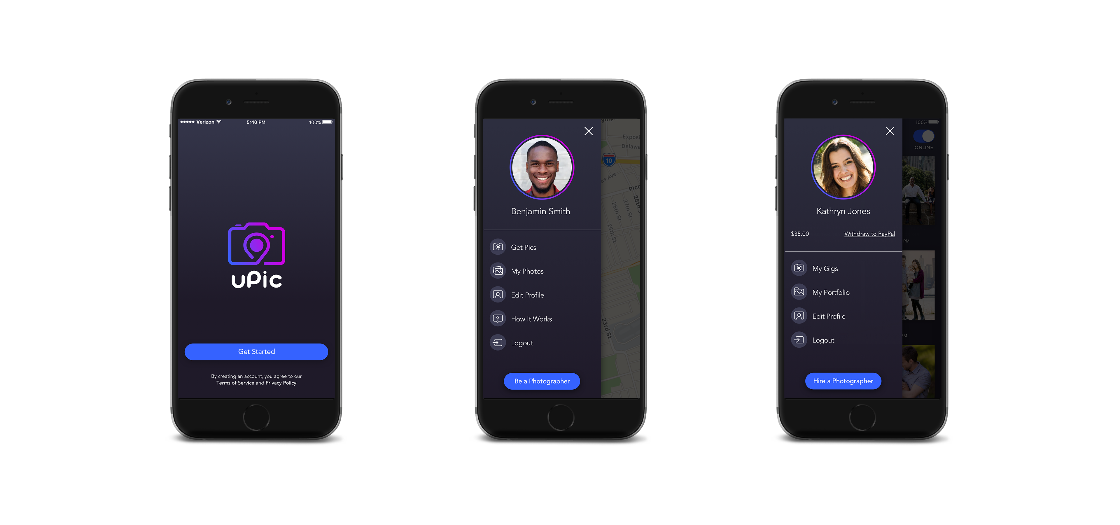
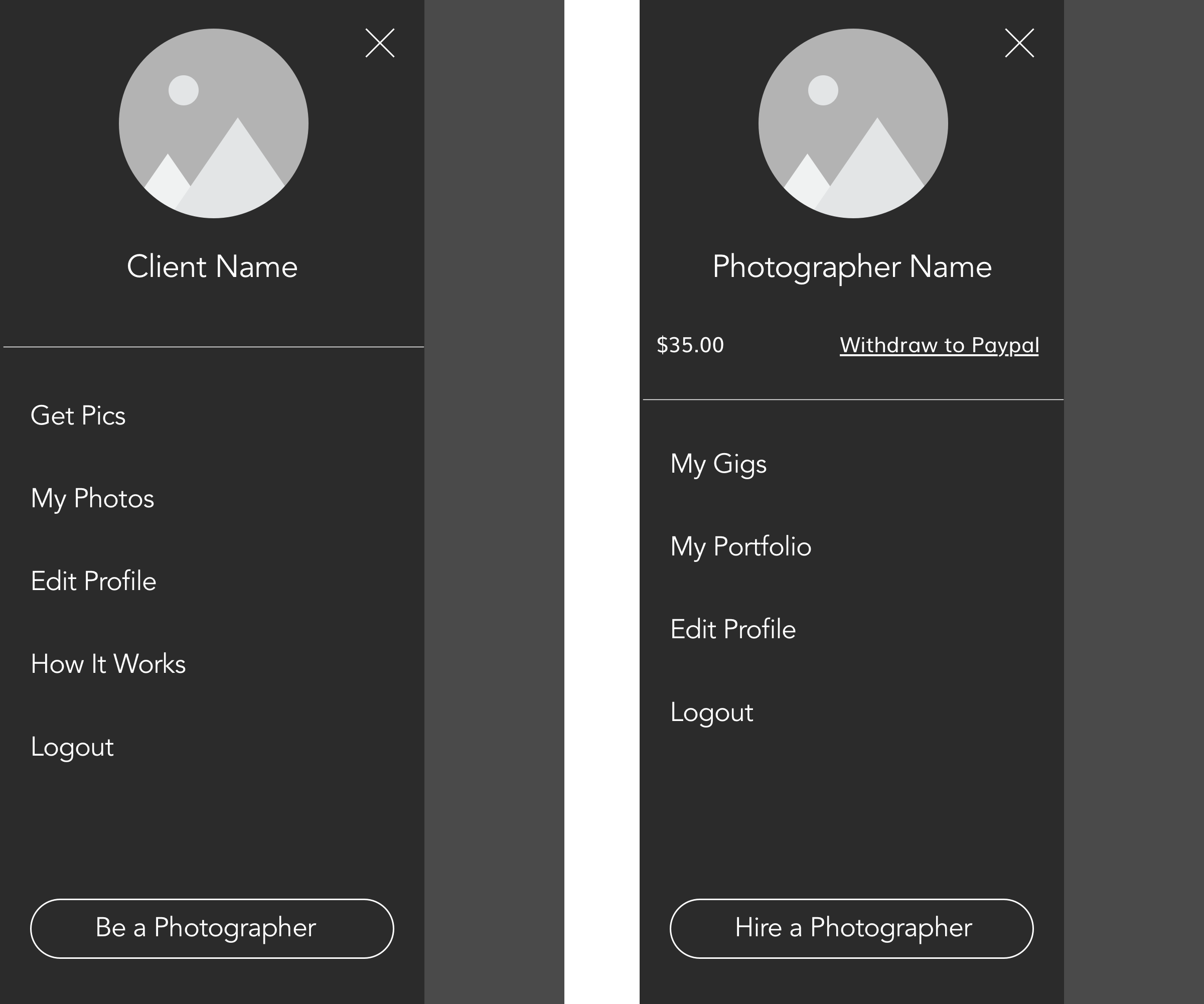
Since uPic is really two apps in one, it has a dual hierarchy with two different menus. The user can switch between sides by tapping a button at the bottom of each menu. Only the “edit profile” and “logout” features are shared by both sides of the app.
CLIENT SIDE FEATURES
Get Pics: book photographer, track progress
My Photos: view and purchase photos
How It Works: tutorial screens
PHOTOGRAPHER SIDE FEATURES
My Gigs: track gig, upload photos, gig history
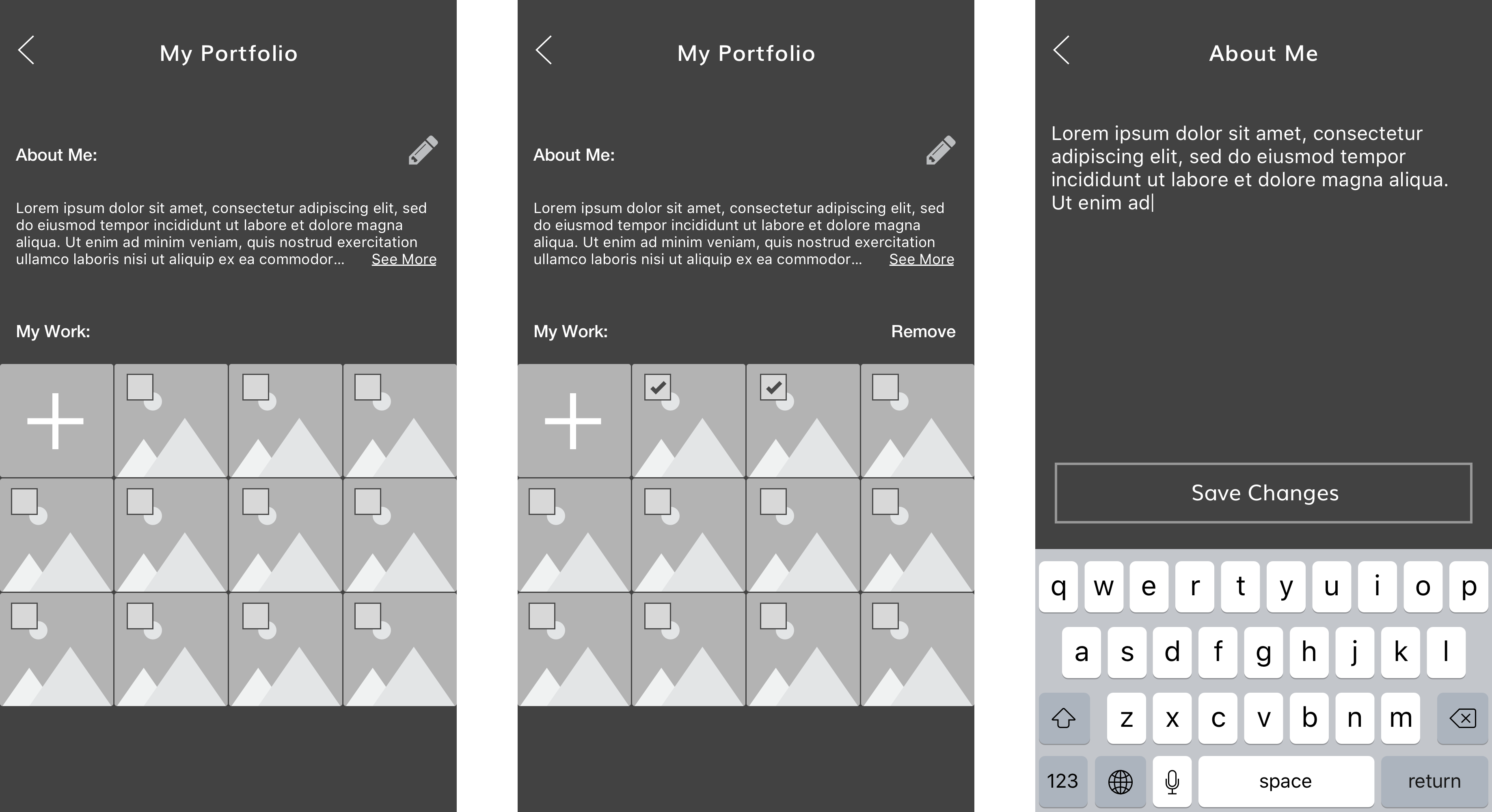
Portfolio: description and example photos
PayPal: balance withdrawal
GET PICS
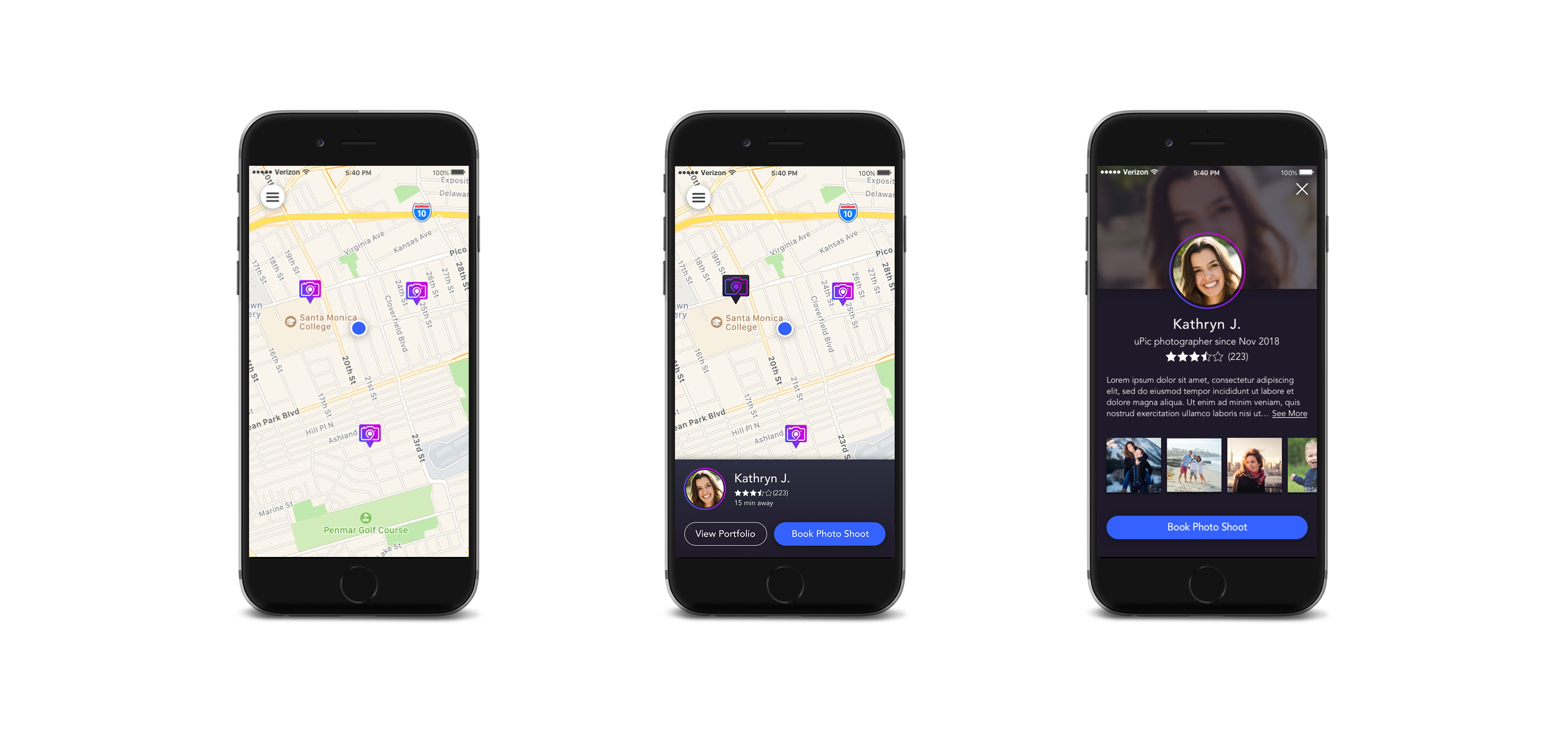
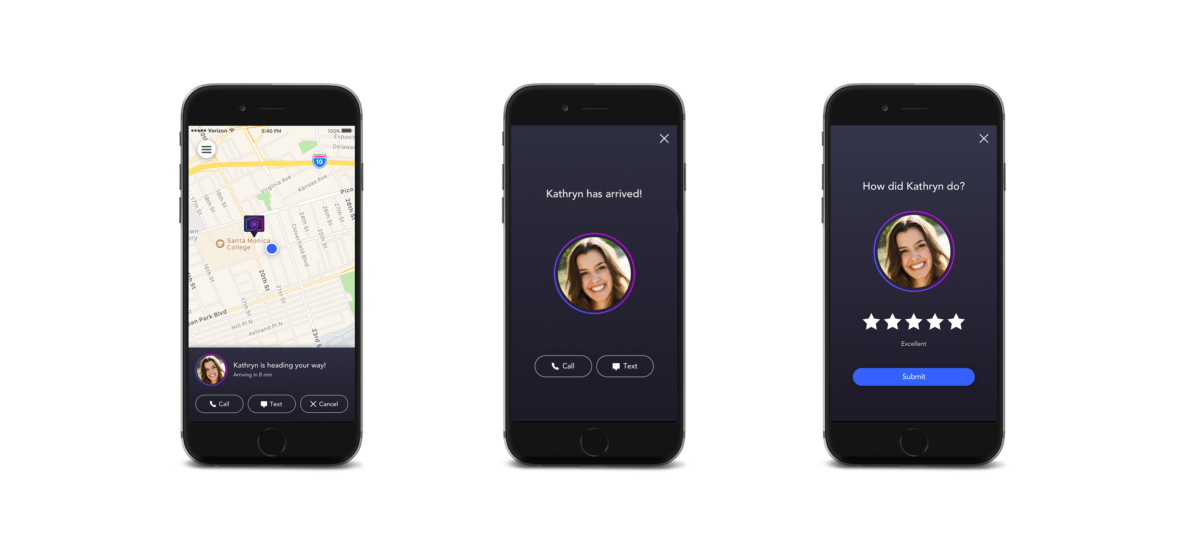
The heart of the client side is the map, so I took inspiration from other on-demand economy apps in which the home page is a full screen map. After the client taps on a photographer pin, a bottom panel appears which allows the user to book the photographer and track their status. The client can also contact the photographer or cancel the shoot.
Once the photographer arrives, the screen reverts back to its default state, and the photo shoot is listed as “in progress” in the My Photos section until the photographer closes out the session.
MY PHOTOS
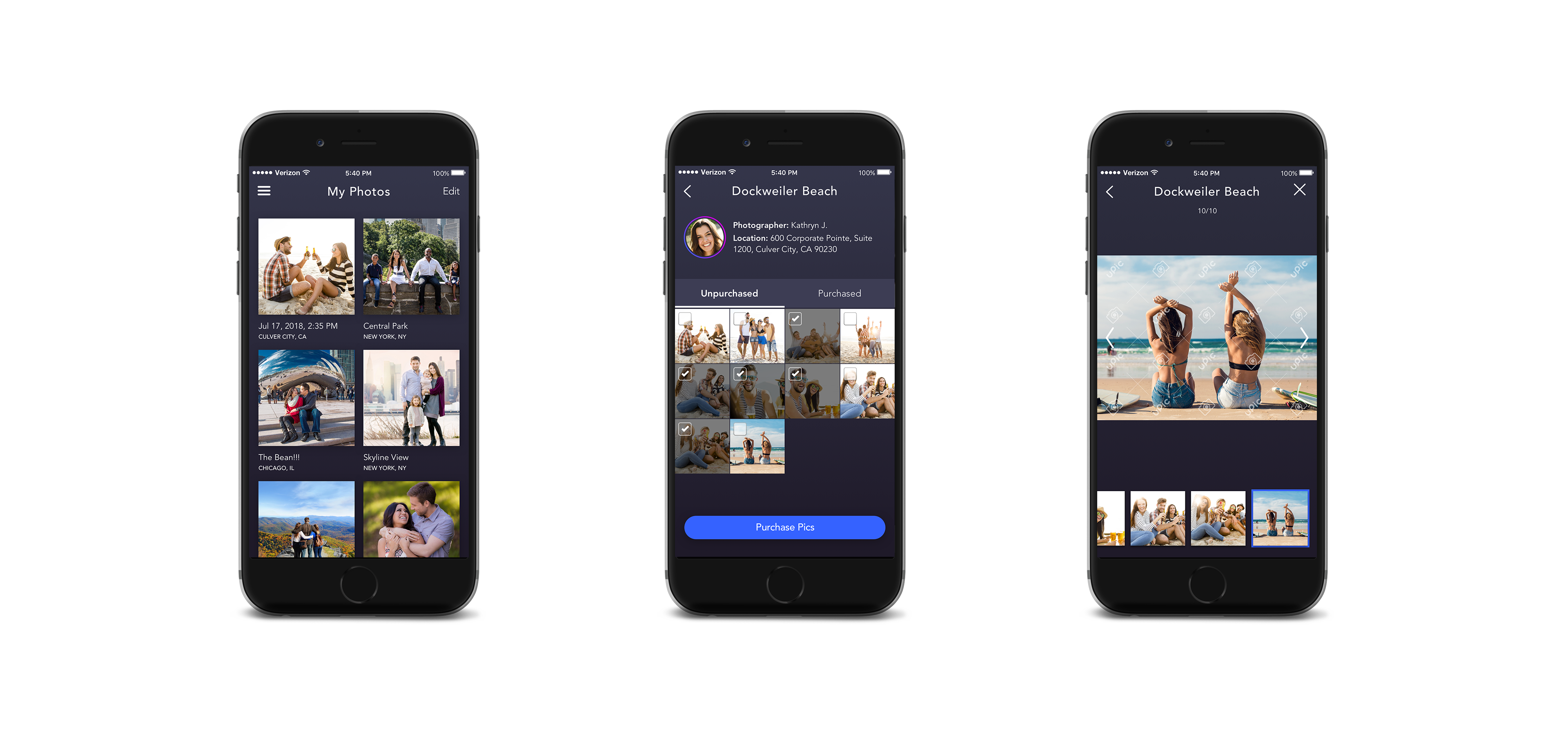
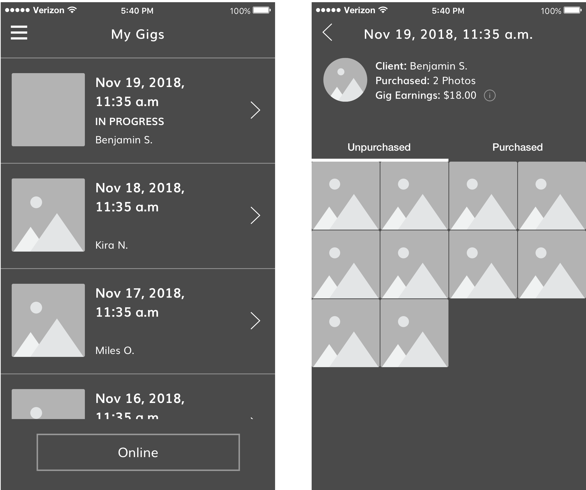
This section is where the client can go to see all of their previous photo shoots, and purchase photos. Within a photo shoot, the photos are separated into two tabs, “unpurchased” and “purchased”, so that the client can download photos they already purchased without having to pay again. (The payment process itself did not require any design work, as the app uses the Stripe payment interface which can’t be customized.)
Tapping a photo opens a watermarked full-screen preview, while tapping the checkbox selects the photo for purchase.
MY GIGS
On the photographer side of the app, the home screen is a list of all their pending and completed gigs. The uPic app is unlike other on-demand apps in that a photographer can have more than one gig open at a time. I felt this was important because many photographers like to crop or retouch photos before sending them to their clients, and if they’re unable to do that right away they should be able to accept other gigs in the meantime.
There is also a toggle switch on this screen for the photographer to go “online”, meaning they will be visible to clients trying to book a photo shoot.
GIG IN PROGRESS
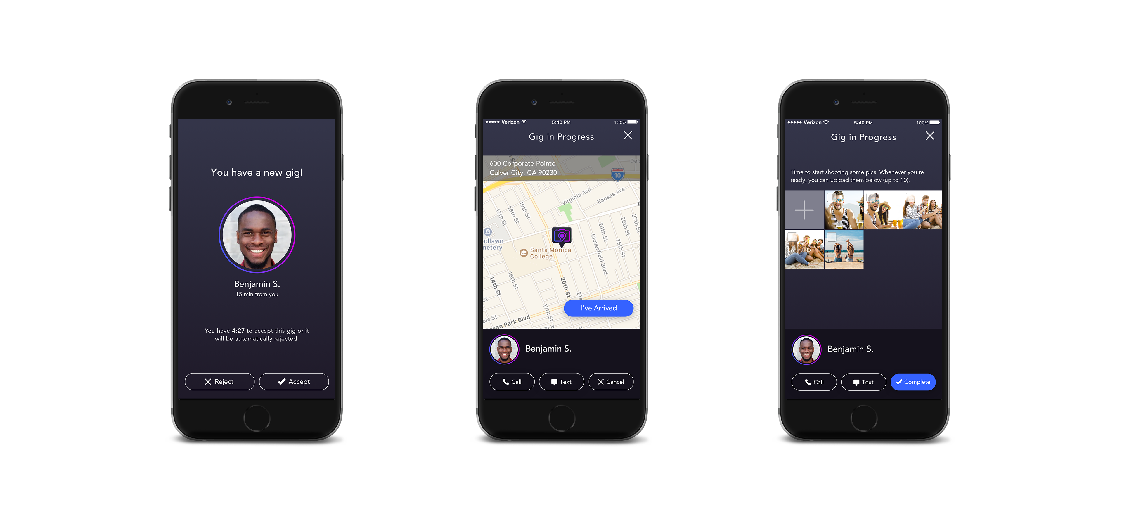
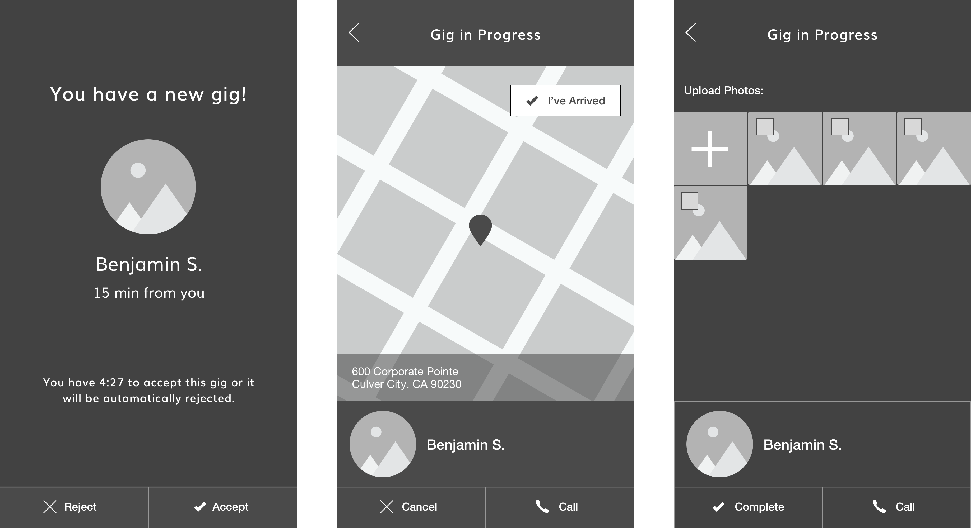
Photographers receive a push notification when they have a new gig. If they accept the gig, they are shown a map with the client’s location. Once they arrive they tap “I’ve Arrived” and the gig switches to the “upload” view, where they can upload photos when they’re ready.
Photographers can always get back to this flow by tapping on the “in progress” gig in “My Gigs”. Until they complete the gig, they have the option to cancel it or contact the client.
SIGN UP & LOGIN
Following a growing trend in UX design, the uPic app takes the bold step of eliminating usernames and passwords altogether, thereby preventing messy “forgot username/password” situations. The user’s mobile number is their unique identifier, and login is performed with a verification code that is sent to their mobile device. If they lose their phone or get a new one, there is a secondary option of having the code sent to their email. Security is preserved in the secondary login by making sure the email is from the same account as the phone number that was entered.
UI DESIGN
COLORS
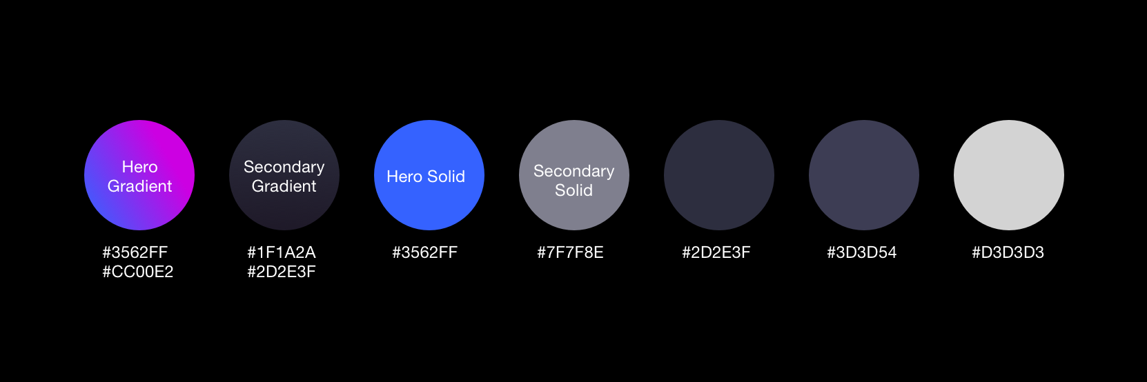
I used the gradient from the logo as a “highlight” color in various places, but I didn’t want to overuse it, so I chose the bright blue from the style guide to be the primary color of the app. I chose a dark blue for the background to make the brighter blues and purples really “pop” against it. The background color is also a gradient to give the design some depth.
REFLECTIONS ON UPIC
uPic has officially launched in select cities! Their strategy will be to build their business in those regions before eventually spreading nationwide. Reflecting back on the app design, if I had the chance there are a few things I would research further:
- Is the map view useful or would a list view be easier?
- Does the client feel they have enough information about the photographers to make a choice?
- The photographers only make money if the client purchases photos. Are they okay with that system or is it necessary to add a base payment upfront?
Overall though I was very happy with the design, and I know the uPic team was too. I wish them lots of success!


© 2022 Christina Scanlon. All Rights Reserved.
