
OVERVIEW
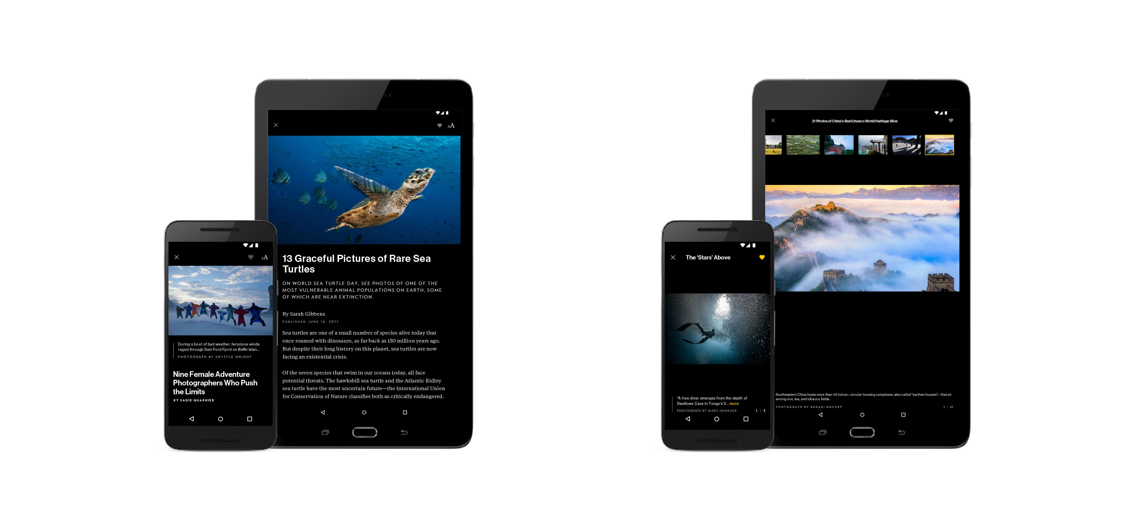
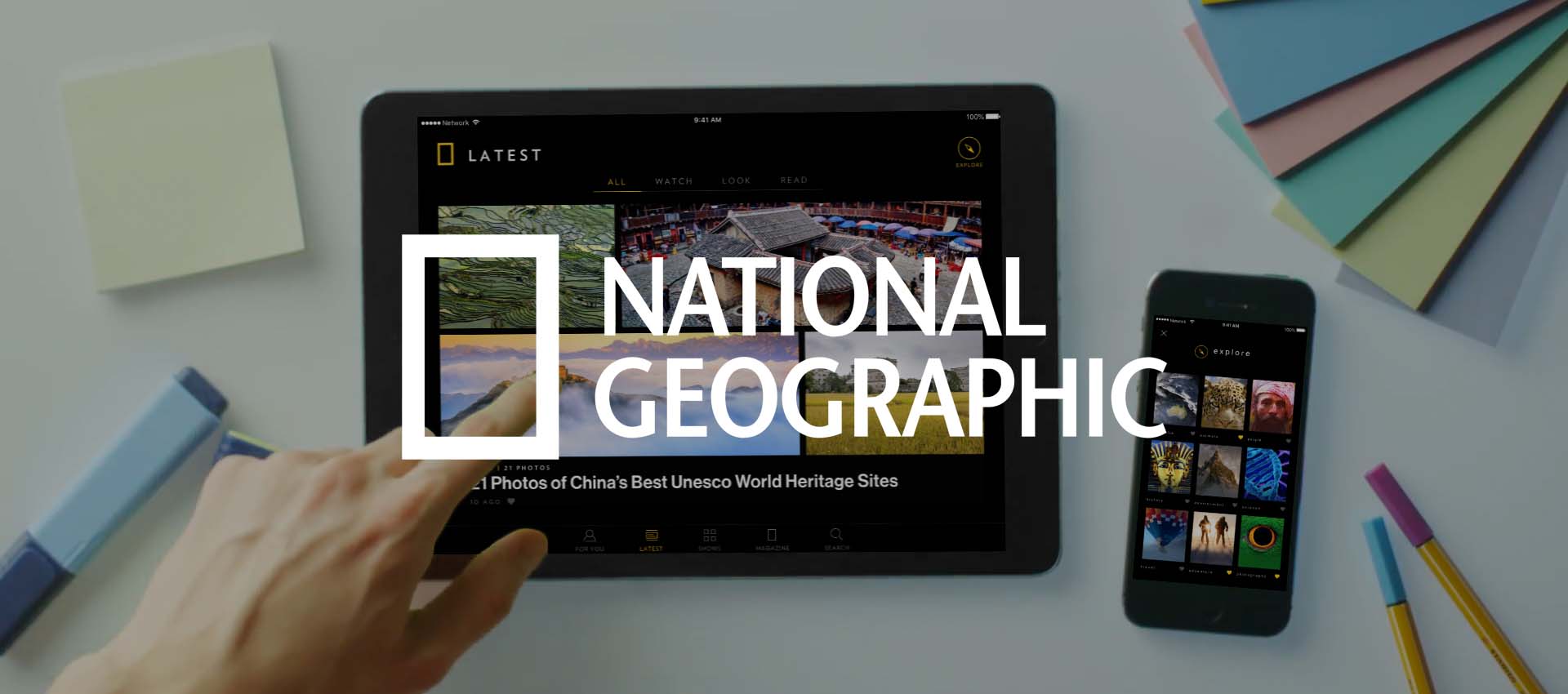
The National Geographic app gives users access to all of the vast offerings of National Geographic right at their fingertips. Users can read articles, watch documentaries, and browse stunning photographs all with the touch of a button. With personalized collections and constantly updating content, users can explore the world of National Geographic to their heart's content.
My Role: UI Designer
Tools: Sketch, Invision
Platforms: iOS, Android - mobile and tablet
Deliverables: High Fidelity Wireframes, Style Guides
MAIN CONTENT
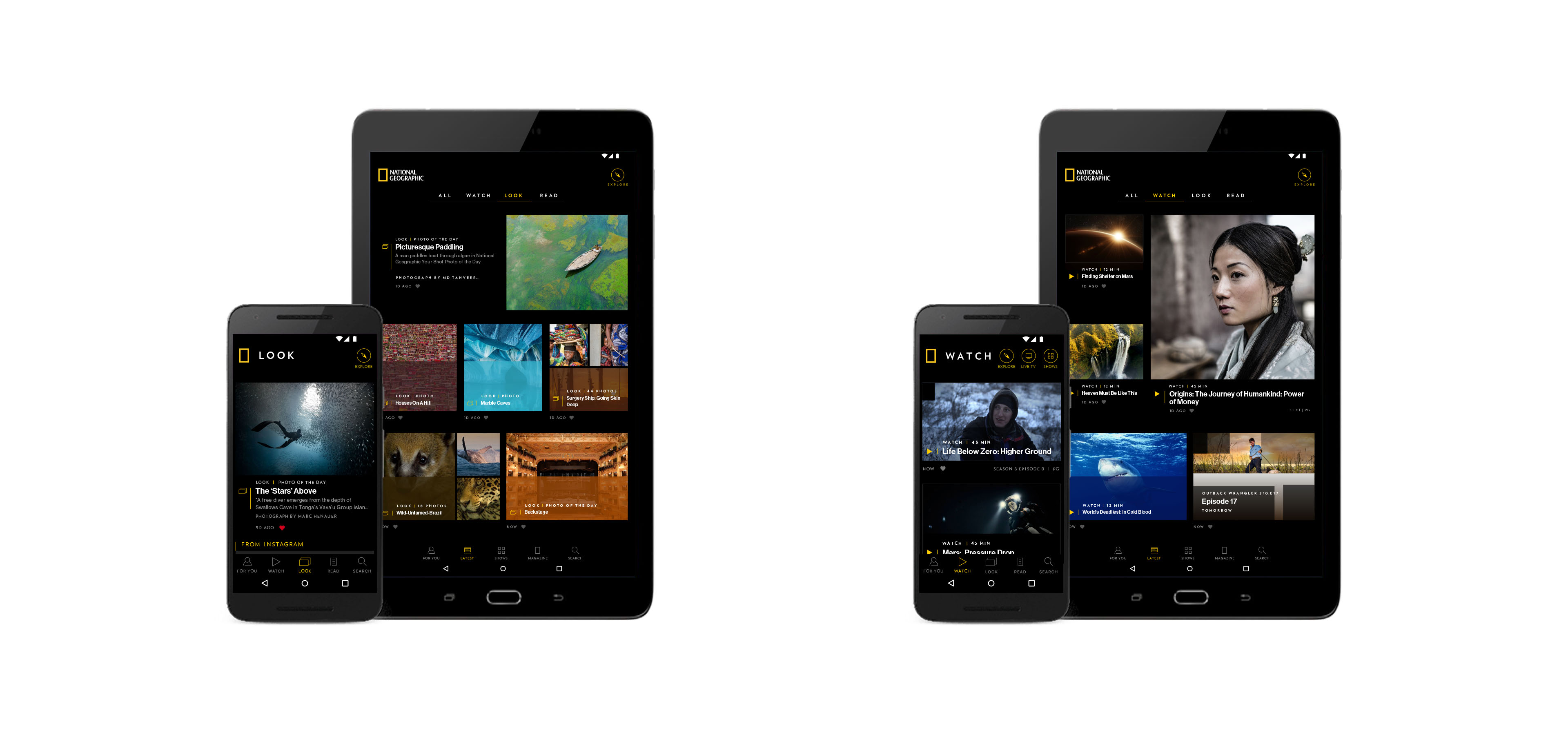
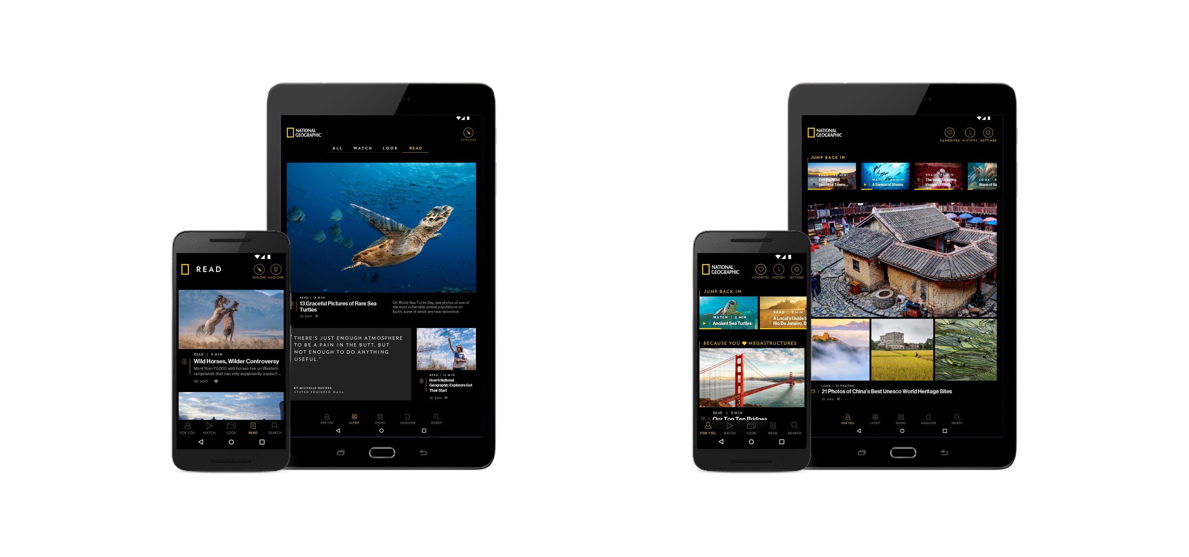
The content feed is designed to have an "editorial" feel, with National Geographic's breathtaking photography taking center stage. It is divided by type into three sections: Look (photography and image galleries), Watch (videos, documentaries, and TV episodes), and Read (articles and inspirational quotes). The tablet version of the app also contains an All section, with mixed content from all three types.
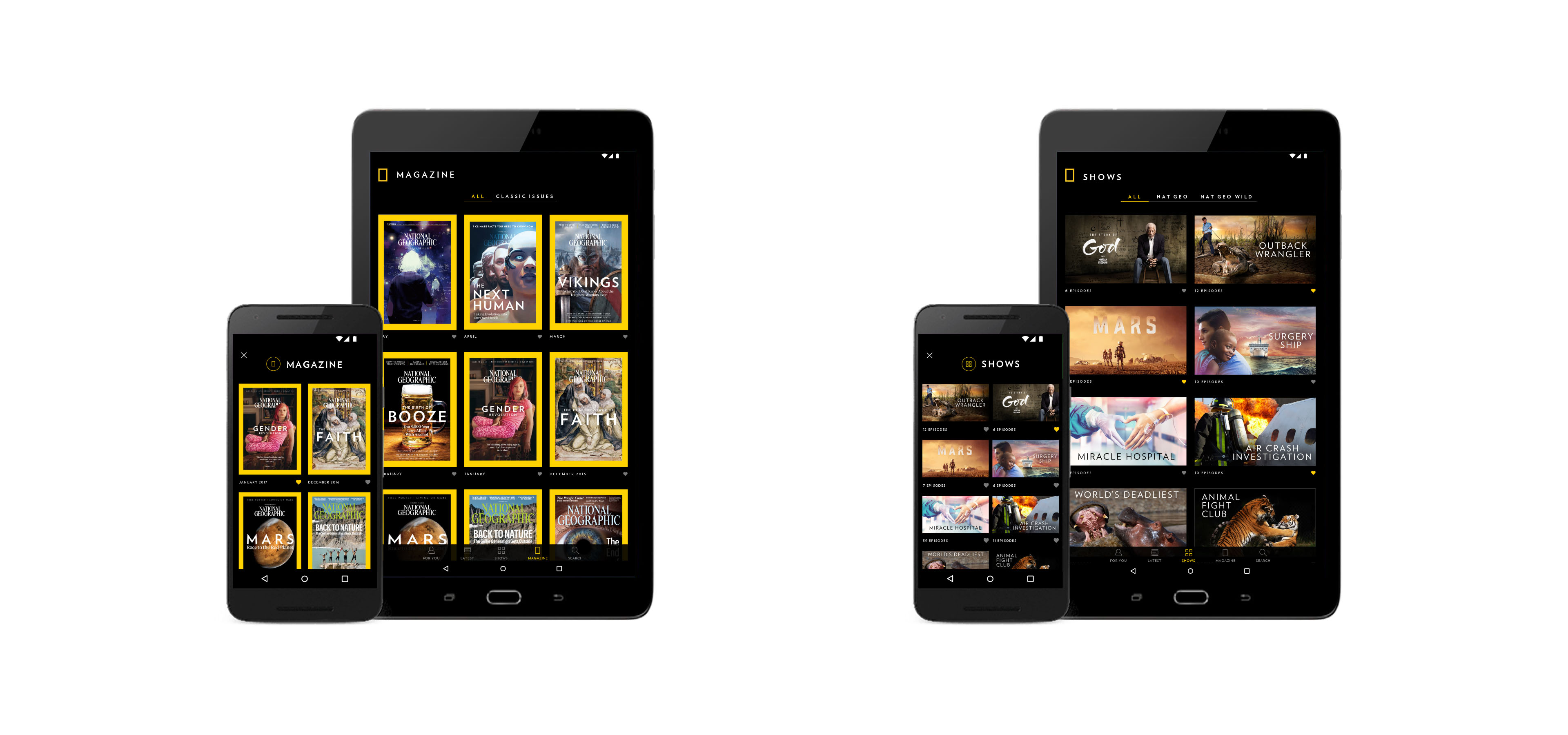
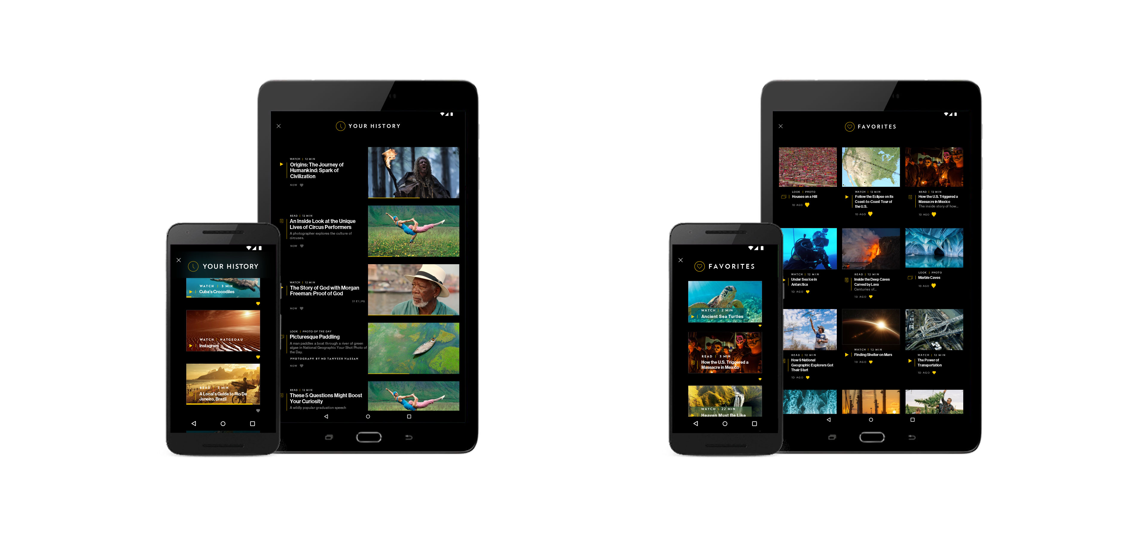
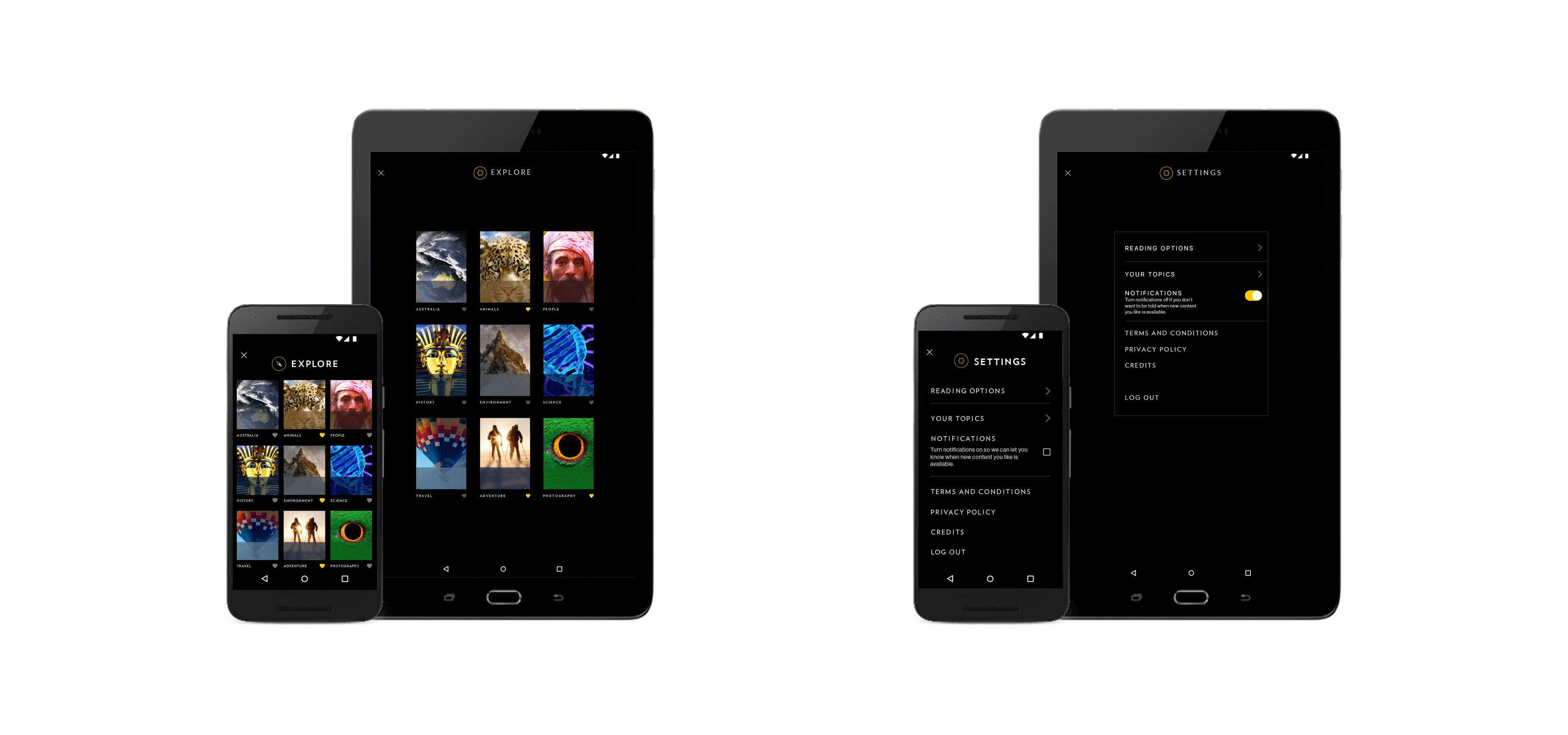
Outside of the main content feed, other sections of the app include For You (a personalized collection of recent items), Magazine (digital copies of the latest National Geographic issues), Shows (all available episodes from NatGeo and NatGeo Wild channels), History and Favorites.
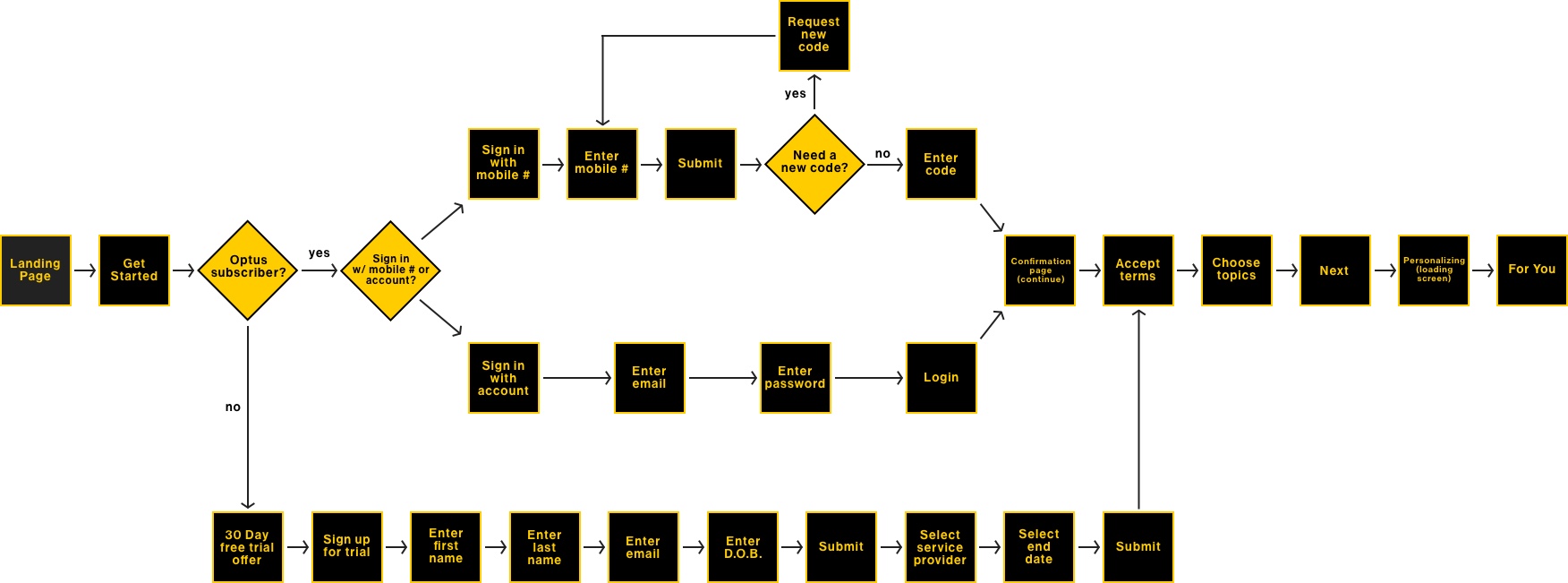
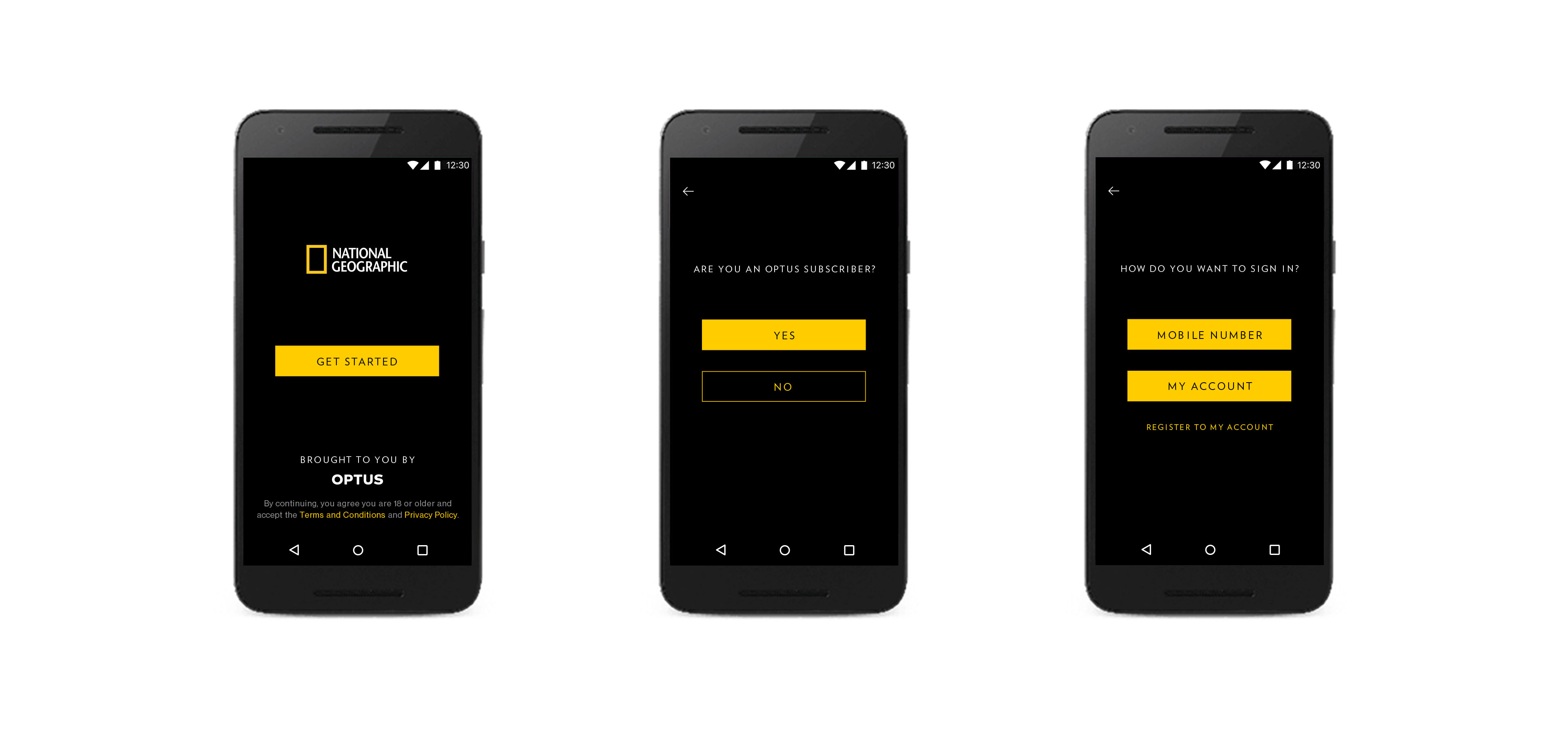
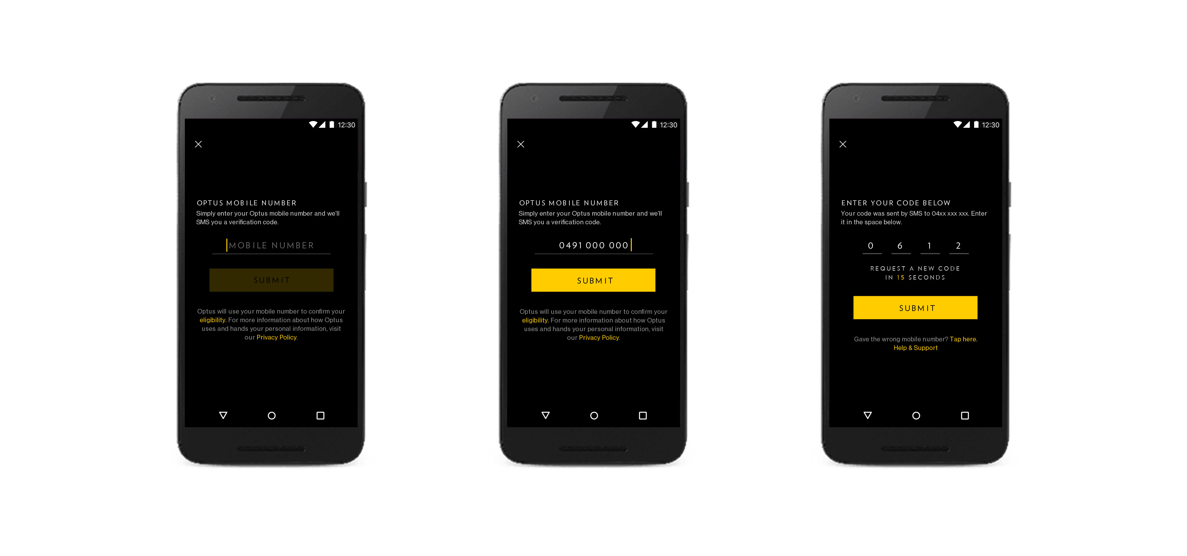
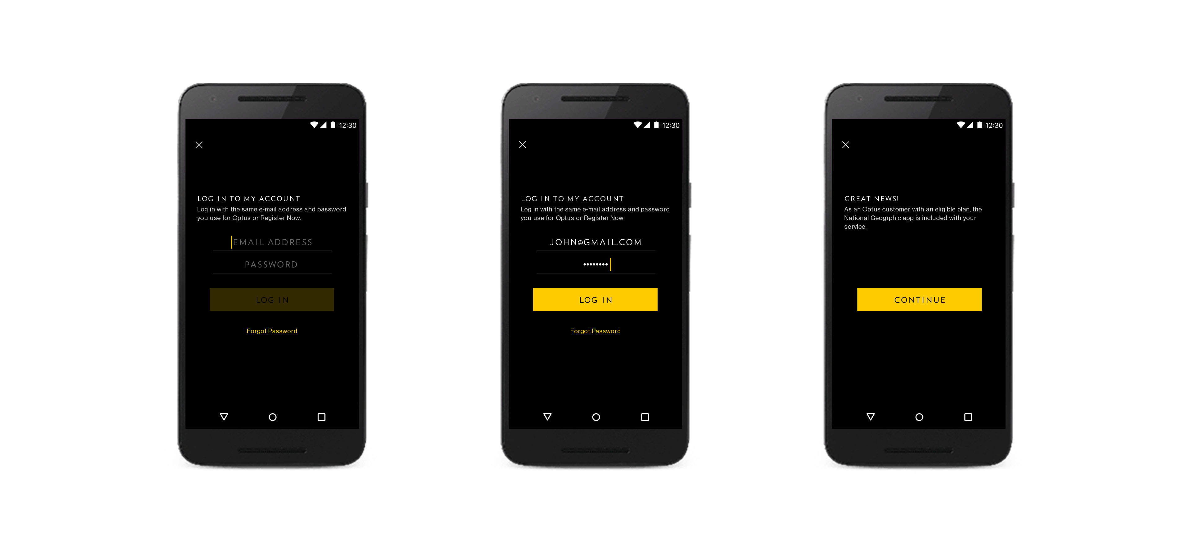
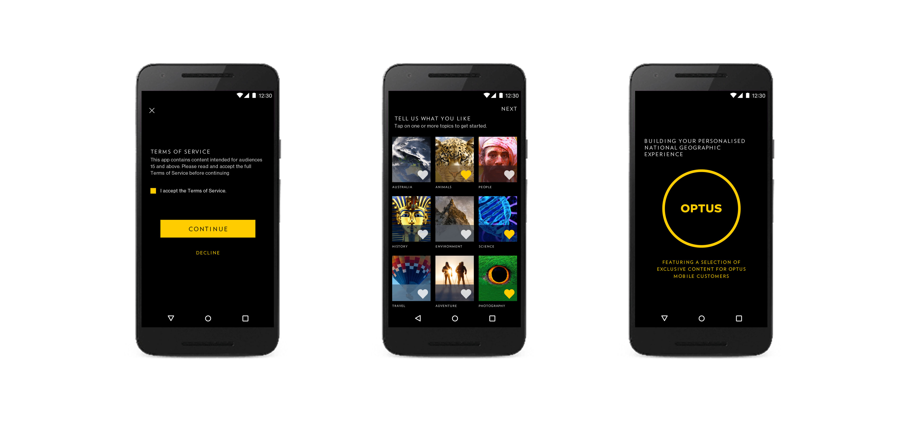
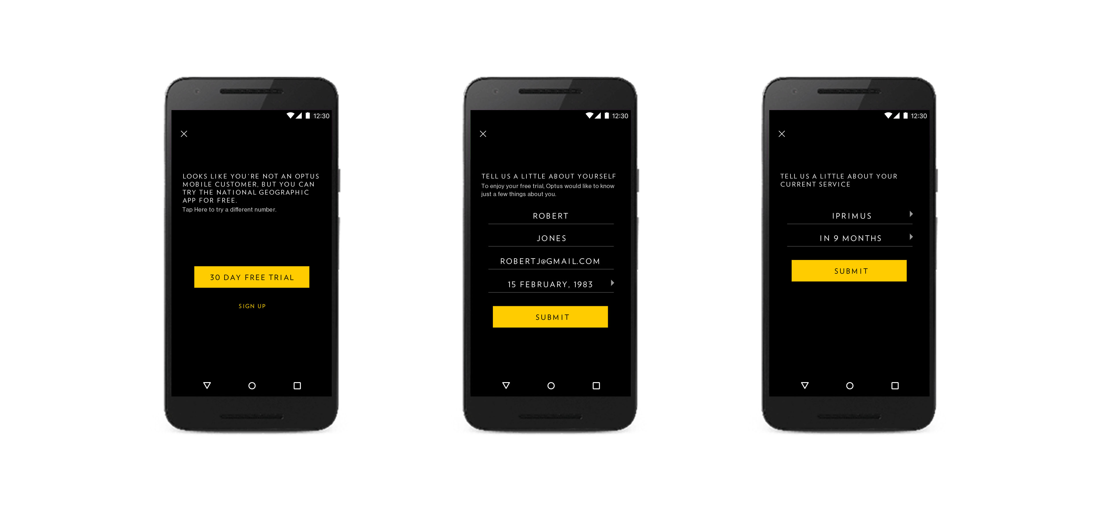
ONBOARDING
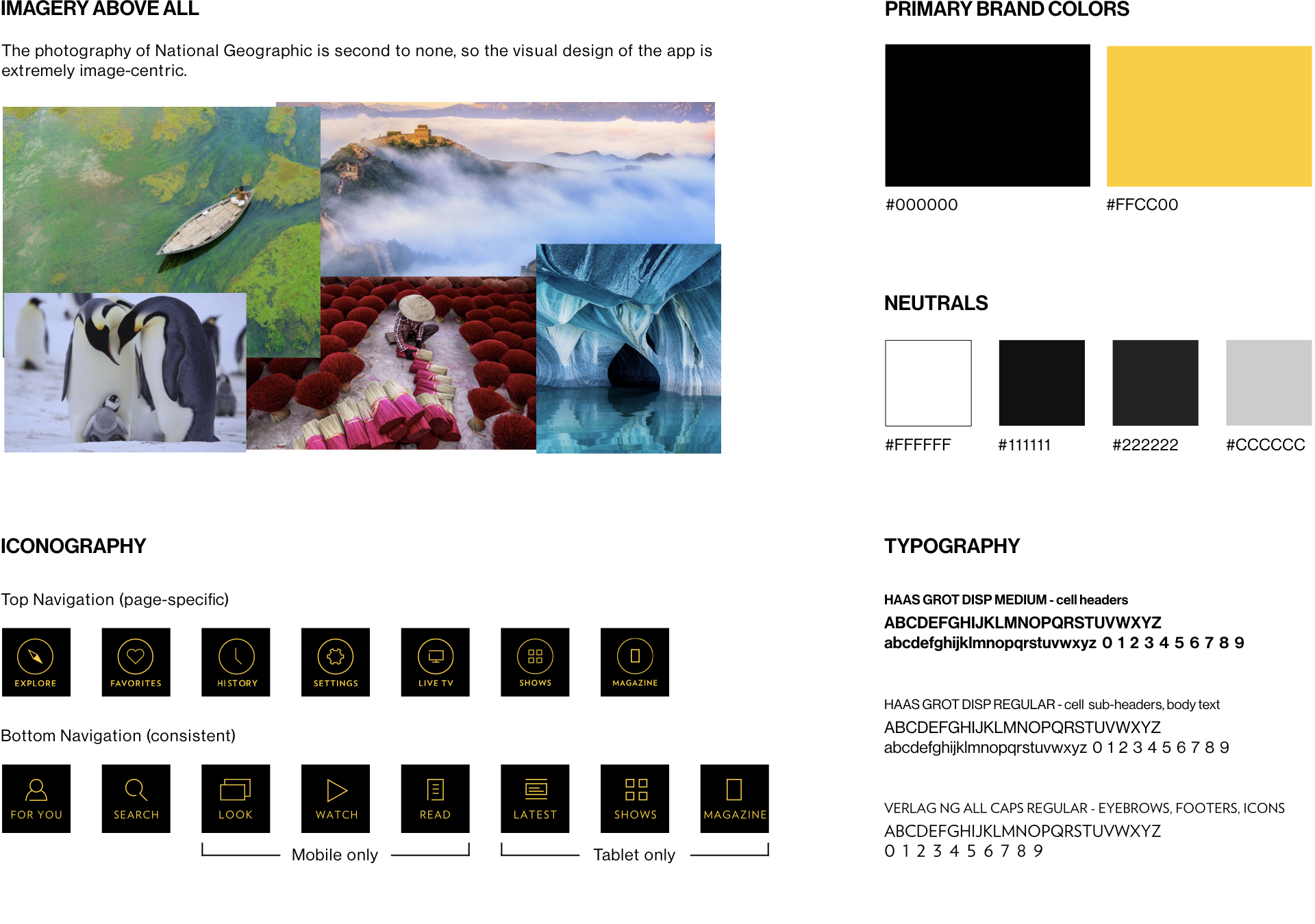
VISUAL STYLE

TABLET LAYOUT
The tablet version of the app takes advantage of the larger space available. Items in the content feed are arranged into "cells", each with its own specifications depending on the type of cell (look, watch, or read). There are multiple sizes for each cell type. Here are a couple of examples:


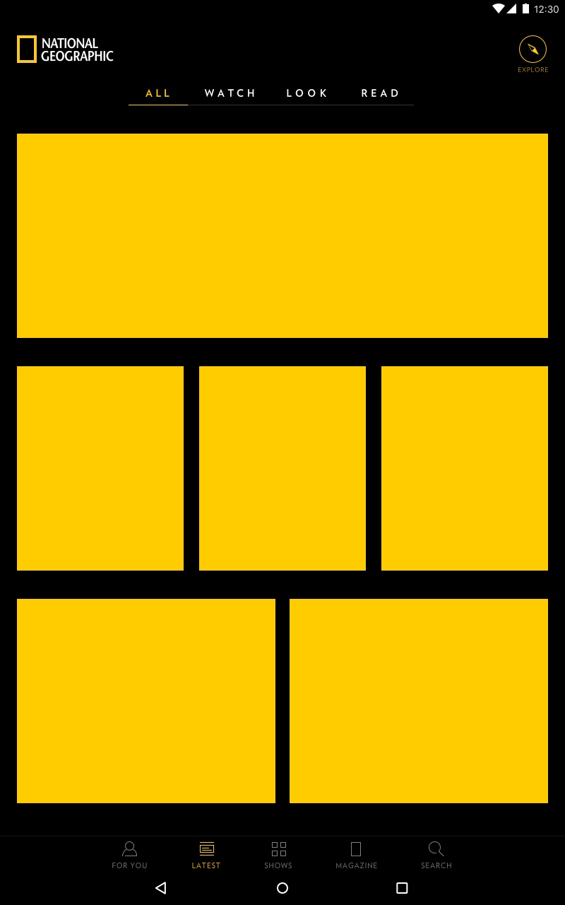
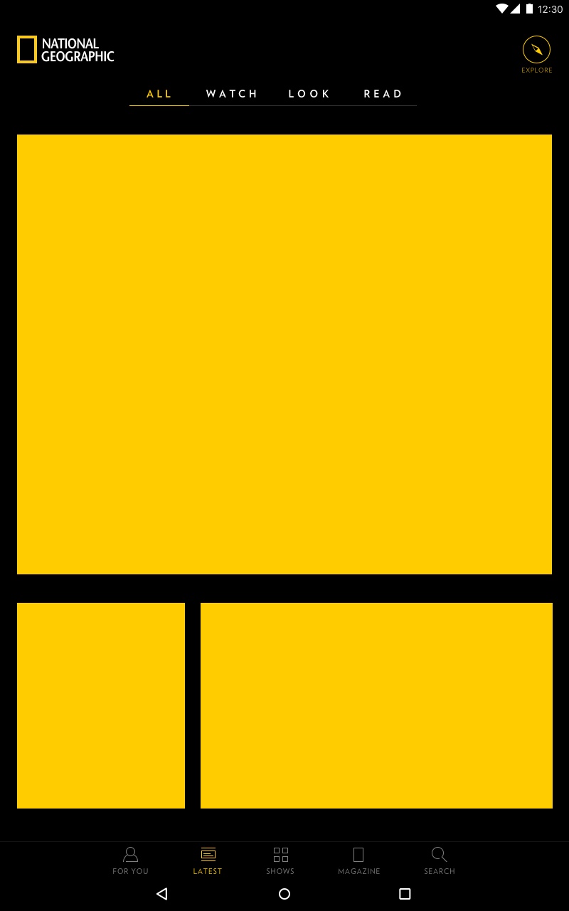
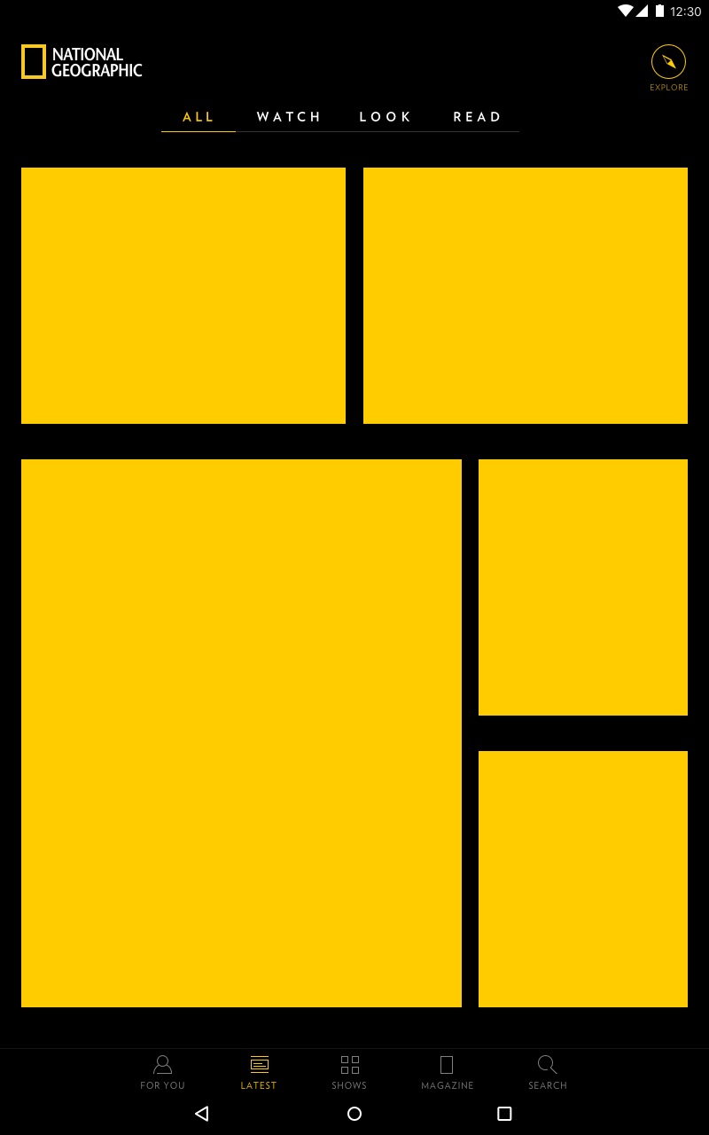
These cells are arranged in various combinations into a 3x3 grid. There are many different grid layouts, however they are always arranged so that the vertical lines of the page are broken up, creating better visual flow. Here are a few examples:



LAUNCH
As of Fall 2017, the mobile version of the app has officially launched in select markets to rave reviews, with the tablet version to follow shortly. Keep an eye out for the National Geographic app in your market soon!
-


-
© 2022 Christina Scanlon. All rights reserved.
